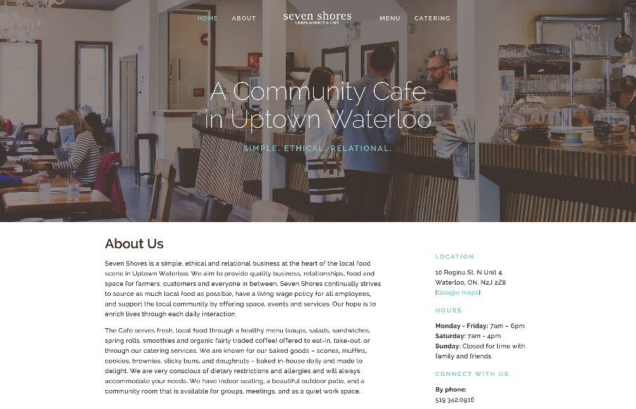
It's not often you see a restaurant or cafe website made entirely out of HTML/CSS. I know that's crazy right? This one isn't spectacular but it's efficient and perfect for the need. That's why I think it's beautiful, really! Also... it's made using squarespace.
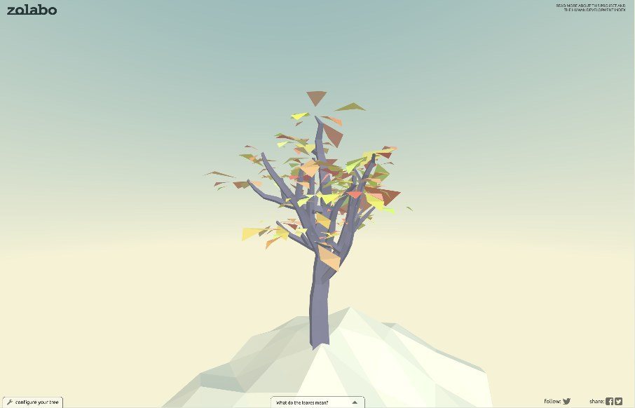
Tree of Human Development
Pretty rad interactive element here. The tree that you get after completing the form is brilliant. Go take a peek and play around with it.
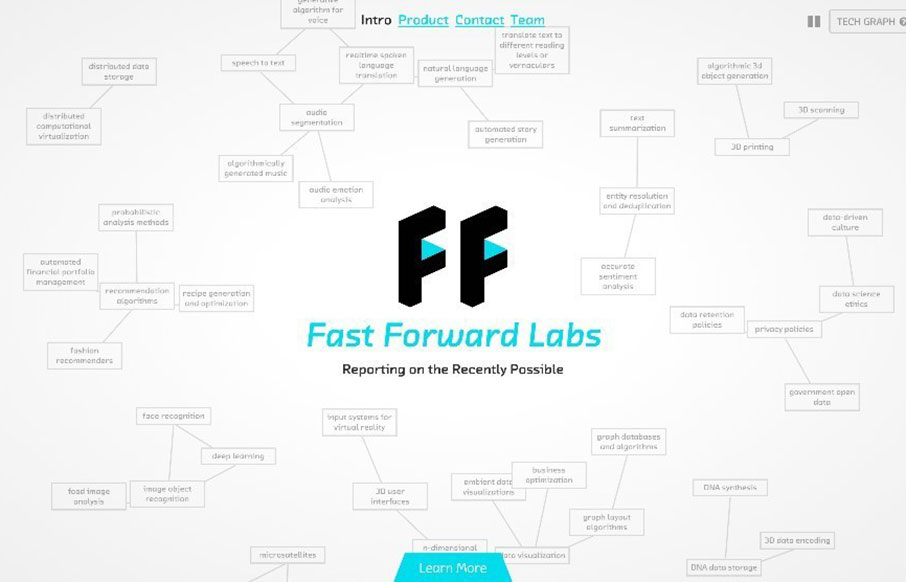
Fast Forward Labs
I dig this simplified layout approach of the Fast Forward Labs website. At it's core it's straight forward and simple, but lay on some neat visuals like the animated mind map graphics and it's pretty darn cool.
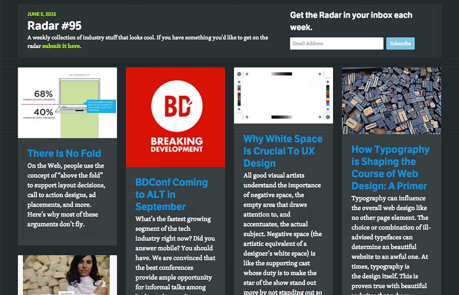
Radar #95
In this week's Radar: There Is No Fold BDConf Coming to ALT in September Why White Space Is Crucial To UX Design How Typography is Shaping the Course of Web Design: A Primer Exploring the Hero Image Trend in Web Design A Designer’s Checklist For Designing Awesome...
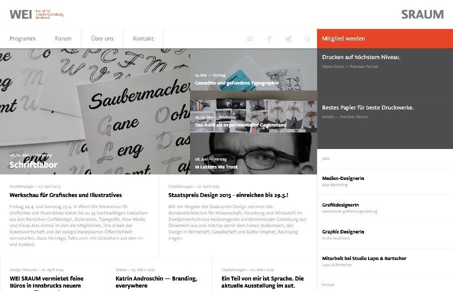
WEI SRAUM
There is a lot going on here to get this website responsive visually. The grid is pretty core to its layout and it flows really well from screen to screen width. I also really dig how the header/nav stays fixed and moves up visually as you scroll down. From the...
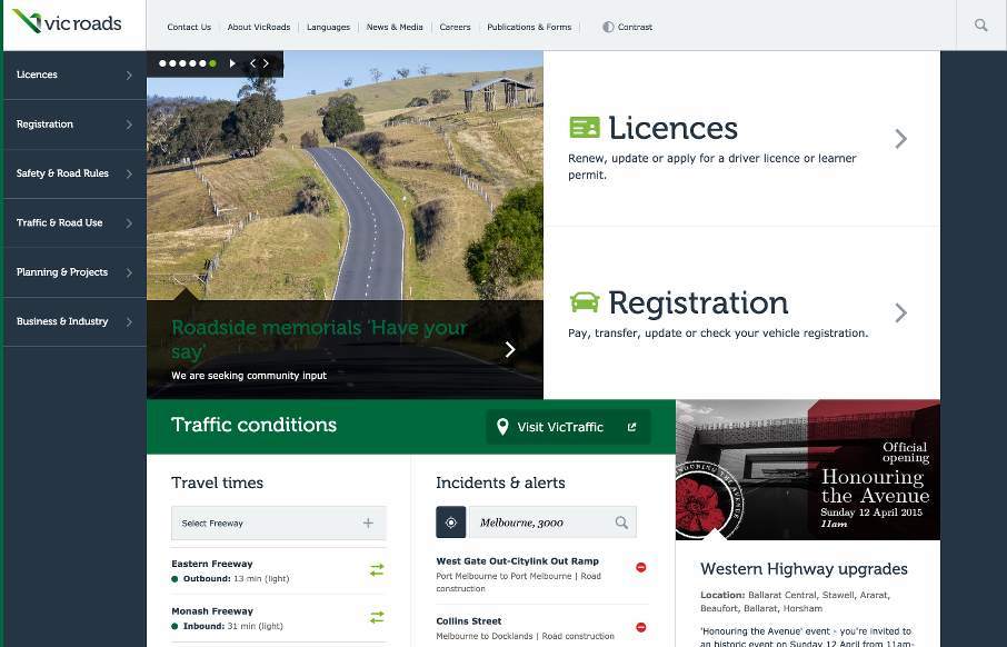
Vic Roads
So I've looked at reviewing the Vic Roads site, out of Australia, a couple of times since it's been in our queue and it took me a little while to come to peace with it. I think my initial problem was that it is very text heavy, so we don't often look at those sites as...
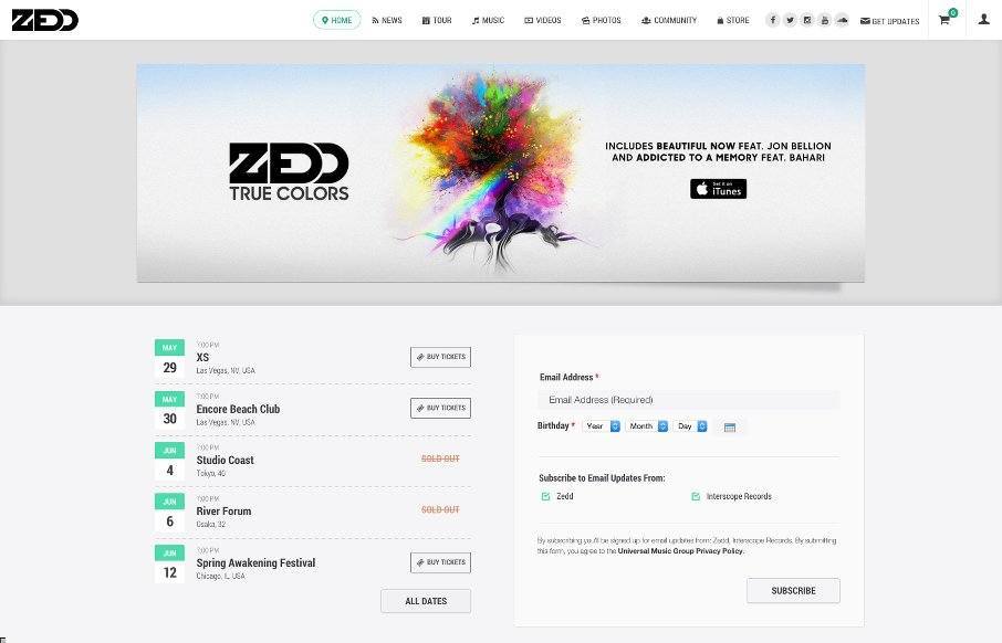
Zedd
Pretty decent band website. It get's straight to the point and doesn't bog you down with giant photos and crazy background design stuff. Band name, play music samples, buy stuff... that's all you need really.
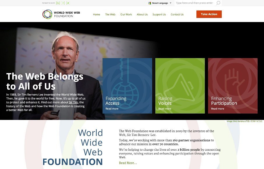
World Wide Web Foundation
Solid, solid design here. There's a lot to this design but I only want to look at one thing for this write up. Take a look at the screen layout changes between what looks like iPhone and iPad - the marquis areas break out of being on top of the hero image to go...
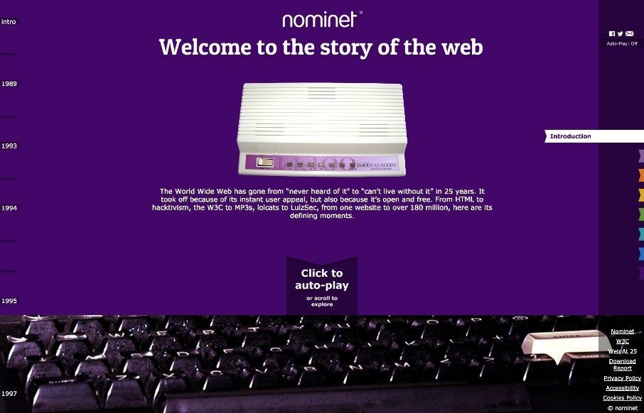
Story of the Web
It's a fun website to scroll through. It's also pretty nifty visually. I like the navigation by year and then also by major event (bookmarks). Solid stuff.
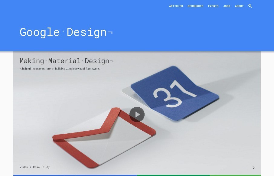
Google Design
A simple feeling design that is anything but simple. Clearly, they utilized their Material Design approach to this site. There is also some really nice little interactions, like the "ping" visual thing when you click on main links. I will say that this site is way...
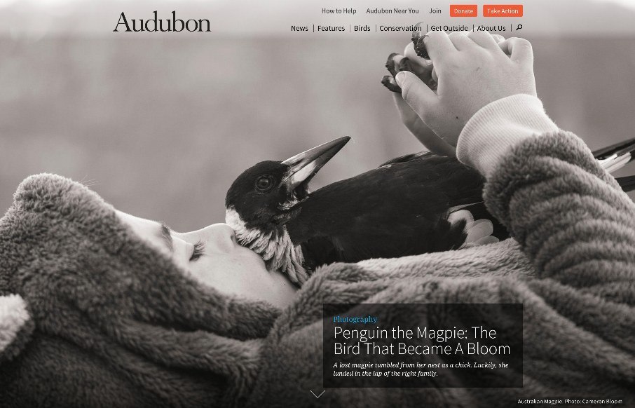
Audubon
A beautifully executed website for Audubon. I love how the first thing you see is kind of like a splash screen, with a large image but still visible navigation, then as you scroll it slides up to reveal a more traditional feeling site. Then the site is not very...
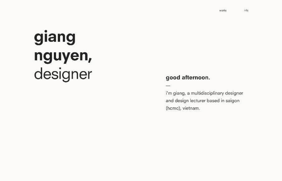
Giang Nguyen Design
Good, clean portfolio site from Giang Nguyen out of Vietnam. It's very simple, with the work being the main focus. I like the little refreshing tag lines on the top left - will say that on my browser, it is hard to see under Giang's name in the sticky header. All...
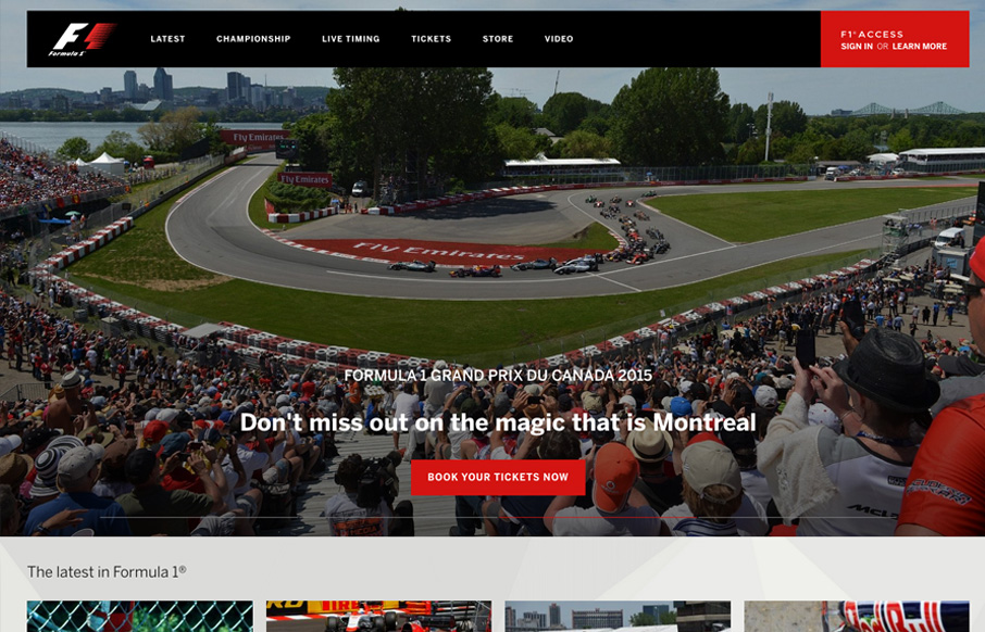
Formula 1
As expected from Formula 1, this is a slick, solid and bold website. The first thing to grab you is the quality of the large and spectacular images on the home page. As a designer, if you’re given images such as these to play with you know your design is going to be...
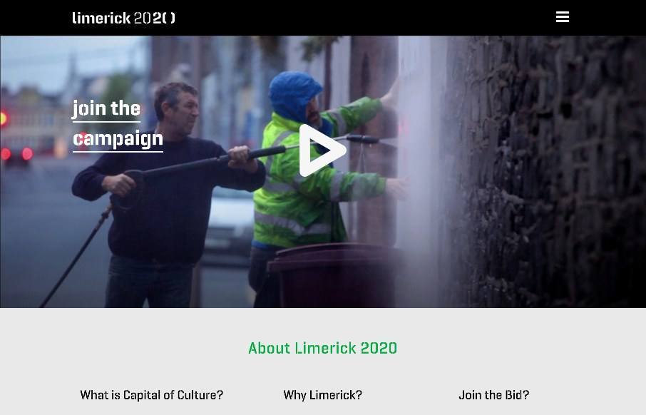
Limerick 2020
Interesting site out of Limerick, Ireland, in their bid to become the European Capital of Culture for 2020 - love to see a site that is built around the cultural events of a city. Really like how they have taken their logo - made a font out of it - and used it...
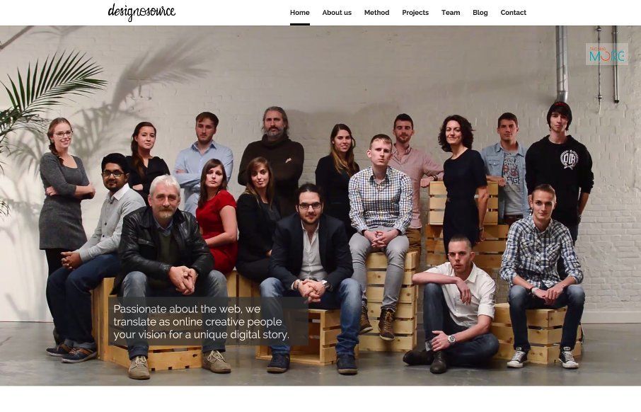
designosource.be
Good clean one-pager agency out of Belgium for Designosource. While the site is good, I think what is more impressive is that this looks to be a hybrid agency / teaching environment that grew out of a college classroom - probably the professors' needs to give students...
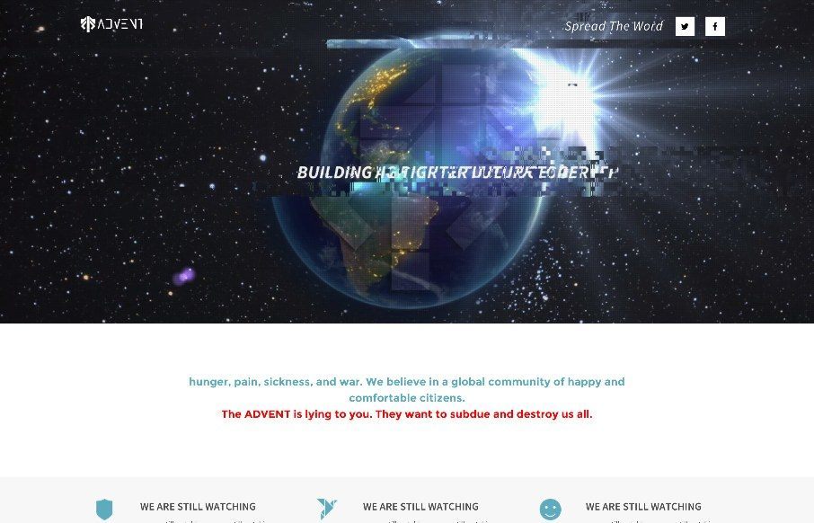
Advent
What the... I only wish some of the hacked websites we've seen over the years could have been this cool. I'm writing this Sunday, May 31st - and not sure how the site is changing on June 1st (the last part of this one-pager for possibly a video game by 2K (@2K) , says...
Old New York City
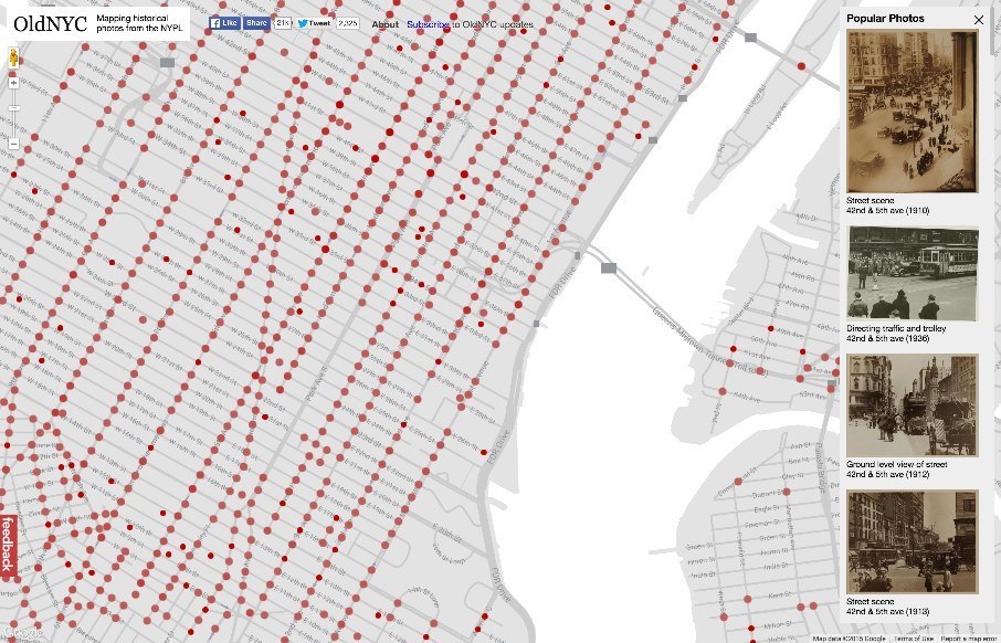
I wish that there were more of these types of sites out there like the Old New York City site, made by The NY Public Library, their NYPL Labs section, and Dan Vanderkam (Twitter handles below). Yes - we're still a style gallery, so you may ask why put this site out...
Radar #94
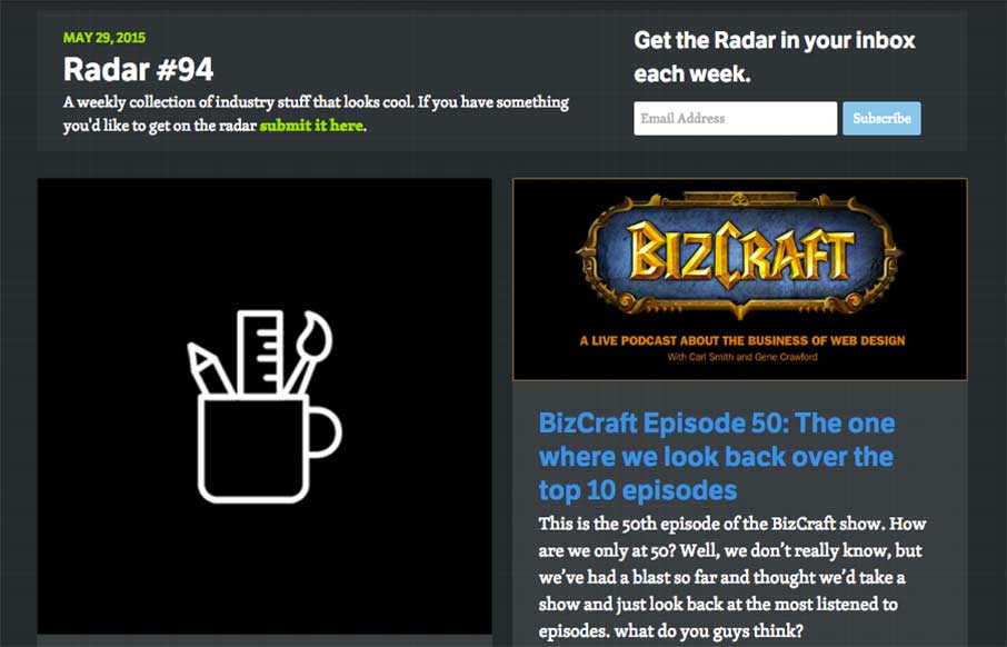
In this week's Radar: The State of Design Tools: An Unscientific Survey BizCraft Episode 50: The one where we look back over the top 10 episodes Bourbon, Bitters, and Neat HOW TO DESIGN A TYPEFACE 1 hour of research saves 10 hours of development time Creating Google...
Rick Allen
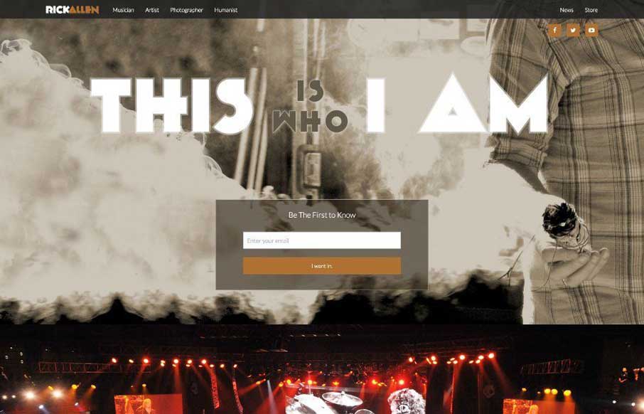
So I've been listening to Rick Allen's music (from Def Leppard) for over 30 years now - and looks like he has a new website out. Really cool - has great full-width images (that are art pieces that Rick has photographed or designed). Speaking of the art - check it out...
Prime Minister Office of India
I don't think when I started writing for Unmatchedstyle, that I thought I would be reviewing the Prime Minister of India's website - but here it is. From what I can tell from his site, PM Narendra Modi seems like a hip and with it leader - a good bridge between...
Marcin Dmoch
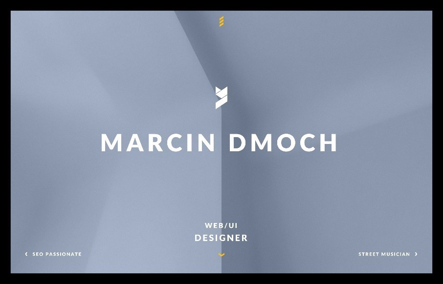
i first looked at Marcin Dmoch's portfolio site on my phone - and really liked the quick interaction with swiping, instead of just using the menu. Like the different look of the Work pages too. From the Designer: "Marcin Dmoch - WEB/UI Designer living in Poland /...
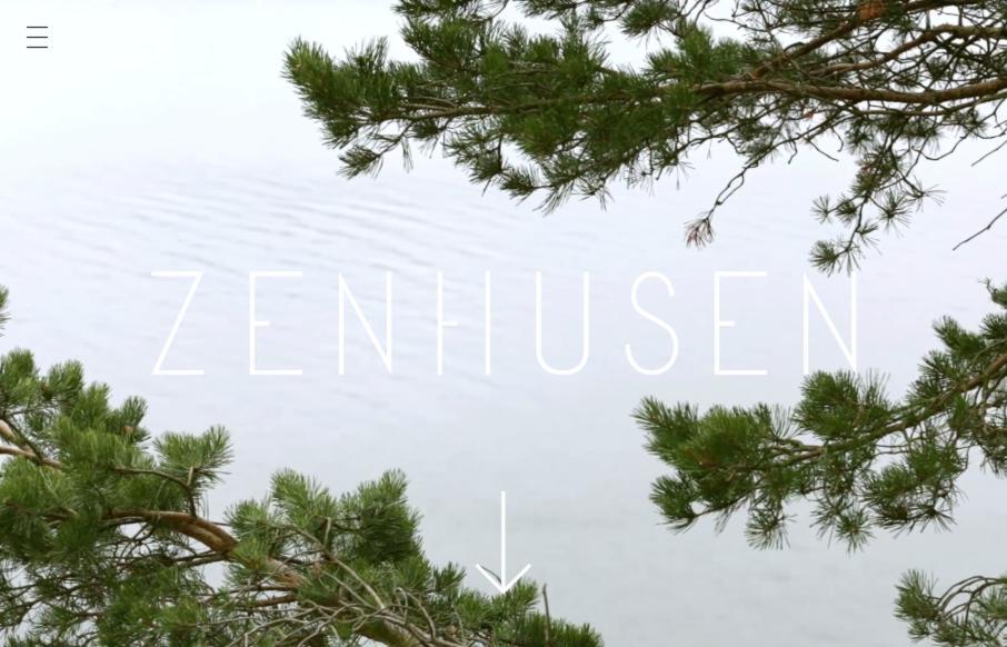
Zenhusen
I'm digging this design for Zenhusen by Rodolfo Agency out of Stockholm. It has enough technical UI stuff to make it cool, but love the movement and clean layers that really make the design of the site. Submitted by: Rodolfo Agency Twitter:@RodolfoAgency...
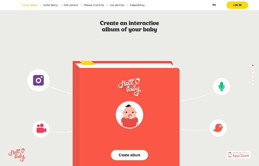
Hell’o Baby
I wasn't a fan of this app product page for Hell'o Baby at first. When we have a site submitted to us, we immediately check for responsiveness by pulling the browser left and right, checking for how the site resizes. Hell'o Baby at the iPhone view on desktop, not so...
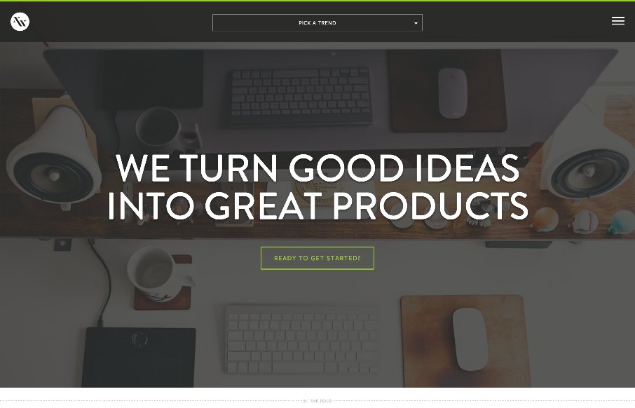
nGen Works
Really love the new nGen Works site out of Jacksonville, Florida. There's a really good change of emphasis to "what we can do" vs "who we are". I like this because as cool as most agency sites are, there have been big trends to show the people and the lifestyle of the...
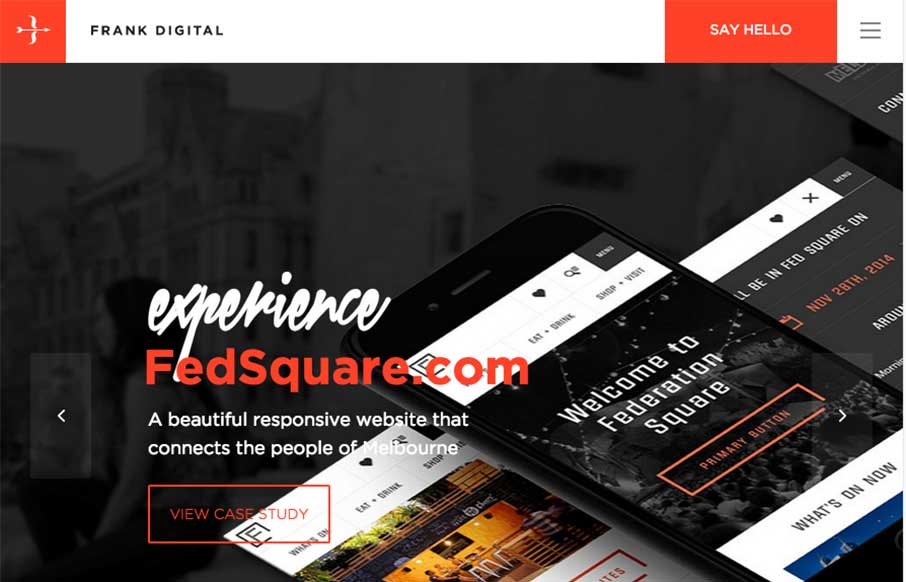
Frank Digital
Strong grid design and some some solid/strong color makes this website shine for Frank Digital. I especially like the asymmetrical layout of the portfolio section on the home page. Designer: Frank Digital Sydney & Melbourne From the Designer: We create websites...
Edilteco
Standard layout here, but what's neat is the main icon designs and their interactions. Needs to be responsive for sure though. From the Designer: An extreme usable way to let clients discover the company world. A web place projected and designed to show all the...
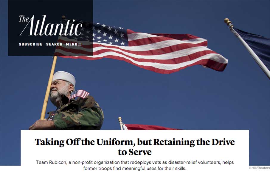
The Atlantic
The layout of The Atlantic is insanely simple. In many ways it mimics such things as say Instagram. It keeps me intrigued with headline after headline and super great photo after photo. I love this, just sitting here scrolling and reading and looking. Thing does it's...
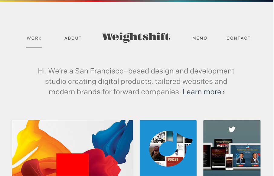
Weightshift
Every now and then Weightshift will rework their website. I'm in love with this version for sure - not that the past dozen were not good by any stretch. I love simplicity and the way this site has traveled down that path over the years is a work of art. Luuurrve this...
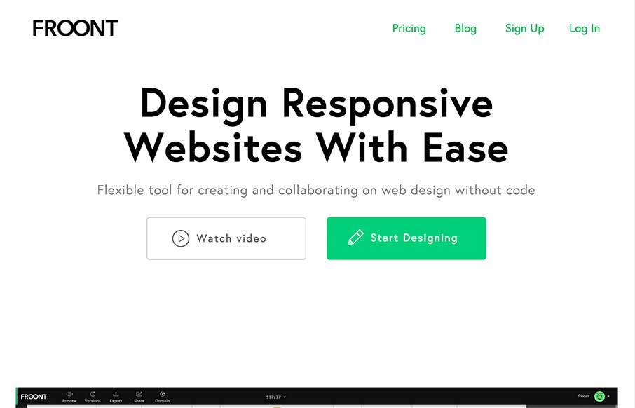
Froont
I LOVE the Froont website design. Man those gifs are fantastic for explaining what the heck the app is all about. Then the Features and Pricing section on the home page is brilliantly designed IMHO. Love it, all the way.
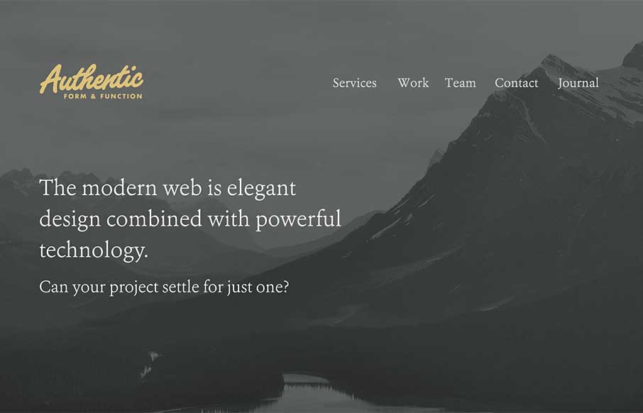
Authentic
I like they way the site for Authentic Form & Function here uses the 'hero' area to sort of lay out a presentation of sorts. Then you taper down into a more or less typical website layout. All the way down to the footer area which is quite nicely executed.

