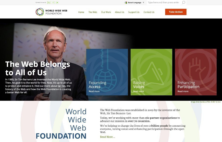
Solid, solid design here. There’s a lot to this design but I only want to look at one thing for this write up. Take a look at the screen layout changes between what looks like iPhone and iPad – the marquis areas break out of being on top of the hero image to go underneath it, but on the wider screen sizes they lay on top of that area. That’s a great design pattern to emulate for other websites. Love it.


The Call to Action, Revisited
The Call to Action hasn’t changed in a decade, but the bar has. A fresh look at prominence, copy, mobile tap targets, and accessibility, with lessons from three major design systems.


0 Comments