Web Design Inspiration Curated
Get This and Other Things In Our Weekly Email Newsletter
Check out the past weekly newsletters as well as our RADAR section of useful links.
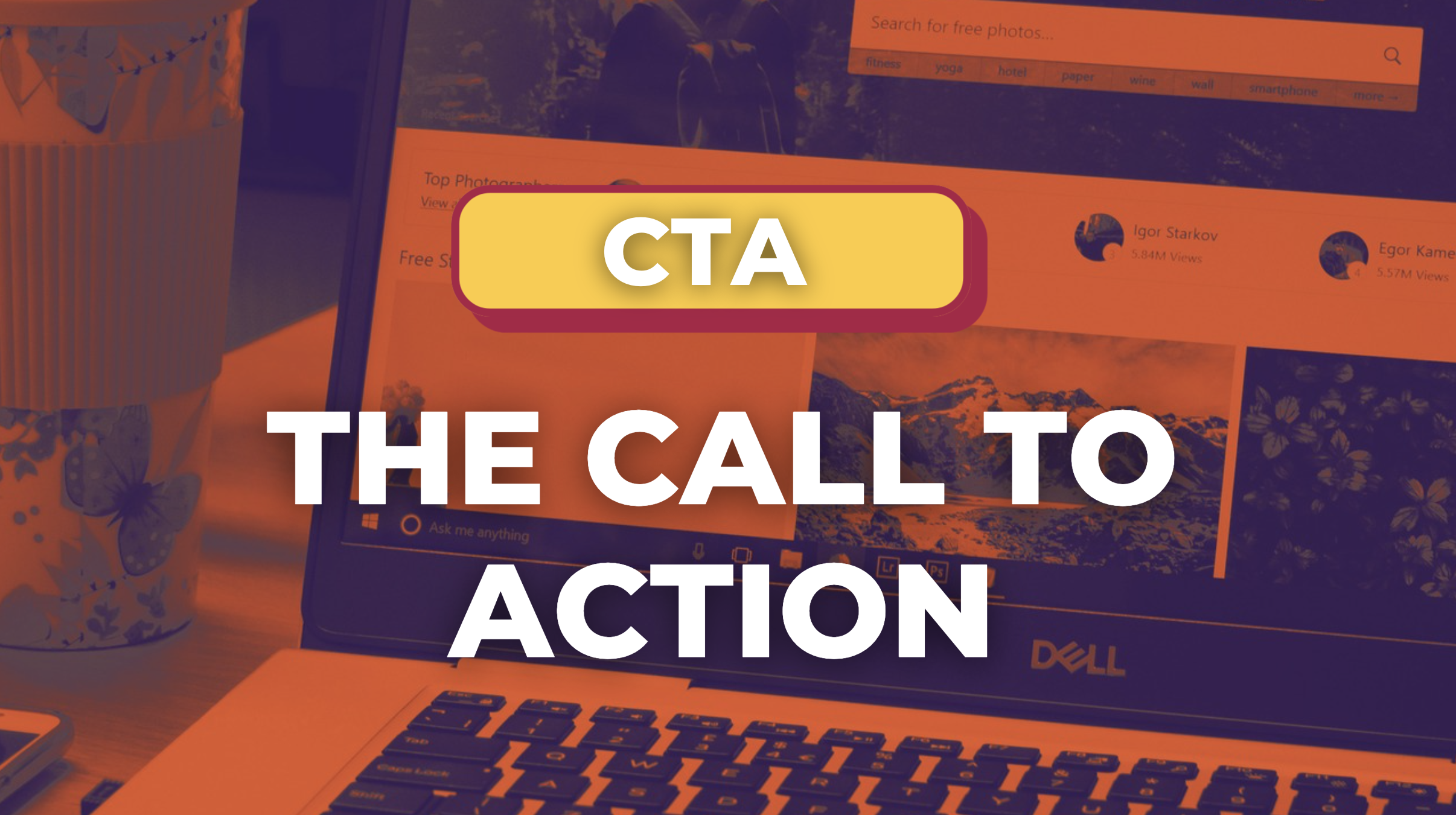
The Call to Action, Revisited
The Call to Action hasn’t changed in a decade, but the bar has. A fresh look at prominence, copy, mobile tap targets, and accessibility, with lessons from three major design systems.
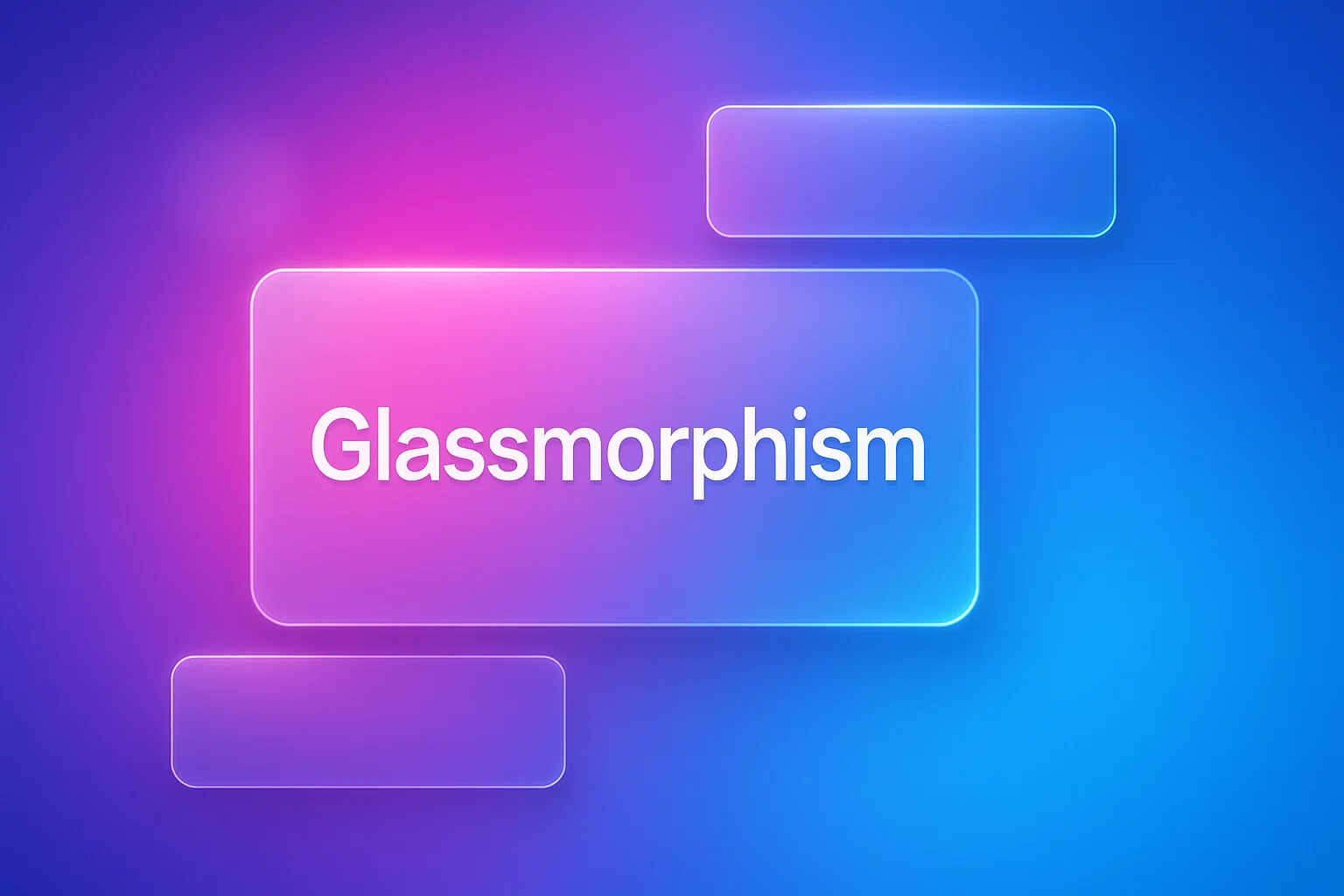
Glassmorphism: The Transparent Design Trend That Refuses to Fade
Glassmorphism brings transparency, depth, and light back into modern UI. Learn how this “frosted glass” design trend enhances hierarchy, focus, and atmosphere, plus how to implement it in CSS responsibly.
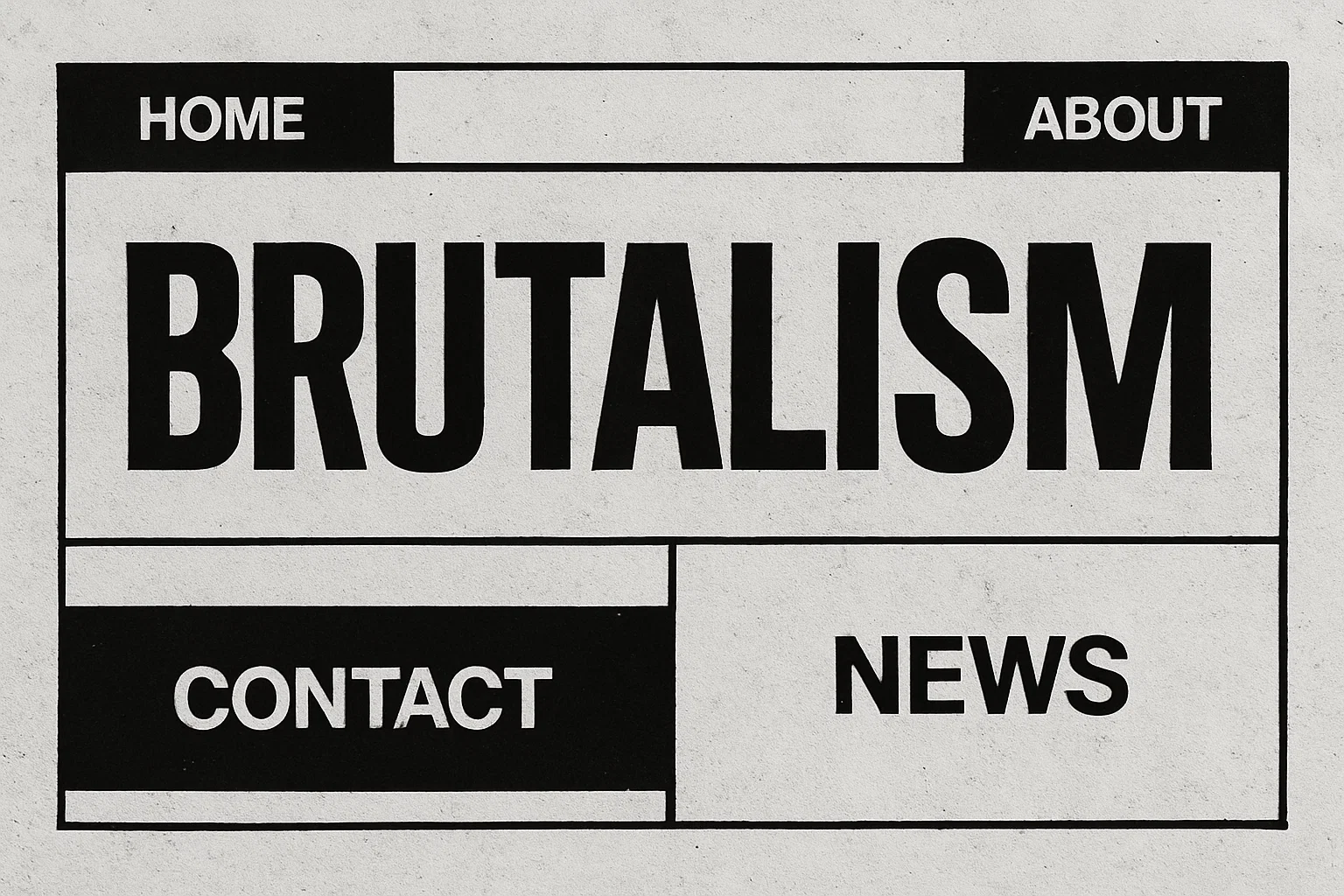
Brutalism: The Beauty of Breaking the Rules
Brutalism in web design rejects perfection for authenticity. Stark grids, raw type, and honest structure create interfaces that feel human, intentional, and impossible to ignore. Break the rules, on purpose.
Passionate about web design and UX? Do you have an eye for detail and a knack for insightful analysis? Do you want to write an article for us. We’d love to talk!
Write for us!