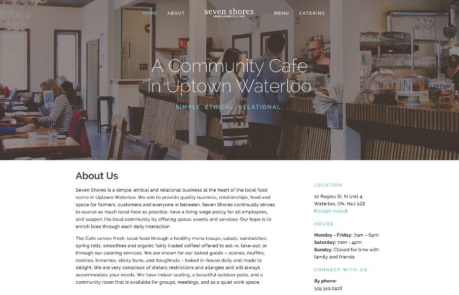
It’s not often you see a restaurant or cafe website made entirely out of HTML/CSS. I know that’s crazy right? This one isn’t spectacular but it’s efficient and perfect for the need. That’s why I think it’s beautiful, really! Also… it’s made using squarespace.
Glassmorphism: The Transparent Design Trend That Refuses to Fade
Glassmorphism brings transparency, depth, and light back into modern UI. Learn how this “frosted glass” design trend enhances hierarchy, focus, and atmosphere, plus how to implement it in CSS responsibly.


0 Comments