There is a lot going on here to get this website responsive visually. The grid is pretty core to its layout and it flows really well from screen to screen width. I also really dig how the header/nav stays fixed and moves up visually as you scroll down.
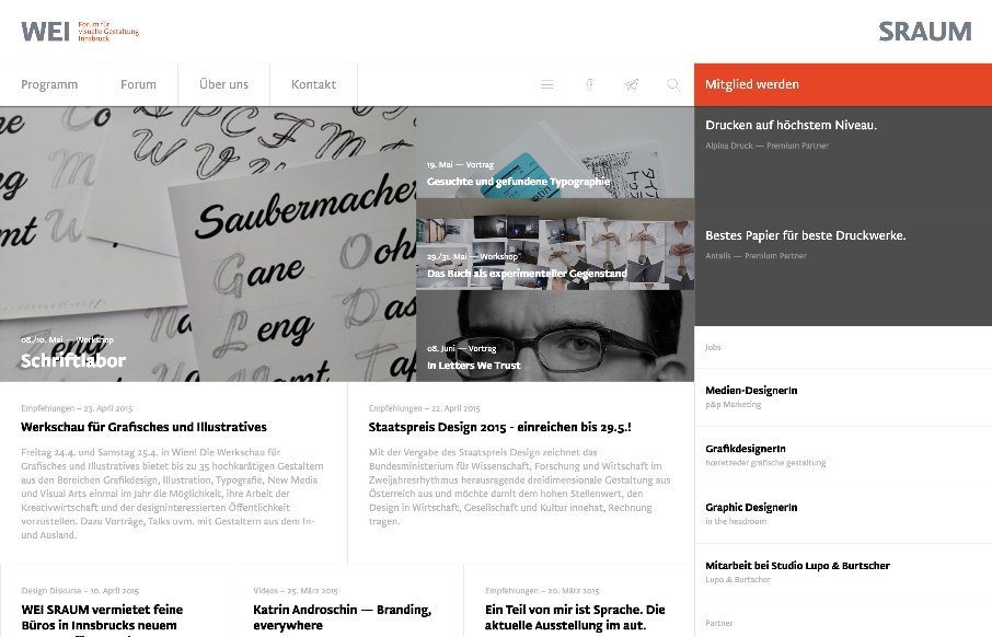
From the Designer: “WEI SRAUM is an initiative for better graphical and visual understanding in Tyrol, Austria. We host Lectures, Workshop and other events.
WEI SRAUM is the german word for white-space, where our typographical roots come from. The website is built with Ruby on Rails and has its own backend for the management of not only the Website but the entire association.”
Submitted by: @florianmatthias
florianmatthias.com


0 Comments