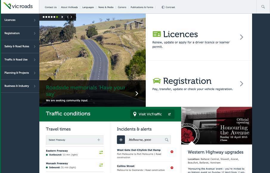
So I’ve looked at reviewing the Vic Roads site, out of Australia, a couple of times since it’s been in our queue and it took me a little while to come to peace with it. I think my initial problem was that it is very text heavy, so we don’t often look at those sites as being “beautiful” in design. So I came back to it today and looked at it for what it is, and how the design is used to actually impart the information that it’s audience wants, no, needs. It’s a Department of Transportation site that has so much to offer it’s users, from how to get your license, to current road conditions and closures. Digging into it, the information architecture must have been an incredible feat, and it looks like they took great care to figure out how best to pull that off in a design sense on desktop, but also mobile, which I would think would be the majority of their daily users. I mean, go look at your state or country DOT site, is it responsive? Is it useful? Looking into it more, Vic Roads is.
Glassmorphism: The Transparent Design Trend That Refuses to Fade
Glassmorphism brings transparency, depth, and light back into modern UI. Learn how this “frosted glass” design trend enhances hierarchy, focus, and atmosphere, plus how to implement it in CSS responsibly.


0 Comments