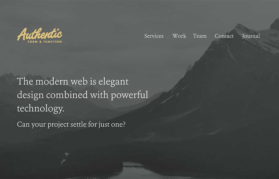
I like they way the site for Authentic Form & Function here uses the ‘hero’ area to sort of lay out a presentation of sorts. Then you taper down into a more or less typical website layout. All the way down to the footer area which is quite nicely executed.


The Call to Action, Revisited
The Call to Action hasn’t changed in a decade, but the bar has. A fresh look at prominence, copy, mobile tap targets, and accessibility, with lessons from three major design systems.


0 Comments