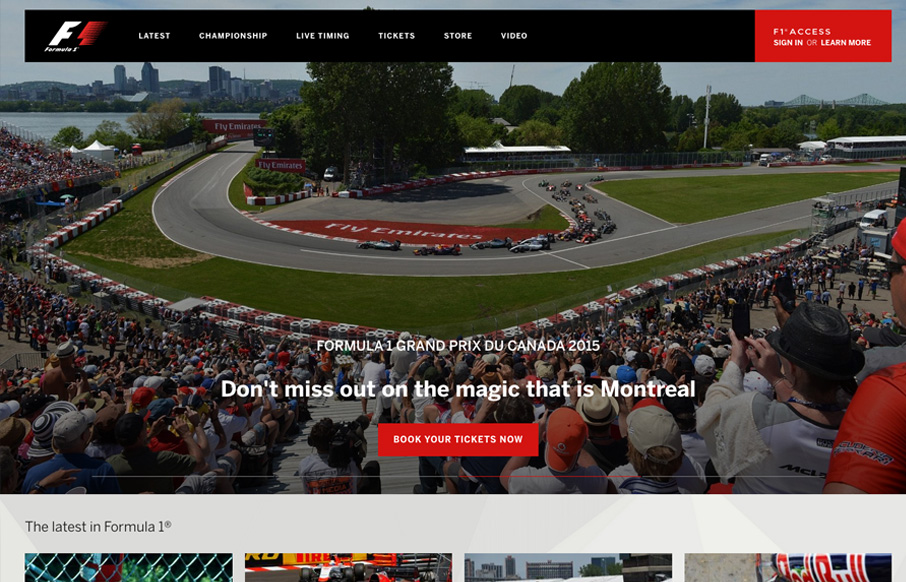
As expected from Formula 1, this is a slick, solid and bold website. The first thing to grab you is the quality of the large and spectacular images on the home page. As a designer, if you’re given images such as these to play with you know your design is going to be onto a winner.
The designers have let the images lead the design of the home page. The fonts and colour palette are minimal and everything has been given generous spacing.
There’s perfectly executed interaction and animation throughout the site – check out the main navigation and the grand prix time table on the home page. All this adds to the overall impact of the design without feeling gimmicky.
Each page of the website is well considered and beautifully presented. Each of these follow the big image and simple typography look and feel from the home page. Difficult to do with such a vast amount of content and up to date information. I like the way that there are no dead end pages here. Each page has enticing links and images that lead you deeper into the content.


0 Comments