
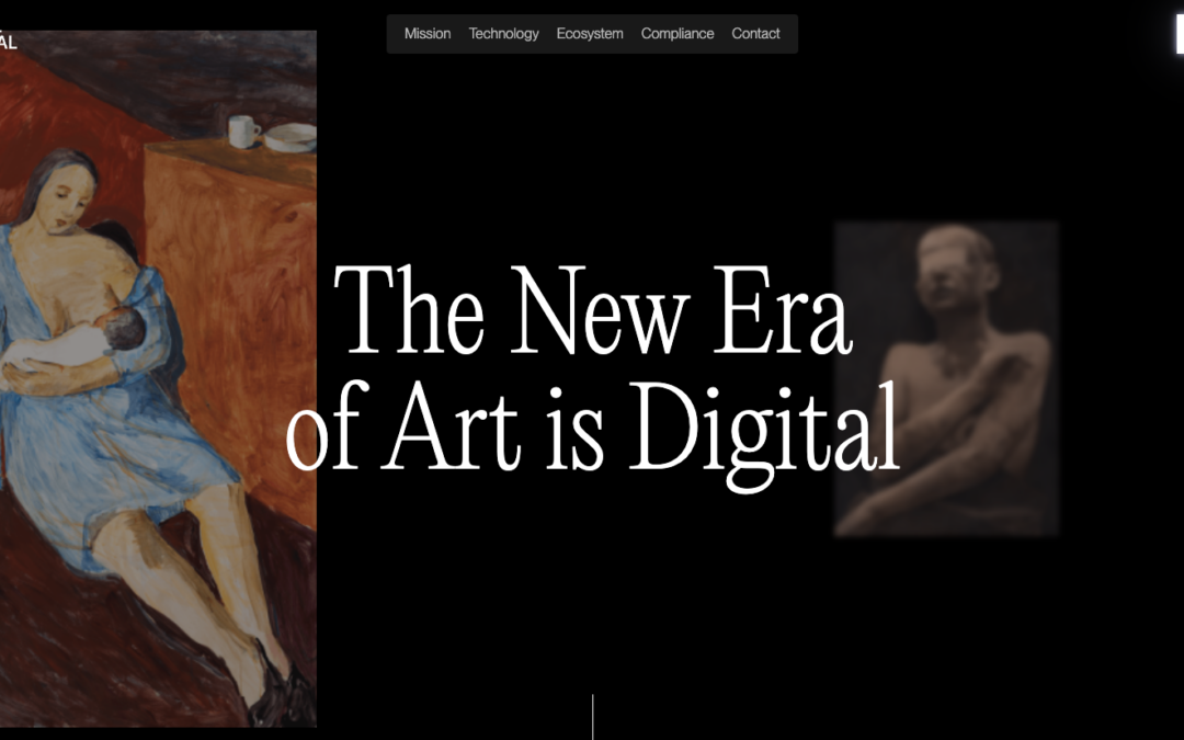
by Gene Crawford | Apr 22, 2025 | Design Firm, Gallery
Website & app design for startups that want to stand out from the rest.
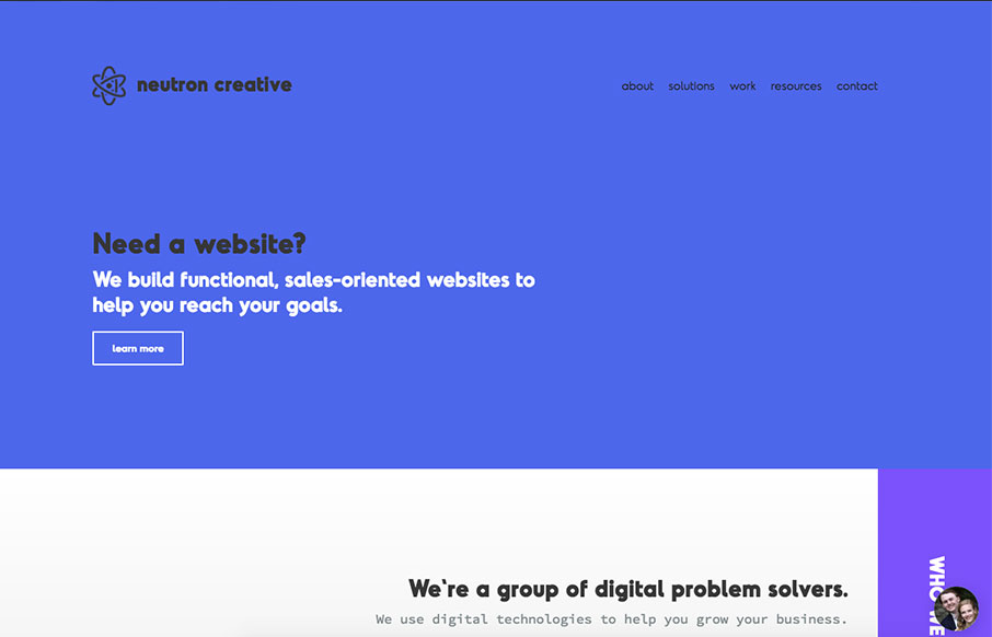
by Gene Crawford | Sep 29, 2023 | Gallery, Software
Overall this is a fun experience on the first viewing of the website. I really like the dark background and layout details. I feel like the dark background reinforces the brand so it really feels purposeful. I will say that on 3rd or 4th viewing it was tedious in that...
by Gene Crawford | Jun 27, 2017 | Gallery
I like showing off the code snippets as you would normally show off visual work. Pretty nifty idea. I also like the off center vibe of the sections. Solid layout. I wanted to build a site that really showcased all of the new aspects of our rebranding, including our...
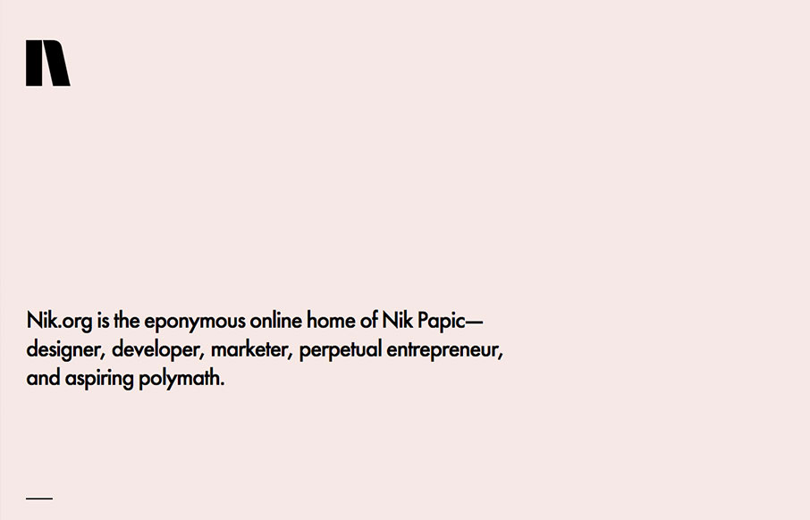
by Gene Crawford | May 18, 2017 | Gallery, Portfolio
Lovely and simplified single page resume/portfolio website. I love the background color and the black/white palette. Nice grid work and layout too.
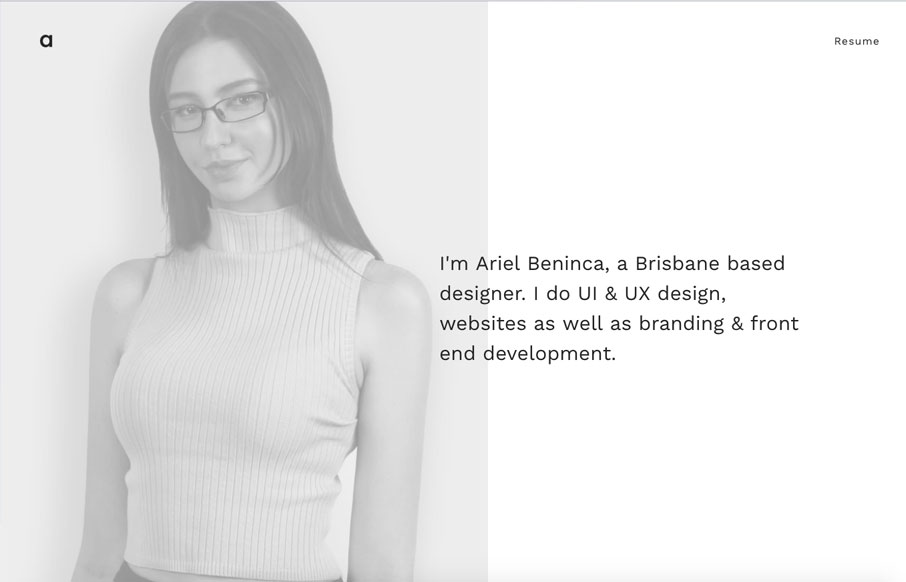
by Gene Crawford | Apr 24, 2017 | Gallery, Portfolio
Great portfolio website design for Ariel Beninca. I love the simplicity which makes you really notice the way the work is presented as you scroll down the page. There’s a very clean aesthetic here but just enough movement and fun to show off some skill....