
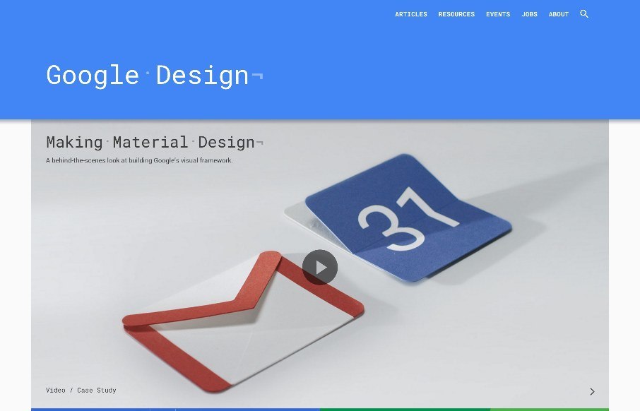
A simple feeling design that is anything but simple. Clearly, they utilized their Material Design approach to this site. There is also some really nice little interactions, like the “ping” visual thing when you click on main links. I will say that this site is way better to look at on a mobile device and not so much your desktop screen but that’s probably just me, it’s still a thing of simple beauty.


Fitts’s Law: Why the Easy Button Wins
Large, close targets are faster to hit than small, distant ones, that’s Fitts’s Law. A look at the 1954 rule behind buttons, prime and magic pixels, thumb zones, and dark patterns.


saw this the other day. very nice