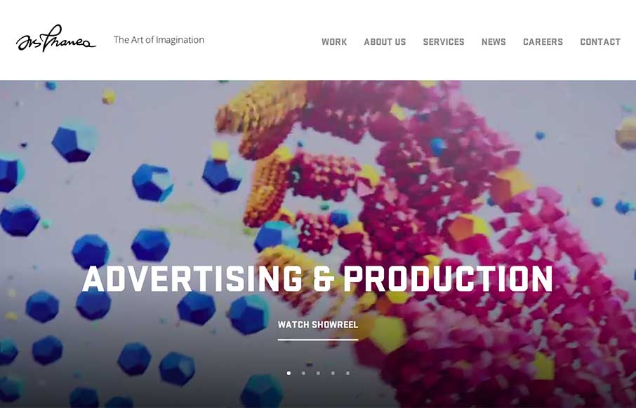
by Aaron Griswold | Dec 23, 2014 | Gallery, Marketing Company
Crash, bang, wow! Ars Thanea’s agency site is a visual assault on your senses – that’s a good thing. The video background / slideshow on the home page actually makes you stay on the page / and watch a slideshow. Cool how when you mouse to the left or...
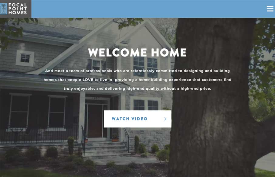
by Aaron Griswold | Dec 5, 2014 | Gallery
Who knew that you can make a real estate website that looks good and is functional (most of the builders and agents in our area have the worst websites ever… really.. we just bought a new home a few months ago, so I’ve seen them all) Focal Point Homes out...
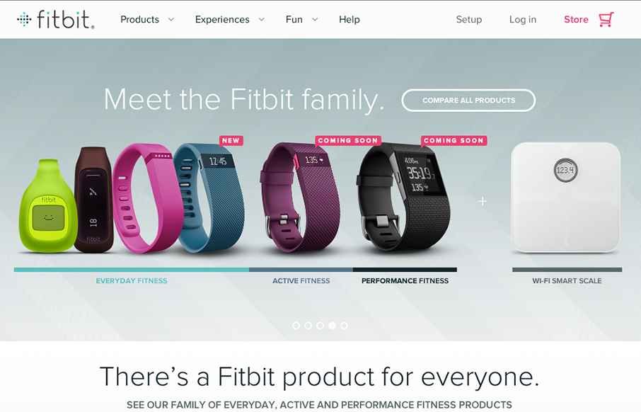
by Aaron Griswold | Nov 26, 2014 | Gallery, Product
So… the home page for fitbit really doesn’t do the rest of the site justice. I actually held off on this review because of my first glance at the home page. Head to the big drop-down menu, or click on these links: www.fitbit.com/surge, www.fitbit.com/flex,...
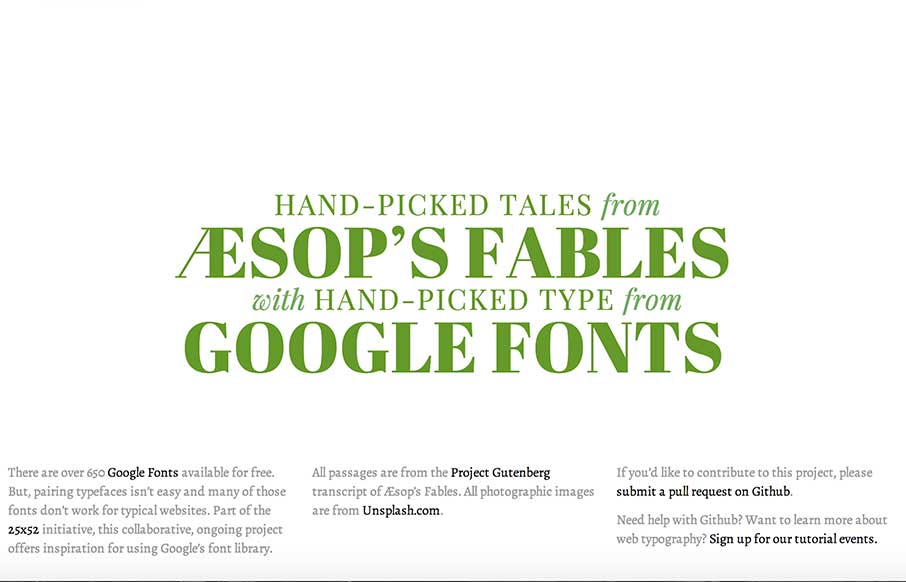
by Aaron Griswold | Nov 24, 2014 | Gallery
I’m not sure that I can do this site justice with a few short words… but it looks like some cool people got together and are doing some cool things here and in the 25×52 Initiative. Check the page out – and the people that are behind it, and...

by Gene Crawford | Nov 20, 2014 | Gallery, Portfolio
Really like the photography and typography on this portfolio website. It’s smooth feeling to me as I scroll with it. Also, you gotta dig the loch ness monster on the contact page there.