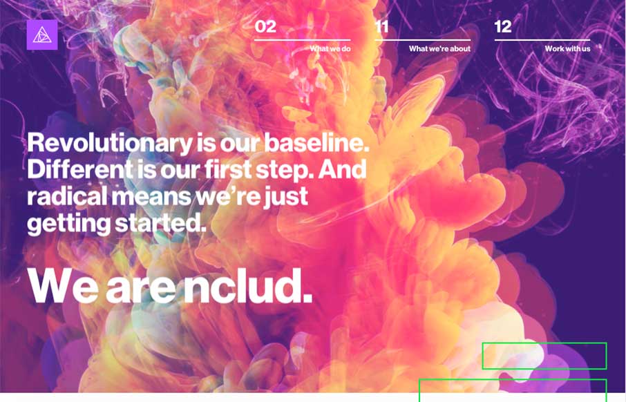
There’s a glitch in the Matrix… sometimes glitches are good, like nClud out of DC – their site is trippy, but a cool experience. Great transitions between pages, and creative use of type heavy pages. (I do think the Pink Floyd documentaries I watched last week are playing with my head a little when I seem to get lost in the hero image on the home page…)
Glassmorphism: The Transparent Design Trend That Refuses to Fade
Glassmorphism brings transparency, depth, and light back into modern UI. Learn how this “frosted glass” design trend enhances hierarchy, focus, and atmosphere, plus how to implement it in CSS responsibly.


0 Comments