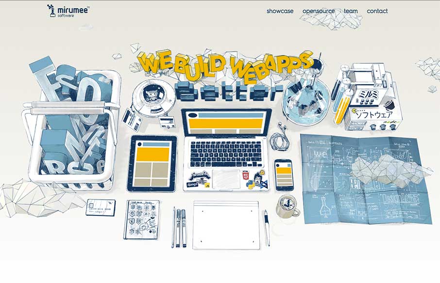
Now this is a fun agency site from Mirumee Software out of Poland. Cool illustrations, some subtle parallax animation, and good coloring makes this one pager vibrant and inviting.
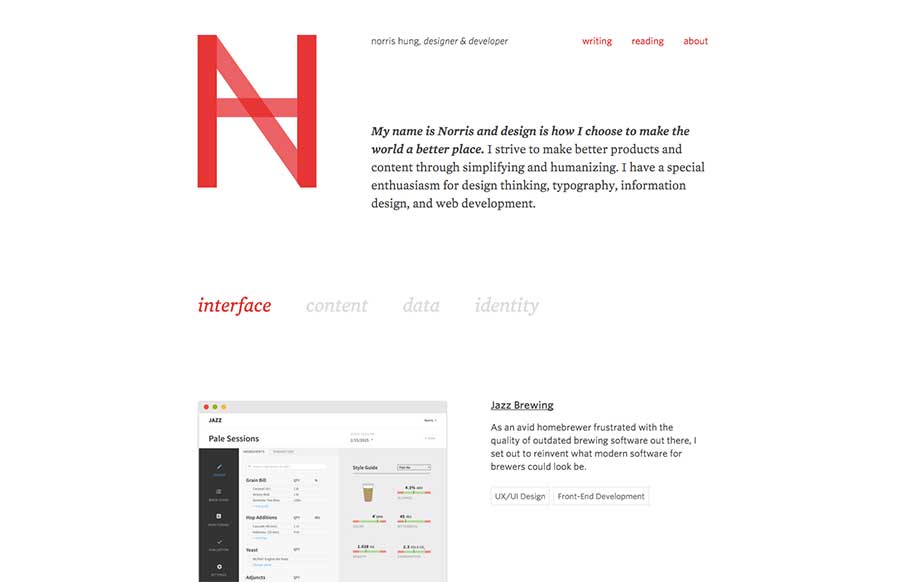
Norris Hung
Portfolio site from Norris Hung out of San Francisco. Like the minimalist design. Also like when designers let you know what stack they use - this one built with Bourbon / Neat and Jekyll. Would like to see either links to the portfolio work itself, or allow for...
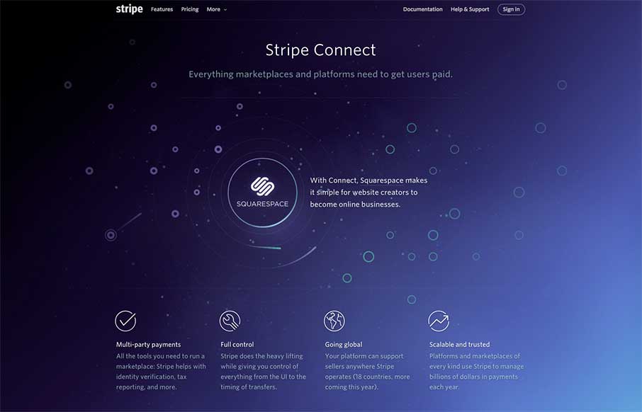
Stripe Connect
So... I've been sitting here for a couple of minutes, trying to figure out how random or not the paths of the meteors are that get pulled into the Stripe Connect orbit, and out.. and figured I should start typing before tomorrow comes... Then I used the "Inspect...
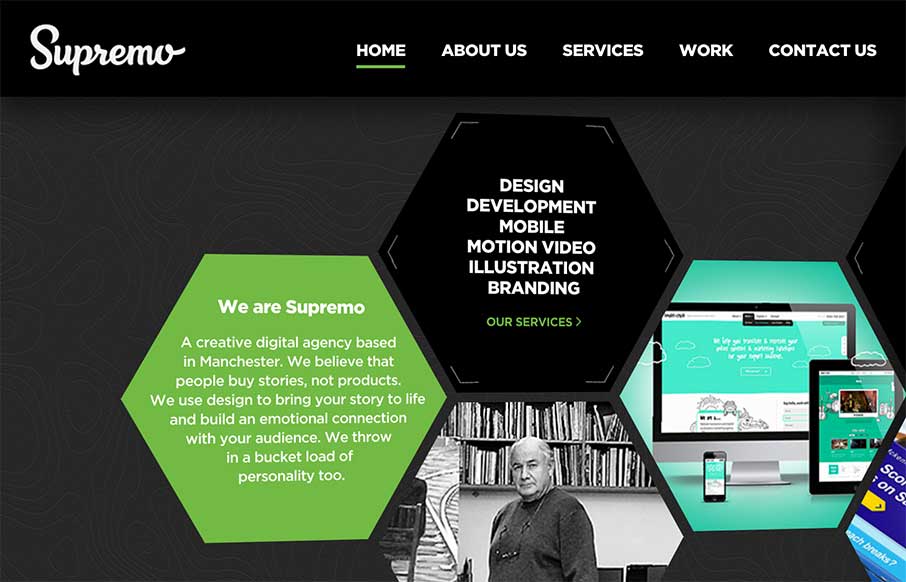
Supremo
Good start to the week with Supremo's site, out of England. The home page is a different take on interactive navigation, which sets it apart from other agency sites. The Work (portfolio / case studies) area is strong and well thought out. Cheers! From the Designer:...
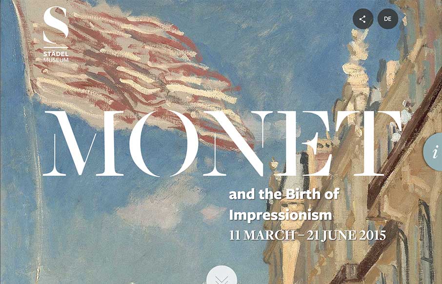
Monet at the Stadel Museum
I became a Monet fan only a few years ago. Here's why: Ok, not a great verbal explanation - but that's the point. I really do get a sense of calm when I'm looking at Monet's prints / paintings that I don't get when looking at other art. And that's hard to quantify and...
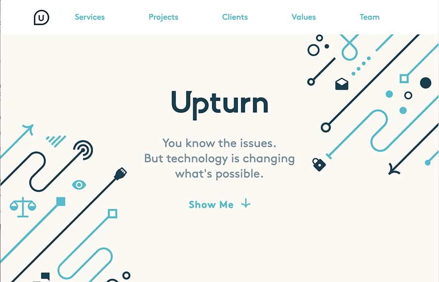
Upturn
Nice work for good causes. Love the design and the simple art work on the Upturn site out of Washington DC. Great SVG work and animation, but still a simple and clean site. I would suggest to change the underlined words to bold or something else so they don't look...
Mukesh Suthar
Cool, quick portfolio one pager from Mukesh Suthar out of India. Of course love the Rubik's Cube preloader - good movement through the rest of the site between the sliders and skill counters. Like the way he has the faceted search on the Work section too - it seems...
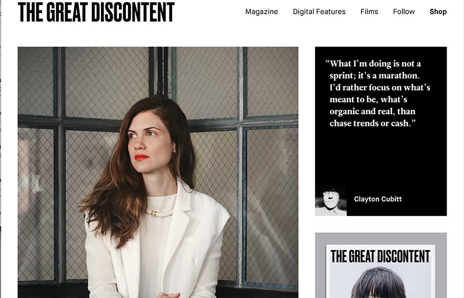
The Great Discontent
Simple, robust and impactful. Since 2011, this is how I've described The Great Discontent, both in its design and its quality long form articles. Every year or so they push out an [almost] invisible update to their site that seems to improve upon an experience that...
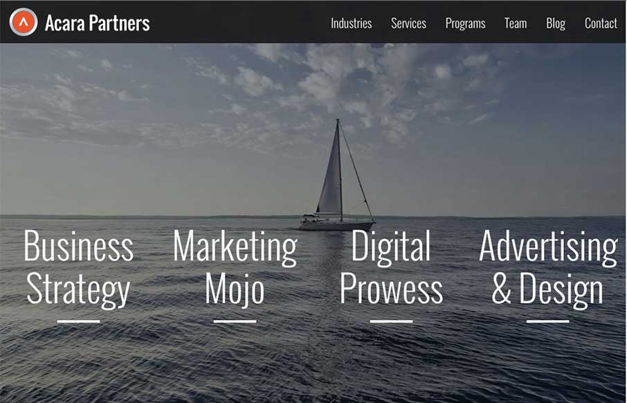
Acara Partners
I like how Acara Partners, out of Connecticut, uses their home page image background to be a secondary navigation - cutting straight to what they do. The site is text heavy and icon rich - and that works more for a biz strat / marketing company (their two first areas...
Lounge Lizard
I'm glad Lounge Lizard out of NY and LA submitted their website to us. There's a little bit of Don Draper in all of us (hopefully the good parts) - and that's projected in LL's website, along with good modern design. Like the block design in the subpages and the...
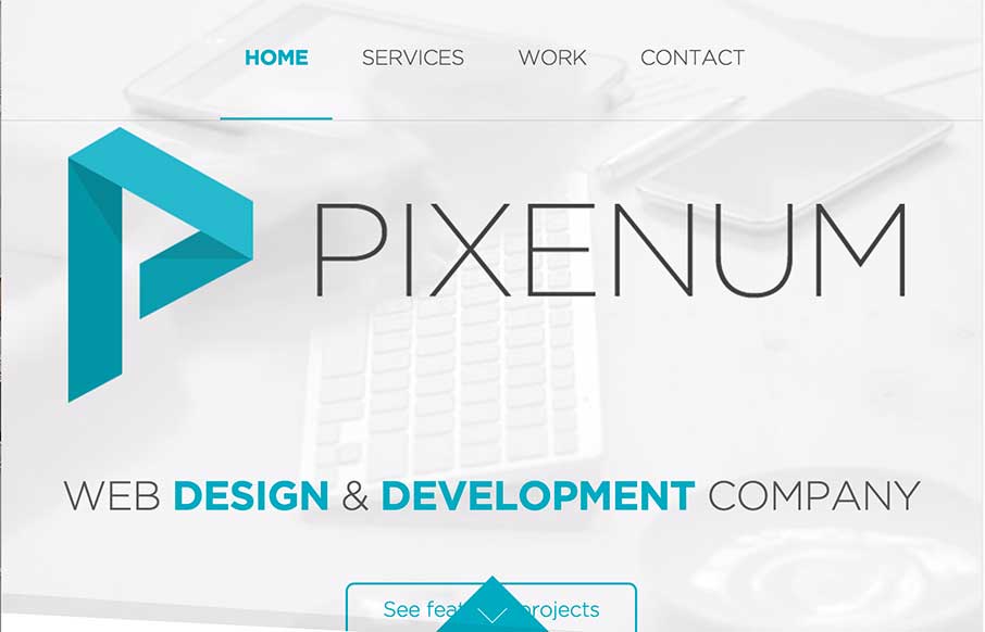
Pixenum
We're starting to see more and more one pagers - especially from start up agencies / freelancers. Pixenum out of Croatia is one of these sites, and it's a good one. Good web design is not only about the look and feel - it should also be about getting your user to do...
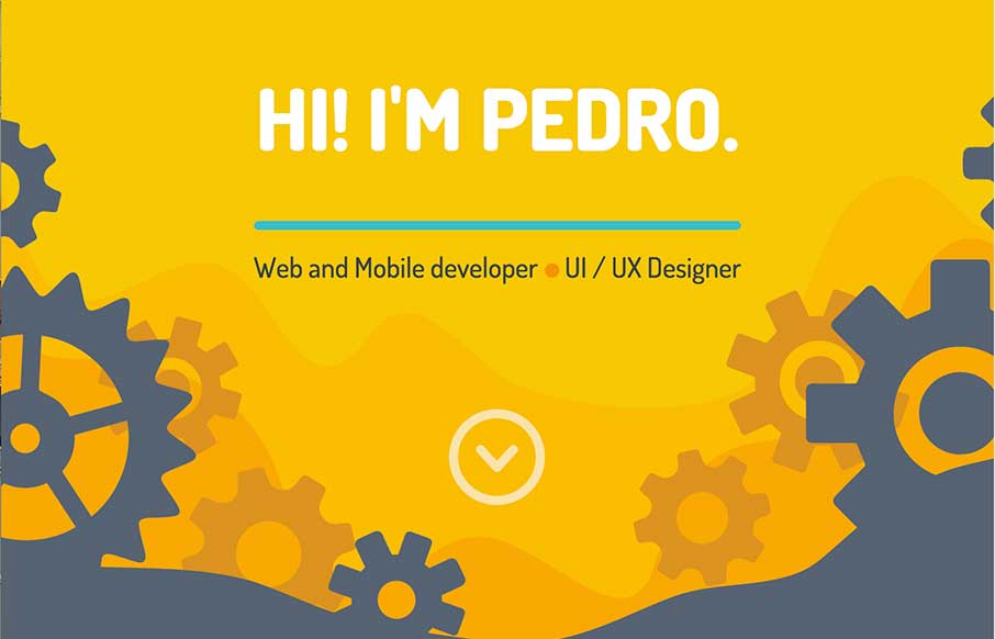
Pedro Landaverde
Cool animated SVG portfolio site from Pedro Landaverde out of Mexico. It looks like a simple one pager - but there are literally a lot of moving parts. Not crazy about how the Project photos clash a little with the rest of the site (maybe add a filter?) - but like how...
Greek Tour Guide
The Greek Tour Guide of Ancient Olympus is a simple site, but I think that's why I like it - we don't do enough simple. I was reading the copy of the site - and decided that you don't need much more than this to get your point across "come see this incredible place,...
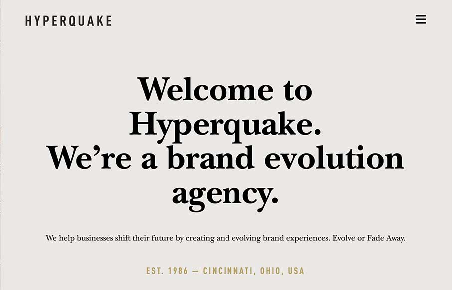
Hyperquake
"Evolve or Fade Away" - strong motto from the Cincinnati based agency Hyperquake - strong site too. Good block design throughout the site makes it clean and crisp along with the color combination. Like the design aesthetic in their work too - has a sense of old meets...
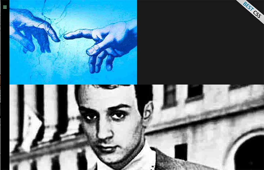
Csaba Gabor
Csaba Gabor's portfolio is definitely different - from the vertical nav, to the myriad of areas he touches on here. The block design, with static images and animated gifs, some that link - make a cool secondary navigation - and the movement of the About page on-scroll...
Woven Magazine
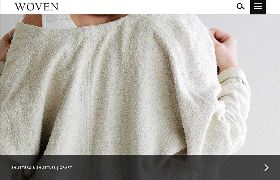
Woven Magazine, out of Austin, is pretty cool - with in-depth articles about crafty people (see below); and has some unique ways it displays the story links on the home page. The article are image rich - and a good read too. From the Designer: "Woven Magazine exists...
Welcome to the New WIRED
Beautifully simple and powerfully functional. I've seen this style popping up for publication style via CircaNews ( http://circanews.com/ ) and Medium ( https://medium.com/ ) and the trend is one that I can see designers getting behind for its high level of...
Masonry
Man this site is tight. The aesthetic is pretty awesome - love the typography design, and then the mix of the full width and the margined areas. Also like the Work detail pages at the top - cool overlay. It may be my connection right now, but transitions were a little...
Species in Pieces
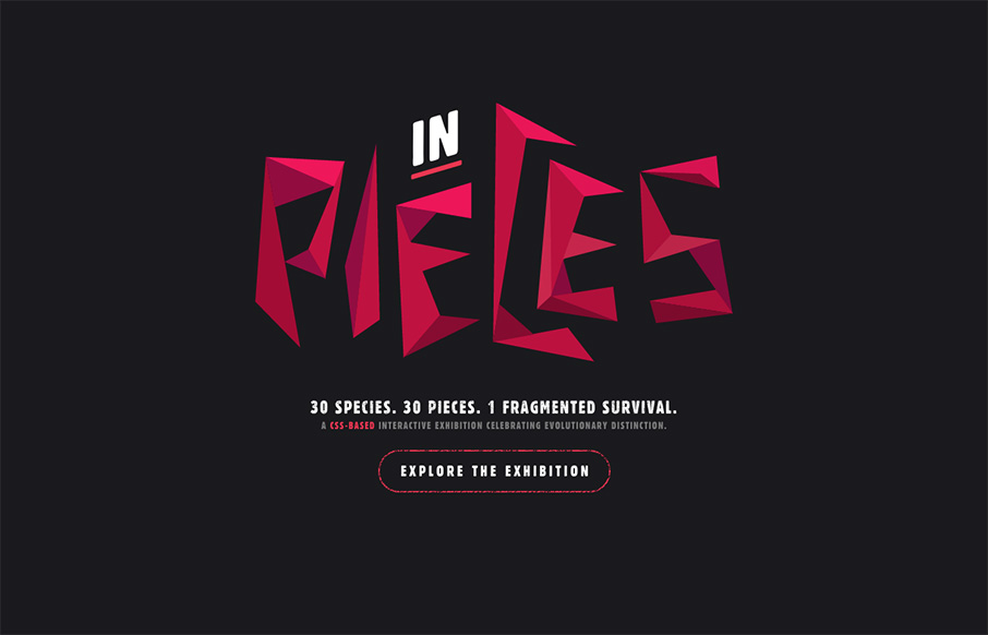
Turn your passion into something cool That's what Bryan James did here in his personal project called Species in Pieces. ( @WengersToyBus www.bryanjamesdesign.co.uk ) Above are some of the 30 endangered species that he hand crafted using CSS polygons and webkit / CSS...
Mother Volcano
Cool site to end your Thursday from Mother Volcano out of Portugal. This is an illustration intensive site from an illustration intensive company - so most of the site is either .pngs or background images. I really like the integration of the social media icons at the...
Search Discovery
Once again - it's cool when the designer gives us a lot of detail on what went into making a site - even better on a site re-design. John Williams tells us a little about the redesign of the Search Discovery site out of Atlanta: From the Designer: "Search Discovery's...
Creativepark
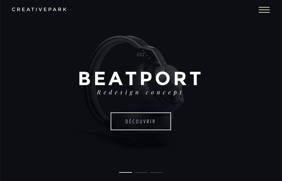
Guillaume Grimaud out of France's portfolio site has cool movement with the pre-loaders, that you don't feel like you're waiting. Also like the movement on the slider when the projects go out and come in. Simple, dark, and good. From the Designer: "Creativepark is the...
Nicolas Thomas
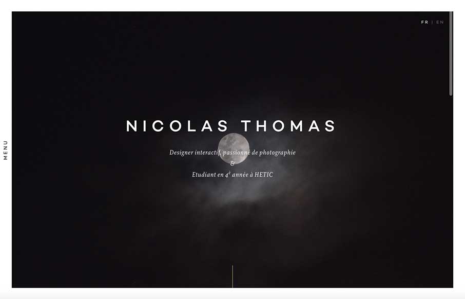
Like this portfolio site from Nicolas Thomas out of Paris. At first look, above the fold - it's extremely crisp with the contrasting black and white of the image a copy, but the moon and cloud gives it something extra that I can't describe right now. Have seen the...
Leap
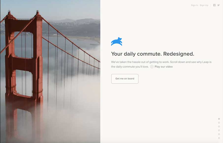
I'm going to assume that the initial pitch for Leap was "It's like Uber - for buses." I drive daily now, but when we lived in Sydney - I would have paid extra for this service since my commute was 45 minutes from the CBD to North Ryde where I was going to school. The...
Movement Mortgage
Yesterday, we posted a real estate site that broke molds of website design that exist in their industry - today we do the same, with the financial / mortgage industry with Movement Mortgage. As Brittney says below, user experience on most mortgage sites are pretty...
Kooba
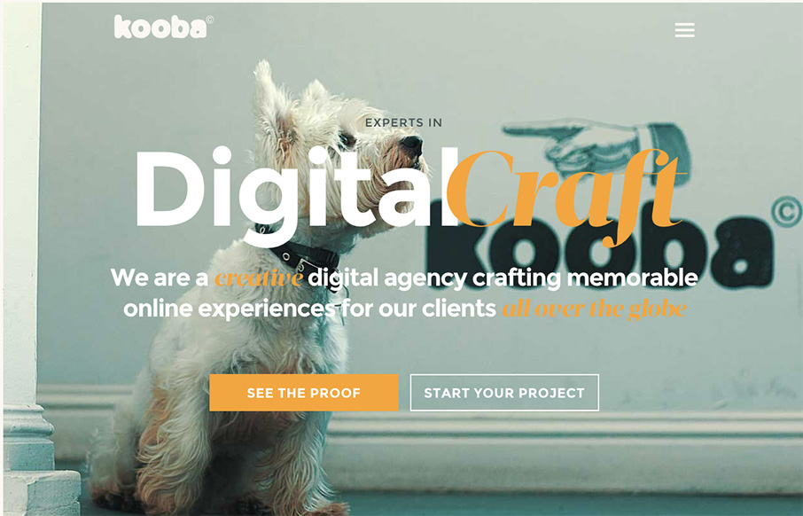
I had to get one Irish design company on St. Patricks's Day, even if it is late in the evening there - and with Kooba, think it's a good one (ther also might be a good chance that they won't see this for a couple of days - St. Pat's isn't just one day there). Besides...
Saimawn Si-Shen
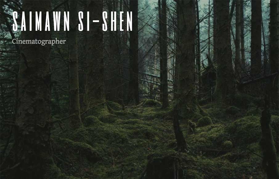
Depending on the type of site, and who you're trying to reach - visuals (images / illustrations / icons / video) are a huge part of conveying your message. I'm going to guess that in the way that YouTube and Vimeo transformed the industry and marketing abilities for...
The Cliffs
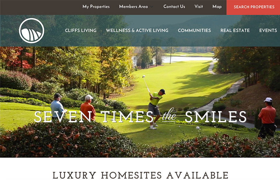
We really don't get very many real estate themed sites at Unmatchedstyle - that's probably because most of them are pretty horrible (if you don't believe me, Google real estate in your locale - if you have exceptions - submit them here). However... The Cliffs website,...
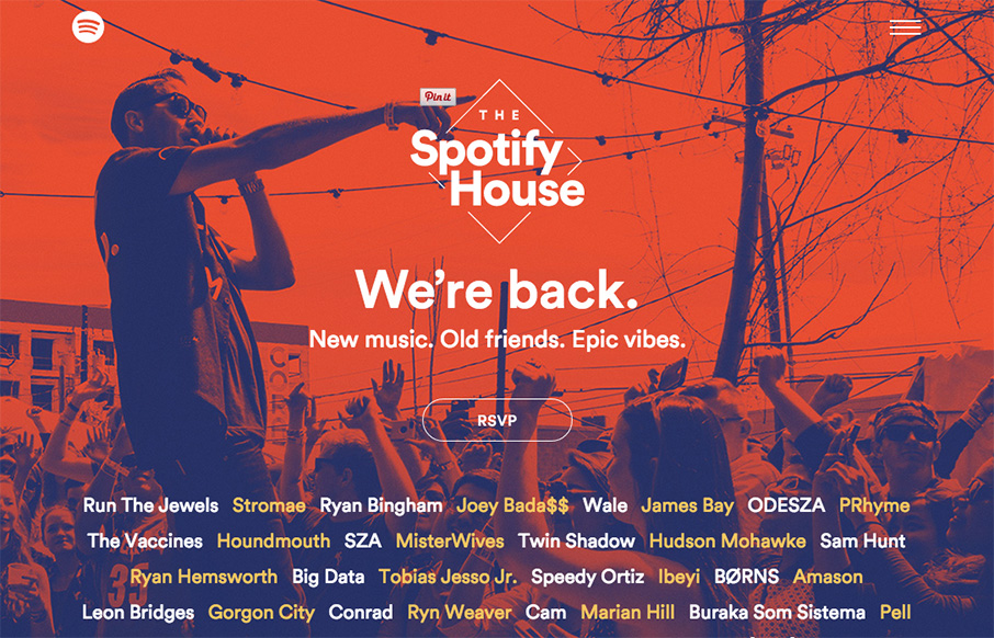
The Spotify House
So... if you're in Austin this week for that little soiree called SXSW, um, and we know half of you are there by your drunken tweets throughout this week.... (yes... you know what you did, and the Twittersphere does too). Head on down to The Spotify House - our buddy...
Celcius Concept
Celcius out of Switzerland looks to be the graphic design arm of Crayonoir, which also has a good site. The site transitions from a video background a split screen site - description on left - work (or team) on right. Good concept and way of presenting since the...

