I became a Monet fan only a few years ago. Here’s why:
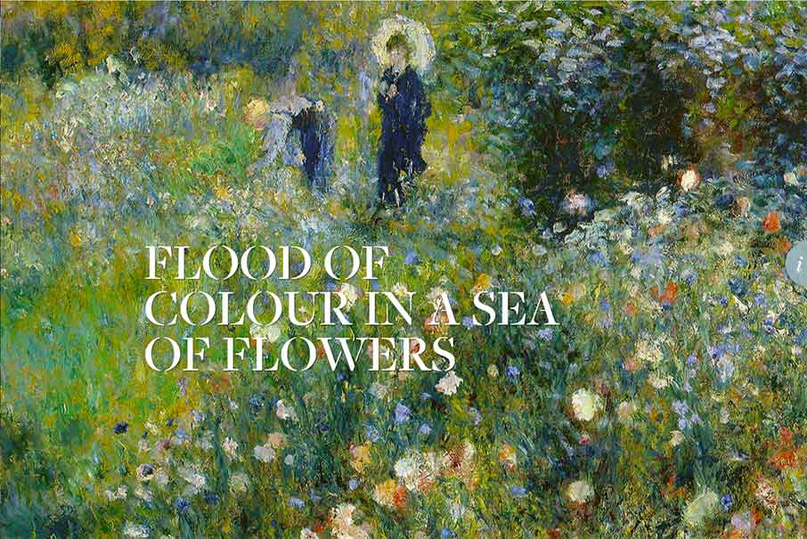
Ok, not a great verbal explanation – but that’s the point. I really do get a sense of calm when I’m looking at Monet’s prints / paintings that I don’t get when looking at other art. And that’s hard to quantify and explain, which is why it is art.
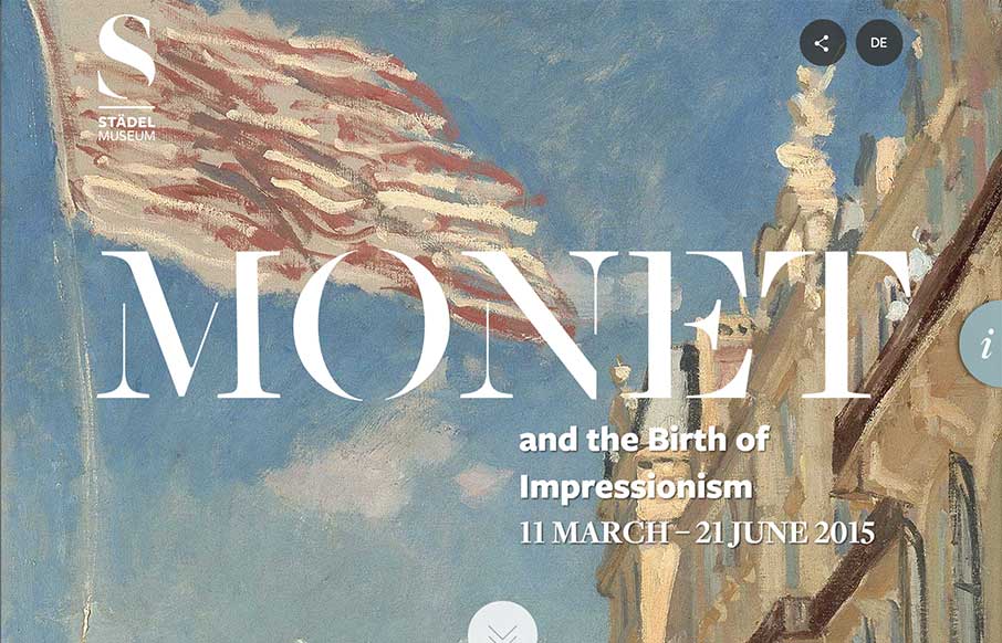
At the Stadel Museum in Frankfurt, Germany through the middle of June, they have a Monet and the birth of impressionism exhibit – and the website that accompanies it is worth a better look.
We were looking a project with an art museum last year, trying to figure out the best ways to entice people to come to the museum, and give them an experience on the website that was engaging, the way real art can be. And since this exhibit is an ocean away from me – I like the take the Stadel has taken on this one pager for the exhibit – bringing you closer to the art, even if you can’t be there.
Sharing
It’s simple – but like the direct, “share this now” the museum takes.
Vertical Menu
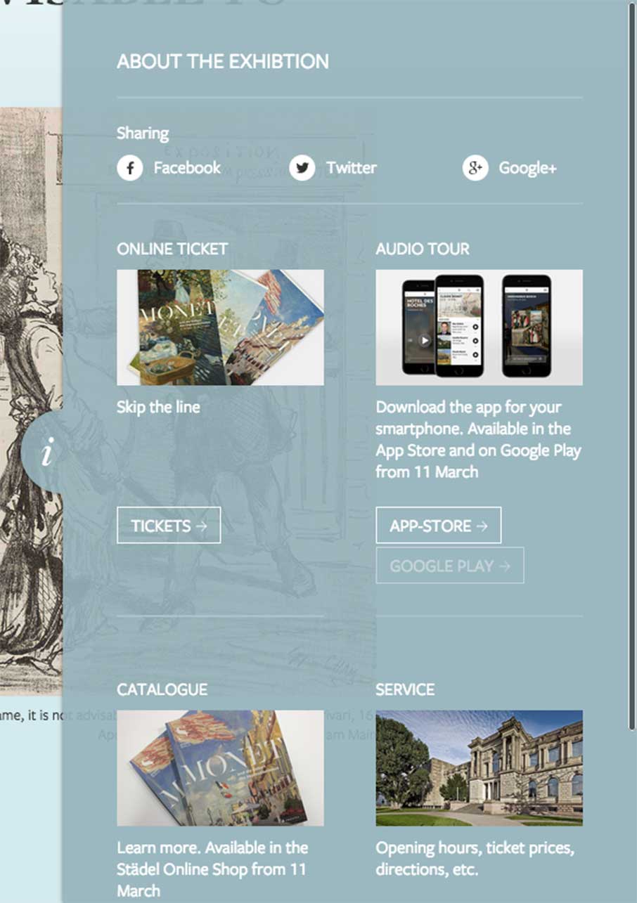
Love this – from the “I” on the side to get you here – a lot of info here, but the good thing is that they let the rest of site flow. This is less of a menu – and more of a call to action.
A Moment of Calm In-Depth
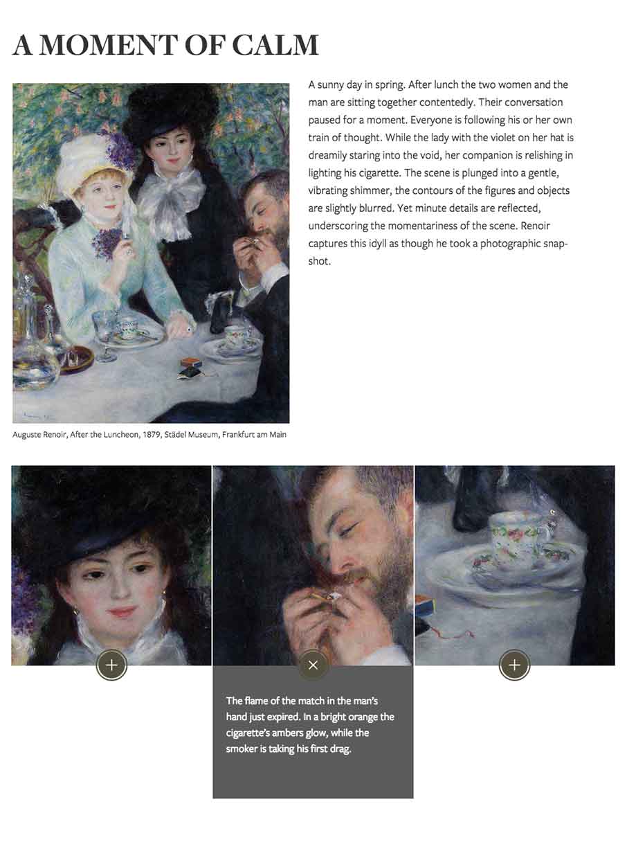
Just like what we’re doing here – going in depth on certain pieces of the site – they do that for select pieces of a painting, like a docent might do while you’re there.
View from Afar
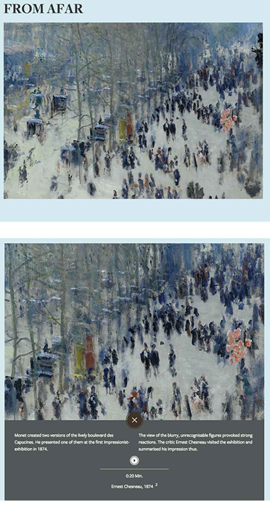
You’ll notice that throughout the site as you scroll down, these will scroll in or out to give you different perspectives of these images.
Progression
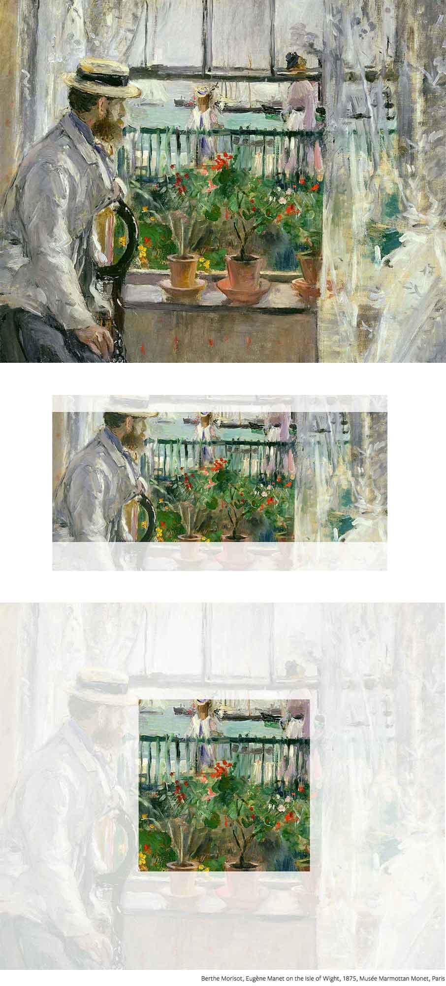
More movement here – hones in on what is important in the painting.
Video Background
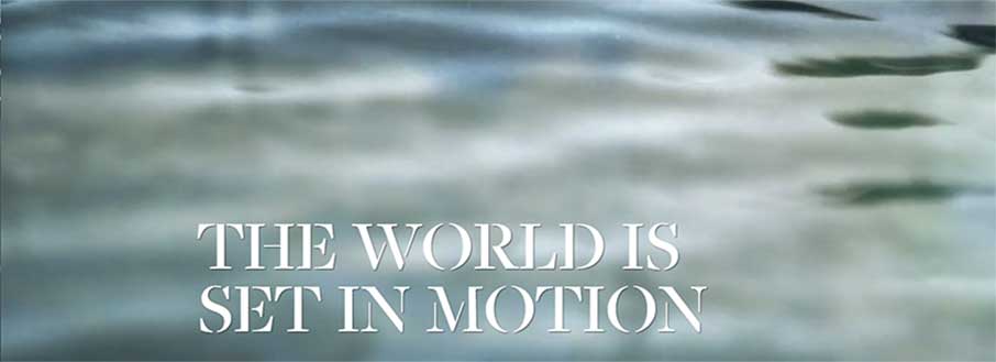
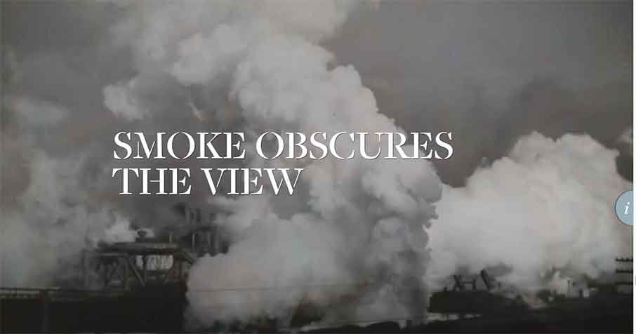
This is beautiful and perfect – and adds realism into an impressionism world.
Reveals

These are a little quirky for me – but still work.
Footer
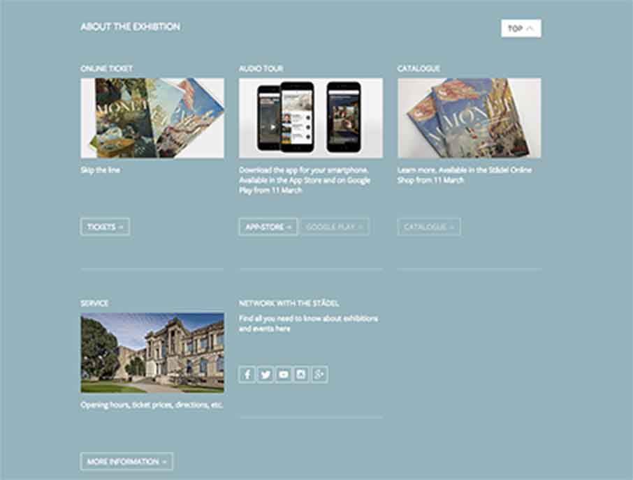
Big ole footer – kind of like the vertical info area – good calls to action.
Interested in Unmatchedstyle profiling your website in-depth? Just fill out the form – “need the info” – make sure you talk a little about the design so we can quote you. We can’t guarantee it to be fully analyzed like this one, and can’t guarantee it will get reviewed (we get a lot of requests, and try to have some standards) – but we’re making this type of long form gallery post part of our weekly editorial calendar. Let us know what you think!



0 Comments