
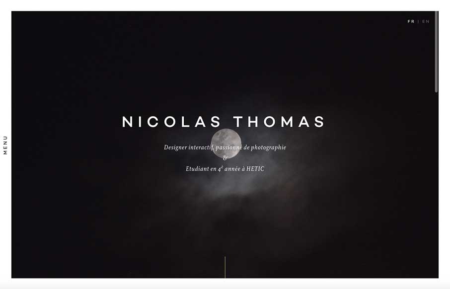
Like this portfolio site from Nicolas Thomas out of Paris. At first look, above the fold – it’s extremely crisp with the contrasting black and white of the image a copy, but the moon and cloud gives it something extra that I can’t describe right now. Have seen the borders around sites in the past year, but like that he adds the vertical / off-screen menu, that changes the border as you click on it. The work portfolio and the CV are pretty sweet too.


Fitts’s Law: Why the Easy Button Wins
Large, close targets are faster to hit than small, distant ones, that’s Fitts’s Law. A look at the 1954 rule behind buttons, prime and magic pixels, thumb zones, and dark patterns.


0 Comments