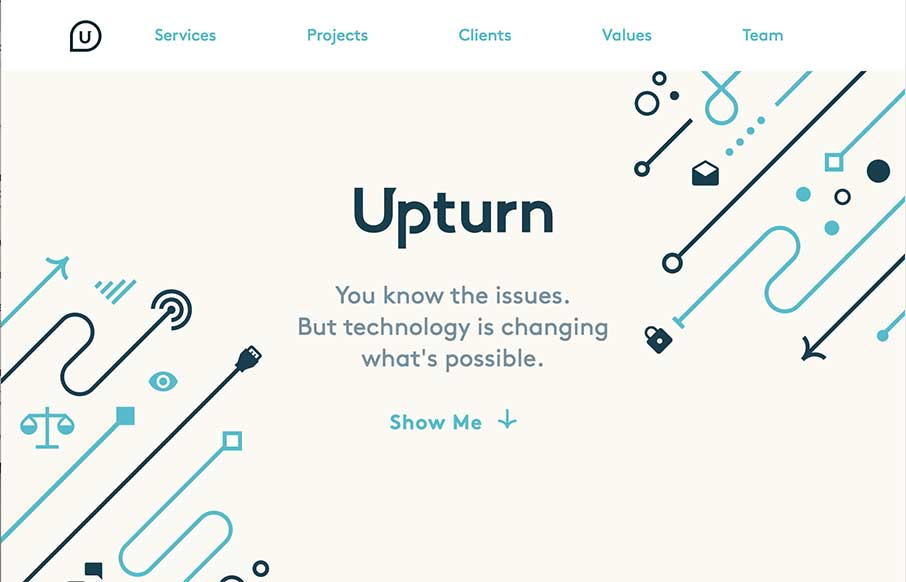
Nice work for good causes. Love the design and the simple art work on the Upturn site out of Washington DC. Great SVG work and animation, but still a simple and clean site. I would suggest to change the underlined words to bold or something else so they don’t look like links – but the site overall is pretty sweet.
Glassmorphism: The Transparent Design Trend That Refuses to Fade
Glassmorphism brings transparency, depth, and light back into modern UI. Learn how this “frosted glass” design trend enhances hierarchy, focus, and atmosphere, plus how to implement it in CSS responsibly.


0 Comments