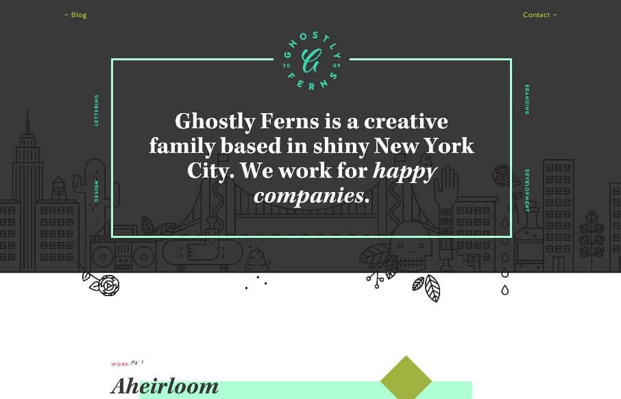
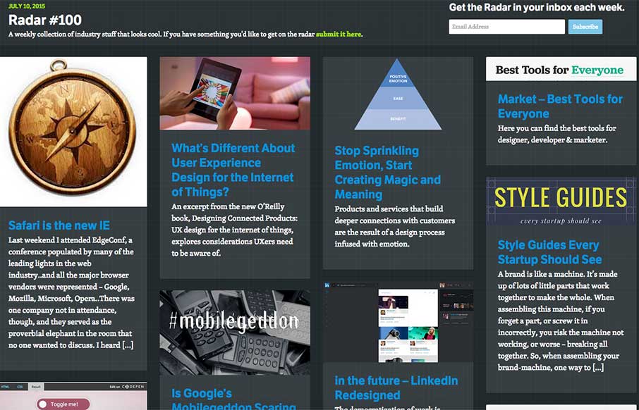
UNIITI

UNIITI

We've reviewed Uniiti's work out of France before - this looks like their recommendation app for restaurants and other services. Apparently the footer landscape image changed. Last night it was a dark sky with a rocket ship and this morning it's a bright day near the...

Helen V. Holmes

Helen V. Holmes

Designer Helen Holmes' site is a little different than most portfolios - and from the content on the site - I'm guessing Helen Holmes is too - in this world - that's a good thing! The site is light, and in parts asymmetrical, and just generally has a cool vibe....

Fighting Illini

Fighting Illini

Love to see sports sites being redesigned over the past couple of years - like this one for the Fighting Illini, in, well, Illini country. It's device sensitive, and looks big and bold on both desktop and mobile. I'm not a big fan of sticky headers with sticky footers...

Axwell Ingrosso

Axwell Ingrosso

Ok - I don't know who Axwell and Ingrosso are (musicians out of Sweden who play every Wednesday in Ibiza)  - but my girls liked their video and music when I played it for them this morning (good message btw). Their website, designed by @kaleidco, is pretty bold -...

Slick Design

Slick Design

Love the opening and closing imagery for Slick Design out of Perth - the movement on the page is pretty cool too (would actually like to see more of it all the way through). From the Designer: This is a beautiful, sleek website that reflects the client's brand....

Jekyll

Jekyll

I'm not always a huge fan of super dark websites like these, but in this case there are some pretty great parts. I like the gold mixed in with the dark vibe. I like the second section, under the hero/video area a great deal. I really like how it loads in. I'm not a...

Adrian Balkwill

Adrian Balkwill

Cool portfolio site from Adrian Balkwill out of Ontario - like his work and his call to action at the bottom of the work pages. (also - love the Mario favicon) From the Designer: I have been working on this site and rather like it and I hope you do too. Submitted by:...

Clínica Good Hope

Clínica Good Hope

Really cool design for the Clínica Good Hope (out of Peru) - especially for a hospital. A lot of flat icon and illustration work here - and interesting points of navigation/sub-nav through out. It's mobile friendly too - out pacing many hospitals here in the US. From...

Fivefootsix

Fivefootsix

Interesting twist on mixing a large hero/video area and a slider like interaction. The home page scrolls well into the about section, I think it works pretty well actually. Simply because they don't hide the nav under a hamburger nav and just lay it out. I do love the...

Skyfox Design

Skyfox Design

Very interesting take on "pages" for a website. I do like the concept here, I also like the fact that the designer is willing to push the limits visually with this and actually use it in production. Bravo and good stuff. From the Designer: I think this website is...

Space City JS

Space City JS

Website for the Space City JS conference in Houston. I like the play between the name and Houston! This site isn't like a traditional web conference site, it doesn't do what you'd expect and put the images of the speakers front and center. I like that. I like that...

CocoBongo

CocoBongo

There is some really fun interaction going on here. The logo and the mouseover animation is brilliant, I love the top left treatment too. Down to the interactions over the work samples as you scroll down the home page which are nicely done as well. These guys really...

Radar #99

Radar #99

In this week's Radar: Discover the power of SVG BrandColors How to Design for Multiple Languages The 10 Commandments of Good Form Design on the Web Buffer's loading animation How mobile impacts local government communications The Debate Around “Do We Even Need CSS...

Natasha Sumant

Natasha Sumant

Really clear and clever website for Natasha Sumant. I dig the imagery and the way it's worked up into a slight parallax vibe. I think clients in the wild will have a pretty solid response to this website.

The Supply Digital Talent

The Supply Digital Talent

Really, really clever layout for The Supply. It's a very non-traditional approach to what feels like a very old school business idea of placing talent. I dig it. Submitted by: The Supply Twitter: @thesupply_feed

Ascend

Ascend

Pretty slick design. It's simple yet compelling in that I never have to leave the home page to really learn about Ascend, but there's plenty of depth and further content to dig into when desired. Love that. Submitted by: Steven Monetti Twitter: @steven_monetti Role:...

Comovee

Comovee

The Comovee site is a great example of a product website that gets the details right. I dig the clean design and mix of large imagery. The screen width differences are nice too, scale it and you'll see what i'm talking about. Subtle yet solid design. From the...

Midnight Works

Midnight Works

I like the strong imagery and the solid typography used in unison like it is here on Midnight Works. The vibe of the site as you scroll through it just feels good. Love it.

Specialized Bicycles: 5+ min

Specialized Bicycles: 5+ min

Pretty darn skippy on this one from Specialized Bicycles - their 5 More Minutes campaign. One more instance of scroll-jacking making a heck of a lot of sense. The bike looks pretty sweet too!  

Day Trip

Day Trip

We don't normally do a lot of iPhone app page's here in the Gallery but when Paravel does an app like this you gotta take notice. This one pager is stunning, from the logo/branding to the layout itself. Gushing here a bit but damn guys. Nice.

Drawp.it

Drawp.it

Fairly nice product website. Solid colors and delivers that "kids" vibe without pandering to all the cliches that come with it. Good work. @drawpit

Magnet Co

Magnet Co

Really strong mix of some very well proven design patterns and some nice visual design mixed together. Smart decisions here, I enjoyed this page as I scrolled and read through all their info.

TERN magazine

TERN magazine

I dig the layout of this site. The strong grid and the interplay with some of the blocks and the background sections is nice and there's some nice little animation layered into the interactions. That big drop down/hamburger menu is actually kinda nice. I'm not in love...

Self Driving Car

Self Driving Car

Real simple design that uses top-notch imagery and some illustrations to sell the concept. It's immediate and has impact, what more could you want from your website?

dConstruct 2015

dConstruct 2015

There is a lot to love about the 2015 dConstruct site. Clearleft always does something cool with this site every year, I always enjoy it when they launch it. I really like how it doesn't take itself too seriously with the layout (mobile vs. desktop). It's a conference...

Stephane.ly

Stephane.ly

I love this simple and colorful site for Stephane Lyver. It seems to have minimal design, but the colorful sections draw my attention. I love his black and white ending portrait shot, and I really dig the simple effects of the angled :before and :after css elements....

Radar #98

Radar #98

In this week's Radar: Chevy put out a press release entirely in emoji — and now we know what it means The Five Uncommon Habits Of Highly Productive People Autopsy The New: Google Design Automating Performance Testing with Gulp Dribble + Invision Typography Cheatsheet...

Built By Human

Built By Human

Pretty solid layout. I dig the loading imagery as I scroll too. Damn that logo is great as well. From the Designer: Uses the latest technology of CSS3 and HTML5 Submitted by: Mark Mole Role: Designer & Developer @builtbyhuman

TwitchCon 2015

TwitchCon 2015

Earlier this year, we reviewed Twitch's Year in Review of 2014, and really liked it. TwitchCon 2015, is their video game video broadcaster / fan-fest conference. Dig the home page - simple, but a little complex behind the scenes. If you "view source" it's fun to read...

ESPN Sports Programming

ESPN Sports Programming

Good looking site for ESPN Sports Programming - we reviewed their main site for ESPN.com a couple of months ago - and looks like they've taken a lot of the those design elements, and improved on them. Probably an easier goal since this is a more discrete type of site...