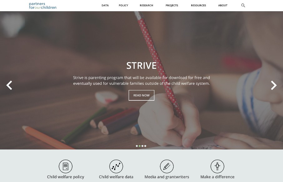
Partners for Our Children is one of those sites that has great purpose, yet may not be seen as ‘cool’. Being in public service or government related areas sometimes makes organizations think they are alleviated from the ‘burden’ of good design, but we have seen many come through recently that have embraced basic design principles as ways to bring more participants to there organization. The site itself is very similar to other sites out there, but in a simple way that just looks good and works well, (it is using wordpress on the backend as well as some basic bootstrap). Although the header image could have better ‘responsiveness’ the rest of the site seems to do alright in this category.
Overall I enjoyed the site even despite it’s heavy walls of text in some areas, due to the clean space and simple design.


0 Comments