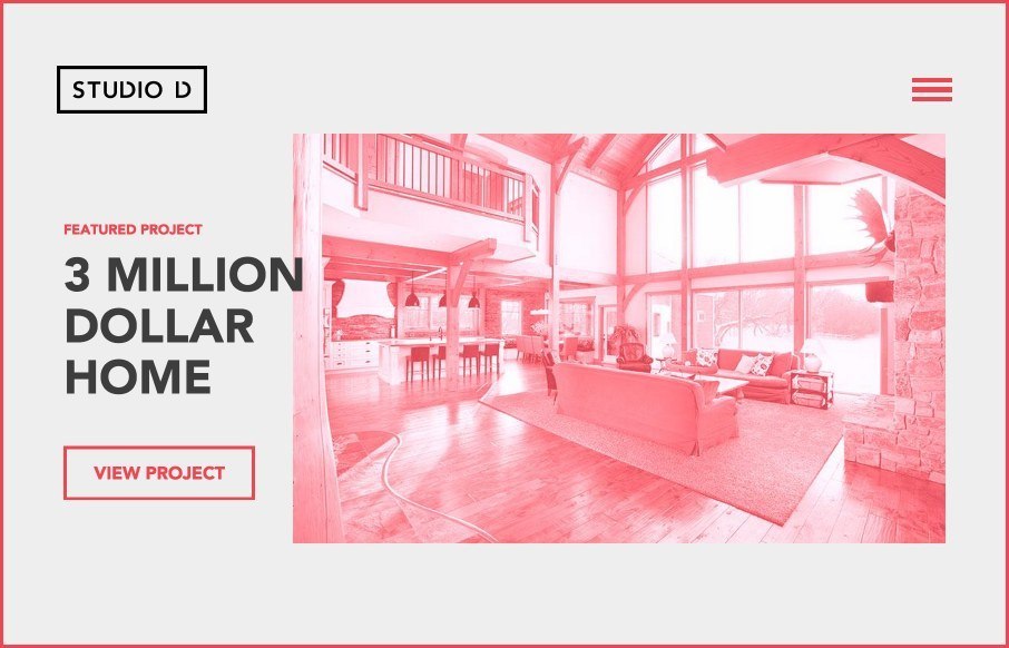
Studio D

http://studiodyxe.com/

Really like this Studio D Photographers site out of Canada. A lot of moving parts through out the site and the blog – and I think it’s playing off of a newer color trend (red, black, off-white so we can start to get away from teal and magenta..). Very cool to see that even though they are photographers, the emphasis doesn’t seem to be “show as many images as possible so people get our work (like I’ve seen on other photographer sites) – it’s about showing off their work, but within the aesthetic of the website – very good.

@studiodyxe

Submitted by: Island
Twitter: @weareisland
Role:
Designer


0 Comments

Submit a Comment

Your email address will not be published. Required fields are marked *

News & Articles

Sign-Up: Enhancing Conversions through good UX

Sign-Up: Enhancing Conversions through good UX

Optimize your website’s sign-up process by focusing on clarity, ease, and user mindset. Clearly explain the purpose, benefits, and steps, and use social proof to build trust and drive conversions.

The Essential Guide to Getting Started on Freelance Writing

The Essential Guide to Getting Started on Freelance Writing

Explore the lucrative and fulfilling world of freelance writing with our essential guide. Learn about specialties like blogging, social media, article, and technical writing. Build a portfolio, find work, set up your business, and discover the potential earnings. Embrace the freedom of working from home and follow tips for success in your dream career.