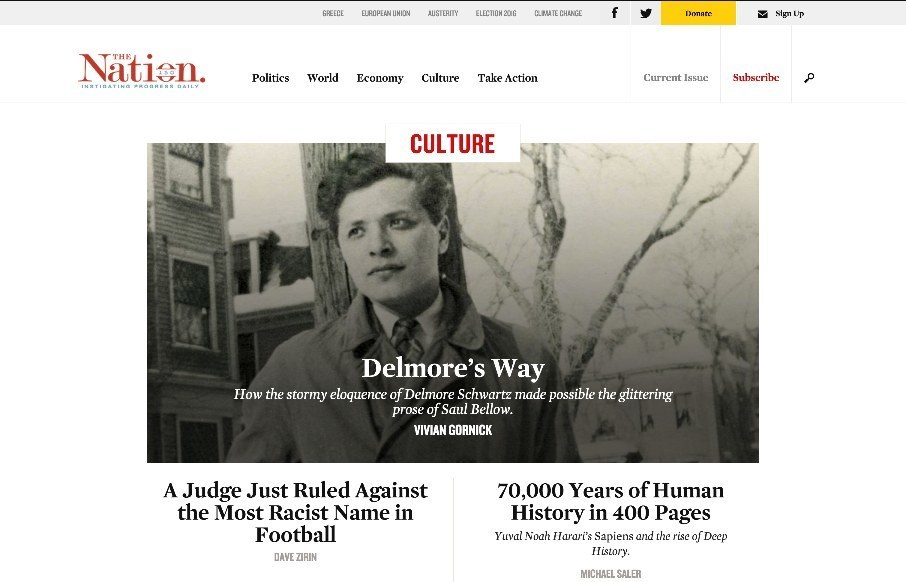
We’ve seen a lot of “newspaper / magazine” type site launches this year – and cool to see America’s oldest weekly magazine do the same. Like the top story categories at the top of the page (think they change as big issues do). Really like the feel and flow of the main category pages (Politics / World / etc) – they are broken up enough to follow what’s going on, highlight major stories, and have good white space and structure to flow easily.
Glassmorphism: The Transparent Design Trend That Refuses to Fade
Glassmorphism brings transparency, depth, and light back into modern UI. Learn how this “frosted glass” design trend enhances hierarchy, focus, and atmosphere, plus how to implement it in CSS responsibly.


0 Comments