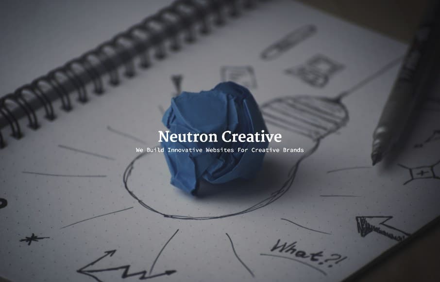
Yes – I was the one that approved the Neutron Creative site out of Raleigh, NC. Some of you may ask “why?” – because it’s a big picture and some text. The reason: I think with some agency sites, we get too wrapped up in trying to show off every trick and new thingy in web design (sorry, UX design right?), and SEO the heck out of our sites – that no one really looks at – except for other agencies. Sorry for the rant, but I just liked the Neutron Creative site’s feel – cuts to the point – “info about us – contact us”.
Glassmorphism: The Transparent Design Trend That Refuses to Fade
Glassmorphism brings transparency, depth, and light back into modern UI. Learn how this “frosted glass” design trend enhances hierarchy, focus, and atmosphere, plus how to implement it in CSS responsibly.


0 Comments