
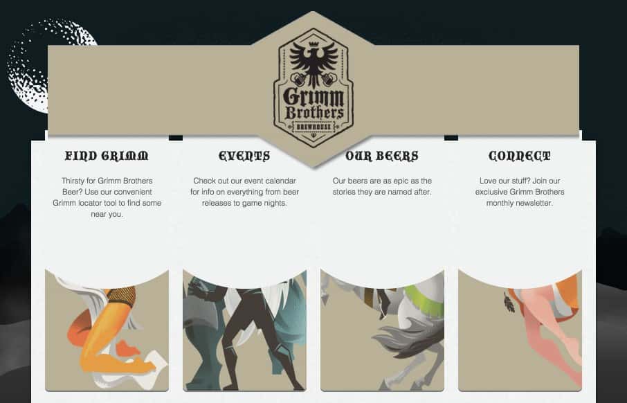
I love just about everything on this website. I luuuurve the illustration work for the bottle labels. On the site itself I really dig the simple layout and colors, I especially like the fly out illustrations as you scroll down too. Now, if I could only try one of these!


Fitts’s Law: Why the Easy Button Wins
Large, close targets are faster to hit than small, distant ones, that’s Fitts’s Law. A look at the 1954 rule behind buttons, prime and magic pixels, thumb zones, and dark patterns.


0 Comments