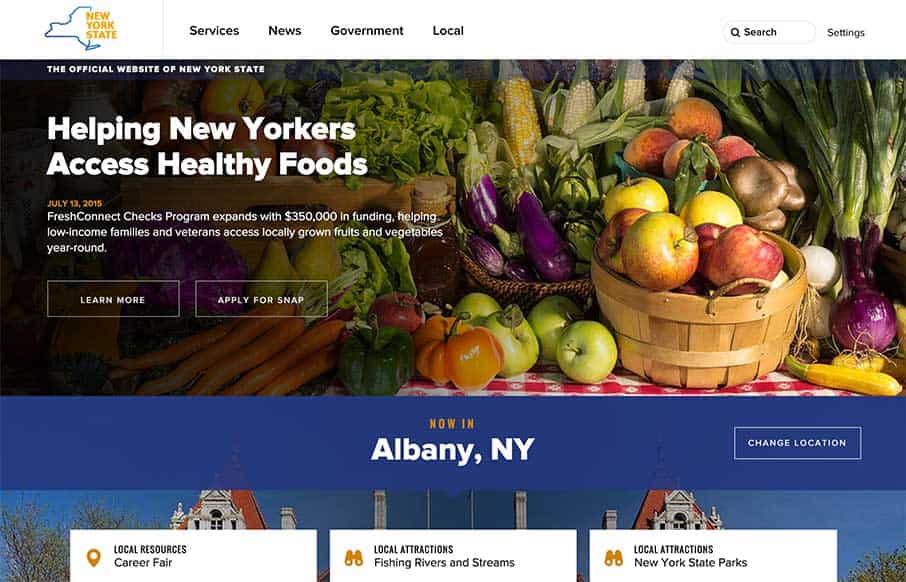
Finally – really good state government website for New York (I hear RFPs being typed out for other states as you read… well we can dream right?) Great organization and really visually established sections. I’m curious about the billboard, cardish design slider – it’s different, and I’m still deciding whether I like it or not – but I definitely get the intent (which is good). The only bad thing is on the Attorney General and Comptroller links go to… wahnt wah… (Debbie Downer site – sorry NYgov – that was probably mean – but kills the experience. To be fair, if you link from the home page, there is a warning that you are visiting another site).
@nygov
Glassmorphism: The Transparent Design Trend That Refuses to Fade
Glassmorphism brings transparency, depth, and light back into modern UI. Learn how this “frosted glass” design trend enhances hierarchy, focus, and atmosphere, plus how to implement it in CSS responsibly.


0 Comments