I’m not always a huge fan of super dark websites like these, but in this case there are some pretty great parts. I like the gold mixed in with the dark vibe. I like the second section, under the hero/video area a great deal. I really like how it loads in. I’m not a huge fan of the hamburger menu, but paired with the logo under it I think it gets noticed pretty well.
From the Designer:
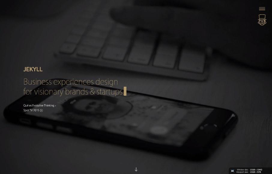
We were born as an advertising agency, but our real specialty is people. We design, plan, and manufacture solutions that make it easier to get your product or service closer to the people, to become a part of their lives and to change along with them as they evolve.
Submitted by: Sergio Diéguez
Twitter: @serdieguez
Role: Designer & Developer


0 Comments