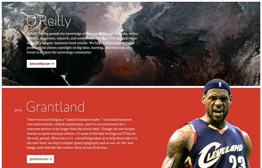
SuperFriendly out of Philadelphia is Dan Mall’s (@danielmall) group – good people – great designers (great people too, who am I kidding). First thing I noticed was that the site renders left to right instead of top to bottom. Love how the site is super-simple – big background images – and then some good, readable copy that isn’t in a thousand places (it’s very linear). We love these folks and their work!
Glassmorphism: The Transparent Design Trend That Refuses to Fade
Glassmorphism brings transparency, depth, and light back into modern UI. Learn how this “frosted glass” design trend enhances hierarchy, focus, and atmosphere, plus how to implement it in CSS responsibly.


0 Comments