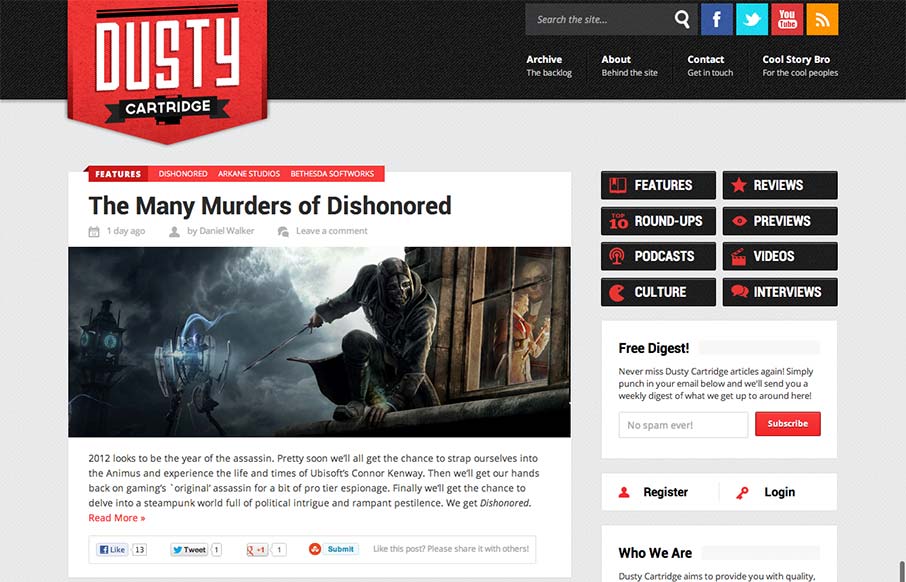
I like the blocky type design of this blog. It looks like it may be a theme but that doesn't take away from it being a nice design. The logo is bold and the nav matches it in simplicity visually. Nice responsive layout too.
Haatch
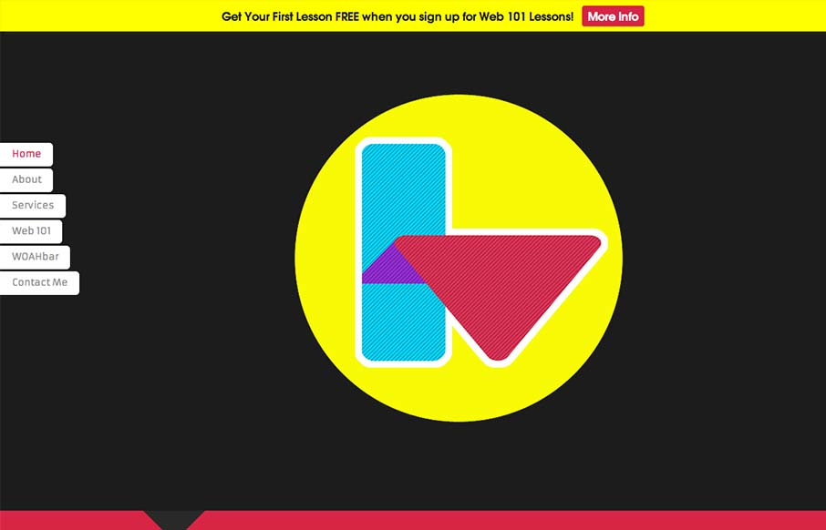
Interesting single pager. Chock full of bright colors and solid looking illustrations/icons. I like the fixed nav on the left, it's a nav design i've seen before but it just looks like it fits here better than others. There are some sections where the black text on...
Siyelo
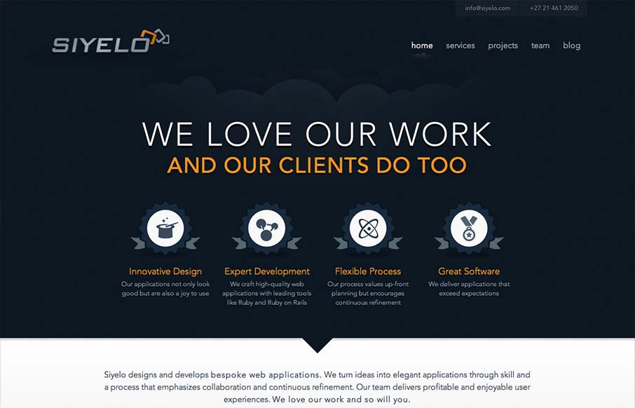
I like the contrast between the dark background in the top half and the white in the bottom half. It's a nice responsive layout too, check out how those main 4 icon/sections change when targeting different screen widths yo. I also really dig how there is consistency...
New Babylon
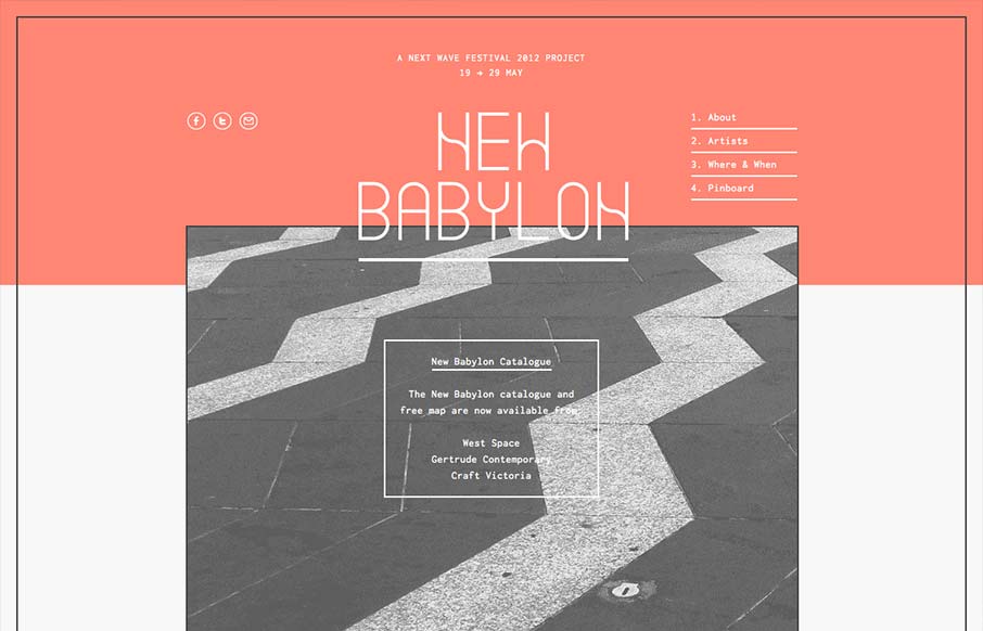
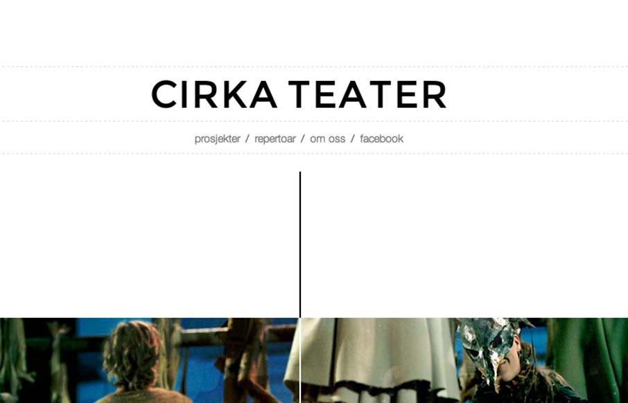
I like the way the lines used in this design and the big blocks of color or no color work together. Even into the type it feels unified yet unbalanced. Rich yet minimal that's how i'd describe this design. Lovely.
Cirka Theater
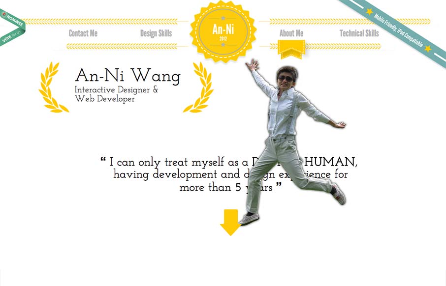
Cool vibe to this scroller website. I really dig how there's a slight parallax thing going on with the show sections/images, it really helps give it some depth interaction wise. The flip over effect on the lightbox windows for the show details is unexpected yet fun....
An-Ni Wang
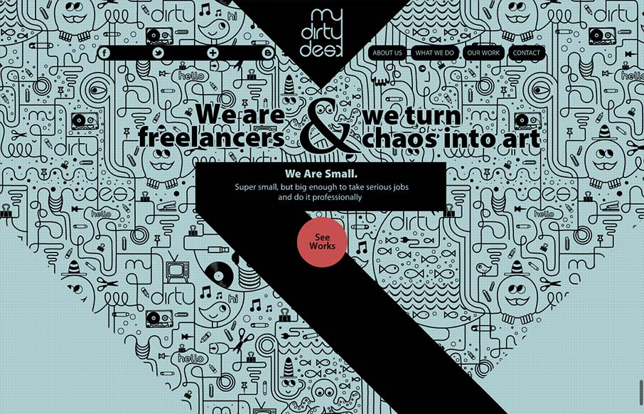
This website represents a great mixture of going too far yet being minimal (almost) at the same time. I love the humor built in and the movement as you scroll down the page. It's hard to take in some of the content with all the movement but I think the fun approach...
My Dirty Desk
This site design is all about the scroll. By engineering the design and illustration layout to work so well with the scrolling of the page it's just turned into a great experience visually. I scrolled around on this thing for a good 5 or 10 minutes too, lovely work...
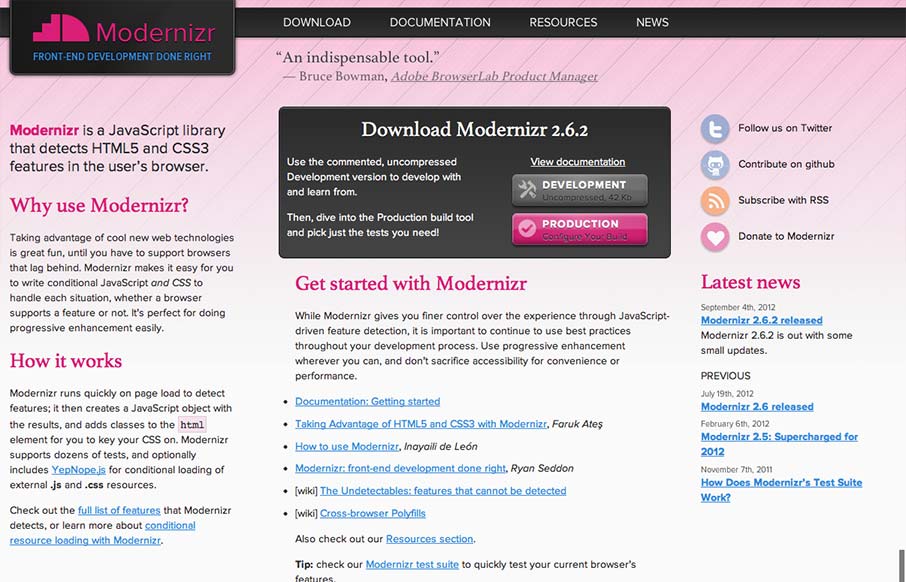
Modernizr
I gave Modernizr․com a small facelift: faster, less finicky, clearer intro text. Enjoy! modernizr.com— Faruk Ateş (@KuraFire) July 20, 2012 Been meaning to put the Modernizr site in the gallery for a while now. Faruk does a great job keeping the site alive...
Giant Ant
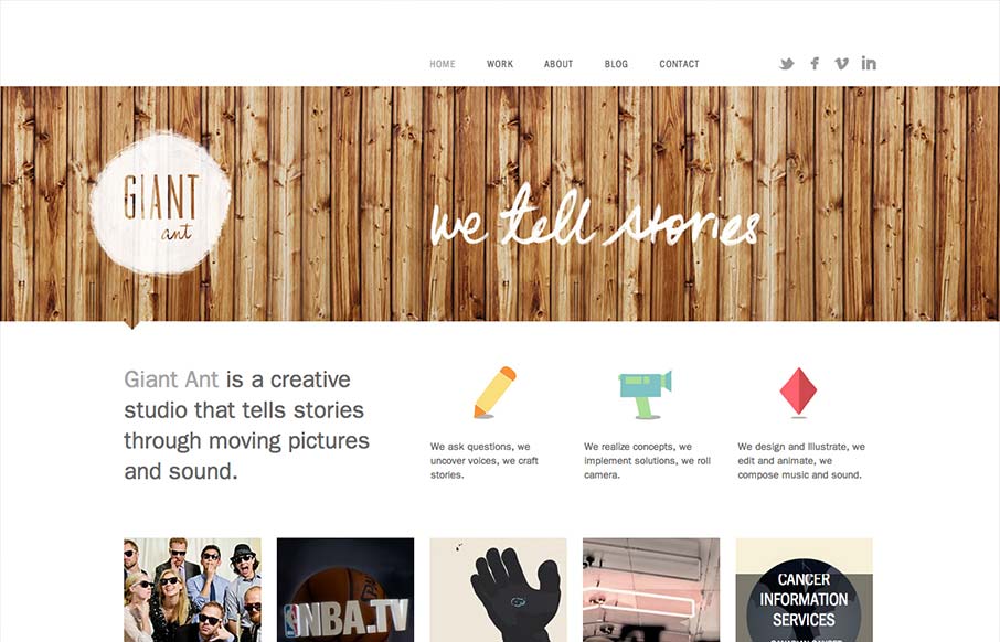
Nice simple and effective website design, it does what it needs to do and packs it in with a clear yet dense layout. I like the way these guys are selling themselves as a "storytelling" agency, that's a fun and compelling message to me. Love the wood background for...
Enochs
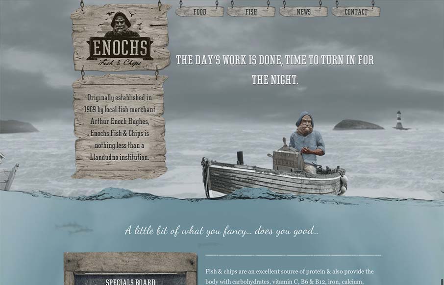
An unexpected responsive design here. It's one of a few sites i've seen recently that takes a lot of the same RWD patterns and adds a layer of decoration on top of it (with the ship captain/fisherman theme) and pulls it off really well. I love the hook that takes you...
MonkeyTag
I like this website because it's not overly fancy. It has a strong graphic punch and some neat visuals that have been clearly crafted by hand, like the timeline section. It's a nice example of a website doing what it needs to do for you.
Tobias Van Schneider
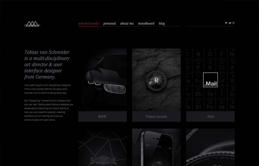
I like the moody darkness of this website. The interaction of the X that loads over the work samples is nice and has a good feel to it as you mouse around. The mood board is a clever look into who this designer is and the blog is a superb minimal example IMHO. Love it.
Spokes
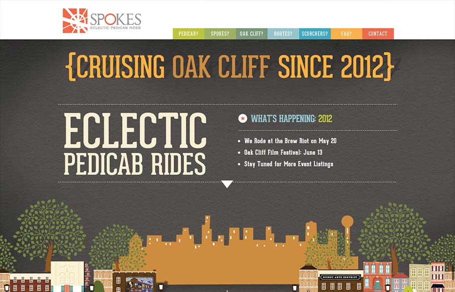
Just a fantastic way to share the narrative of what a 'pedi cab' is and how it all works. Beautiful illustrations and scrolling based animations, just wonderful to look at.
We Work on Sunday
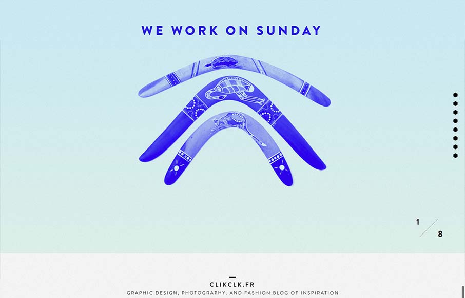
Fun website! I like the duotone color look as well as the way the scrolling is designed. Also cool way to display the work, in the monitors like that, it's not new to see but in this instance it feels fresh somehow - maybe it's the boomerangs?
Acorn
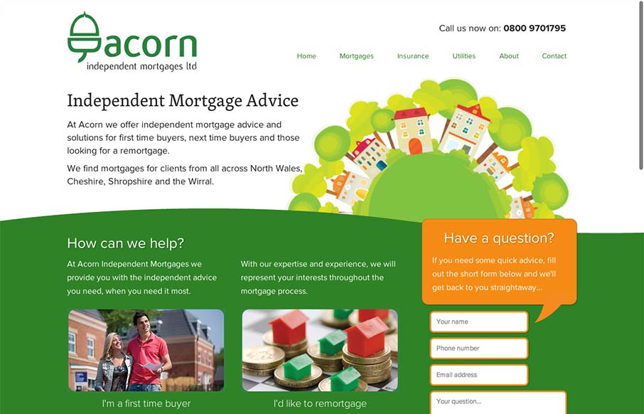
There's a lot to like about this design. The animation of the rows of houses spinning in a big circle like that is used perfectly in conjunction with the rest of the otherwise static feeling design. The design doesn't beat you over the head with the animation either....
Flex Pantech
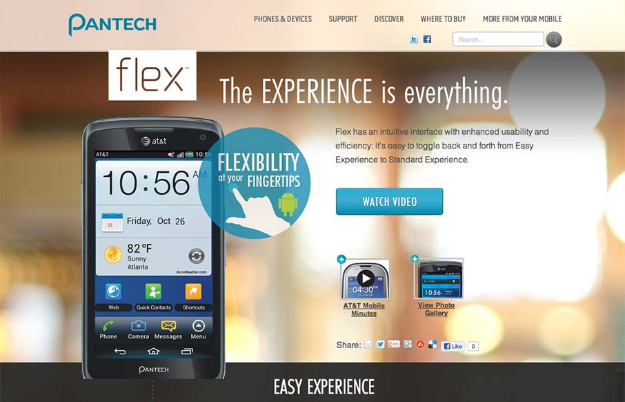
Via: Bob Galmarini on Dribbble Really fun little microsite / landing page for the Pantech Flex went live today. Check out the screen swap to show off the different phone UI. What a great website design. It's just a single pager or microsite as they're called but it's...
Work Turn
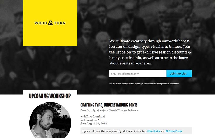
Nice asymmetrical yet super balanced feeling design. From the colors, the yellow and black with that blue is striking - can you make colors feel asymmetrical too? Super clean look and feel with some superb type handling pitched in for good measure.
Parenteau SF Journey
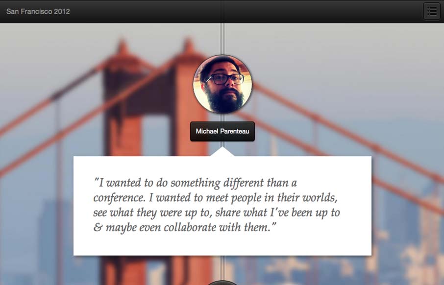
This is a tale of a Designer/Developer that went on a trip to meet people in the product space in San Francisco. The plan was simple: take some conference budget and get creative with it. When it is all said and done.. make a small mini-website and tell a story....
Outer Banks
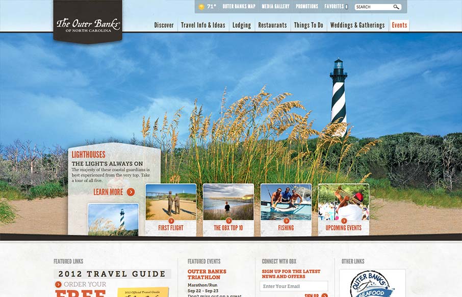
Really slick vacation marketing site for The Outer Banks of NC. I like the hero area slide show's interactions, they're quite involved but they look tempting to click around on. The mid area feels a bit cramped with the 4 columns at first but they've left it airy...
Tag
Pretty crazy design with the full screen background video. Love the cow suit! The interactions are all over the place but look interesting and there is real content here too. Overall pretty fun website design and I dig it.
mostlyserious.io
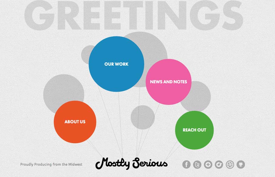
This is an interesting site. It's a pretty sweet idea and the floating balloon nav is kind of mesmerizing. Each page is a custom design, which is great. It's a fun design that sells mostlyserious' brand.
playgroundinc.com
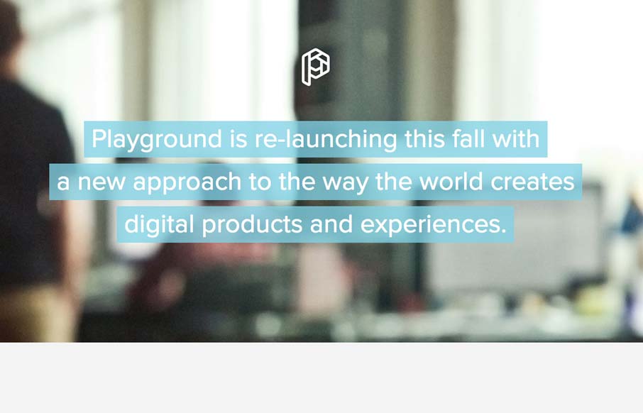
This is how you should post job openings. This is a lovely little site to entice people of the 'web nerd' persuasion. I think that the photo animation is a bit much and seems a little out of place in an otherwise tight and professional design, but everything else is...
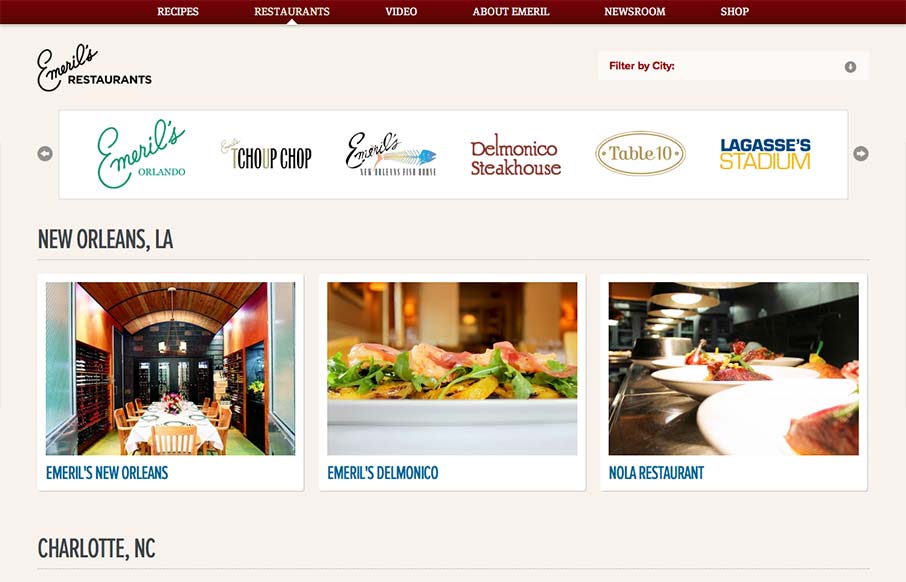
Emeril’s Restaurants
Aside from the oddity of having different sites/URLs in the main nav, the restaurant "site" is really nice. It has a clean design with gorgeous imagery (cuz let's face it, Emeril's food is a dream) and a great layout of information. It's as if each location has its...
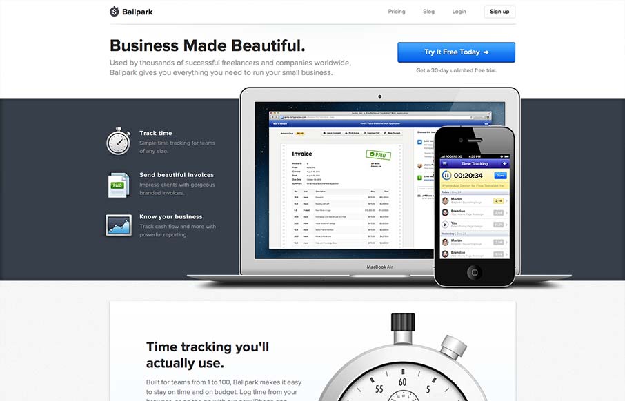
getballpark.com
incredibly elegant getballpark.com — Matthew Smith (@whale) August 15, 2012 Take away the beautiful aesthetic and you're left with a clearly defined product page. The copy is straightforward enough to be informative, and polished enough to be engaging on its own....
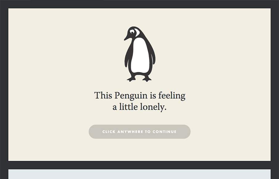
impressapenguin.com
Yet another great site intended to attract new talent. I talk a lot about narrative and this site takes that idea to heart. People respond to stories and what better company to seek out those people? Just click through it, its great. Who can't empathize with a...
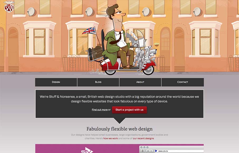
stuffandnonsense.co.uk
Super fun reboot from Andy Clarke's stuffandnonsense.co.uk website. Outside of the technical stuff, which yes you should go view source and pour over it. The header is so fun, the illustrations of the dude on the bike with the animated background makes it so...
colorkite.com
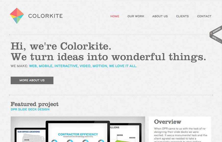
Colorkite is a clean, minimal design that does a great job at getting out of the way of the content. The typography is pretty solid and the color palette is subtle and sophisticated. The site is responsive, though it looks a little disjoint at some screen sizes. The...
eattheordinary.com
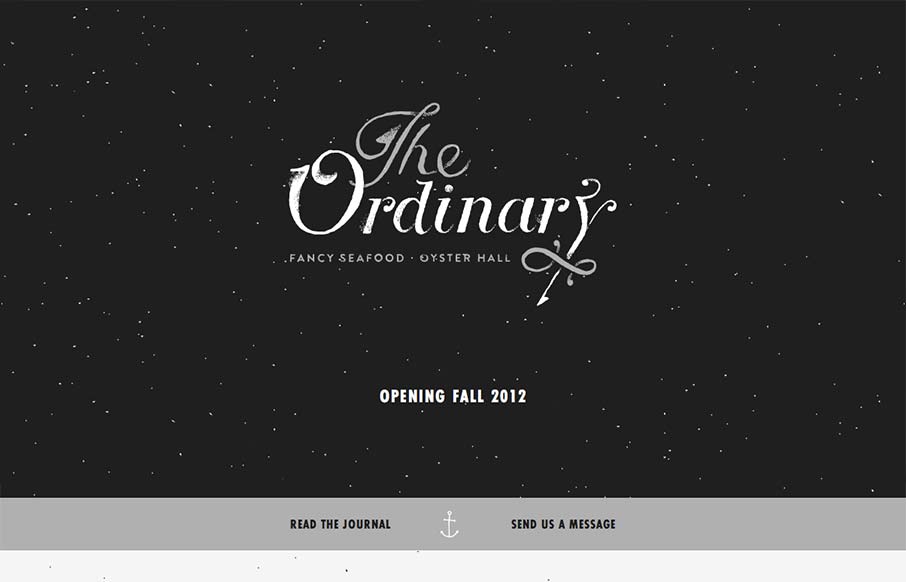
I have to say that I think this is an great site. It has just the right mix of texture, art and typography. My favorite part of the design is the speckled background, which does a great job of softening and activating the negative spaces without making the design...
convax.com
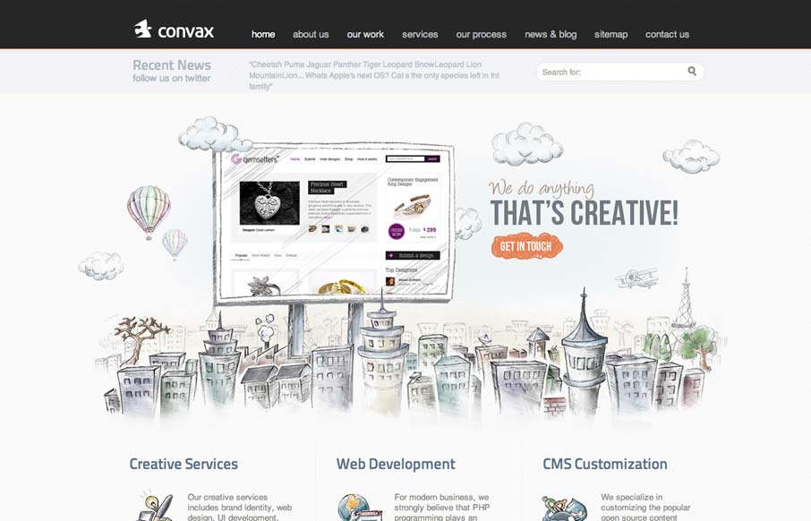
This slider is so coolconvax.com— Dan Denney (@dandenney) September 4, 2012 Agreed Dan, the animation that follows your mouse around behind the slideshow is clever. It's something that's pretty minimal really, as fare as interaction goes, but works well to keep...
fiafo.com
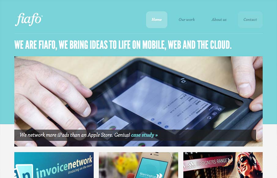
There's a pretty structured grid feel going on here. The use of League Gothic emphasizes the grid weight, but Chaparral Pro is a welcomed contrast. I think both typefaces are executed well enough to marry the crisp imagery with the fun illustrations. I like the...

