
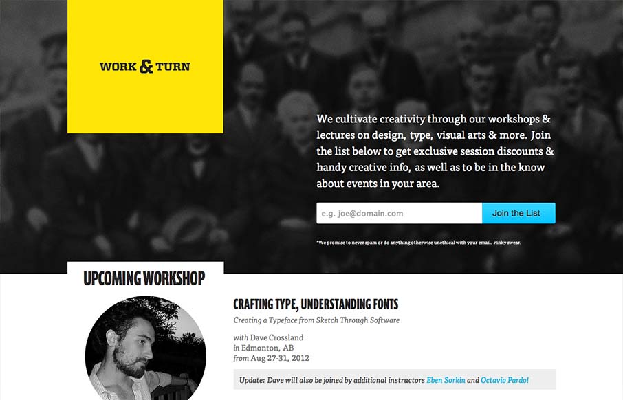
Nice asymmetrical yet super balanced feeling design. From the colors, the yellow and black with that blue is striking – can you make colors feel asymmetrical too? Super clean look and feel with some superb type handling pitched in for good measure.


Fitts’s Law: Why the Easy Button Wins
Large, close targets are faster to hit than small, distant ones, that’s Fitts’s Law. A look at the 1954 rule behind buttons, prime and magic pixels, thumb zones, and dark patterns.


0 Comments