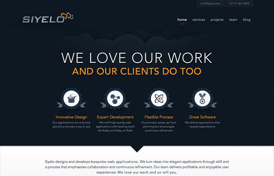
I like the contrast between the dark background in the top half and the white in the bottom half. It’s a nice responsive layout too, check out how those main 4 icon/sections change when targeting different screen widths yo. I also really dig how there is consistency yet each page feels a little different at the same time. Good work!
Glassmorphism: The Transparent Design Trend That Refuses to Fade
Glassmorphism brings transparency, depth, and light back into modern UI. Learn how this “frosted glass” design trend enhances hierarchy, focus, and atmosphere, plus how to implement it in CSS responsibly.


0 Comments