
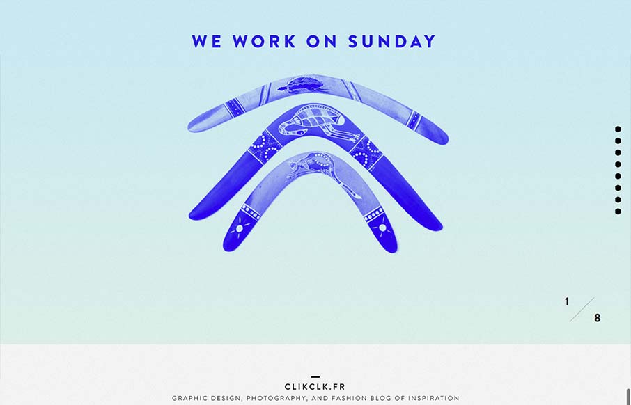
Fun website! I like the duotone color look as well as the way the scrolling is designed. Also cool way to display the work, in the monitors like that, it’s not new to see but in this instance it feels fresh somehow – maybe it’s the boomerangs?


Fitts’s Law: Why the Easy Button Wins
Large, close targets are faster to hit than small, distant ones, that’s Fitts’s Law. A look at the 1954 rule behind buttons, prime and magic pixels, thumb zones, and dark patterns.


0 Comments