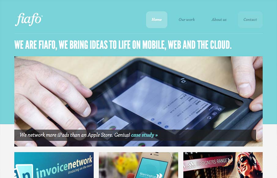
There’s a pretty structured grid feel going on here. The use of League Gothic emphasizes the grid weight, but Chaparral Pro is a welcomed contrast. I think both typefaces are executed well enough to marry the crisp imagery with the fun illustrations. I like the restrained color scheme and the way they’ve injected a bit of personality into their text. I also dig their form error treatment. Nice site!
Glassmorphism: The Transparent Design Trend That Refuses to Fade
Glassmorphism brings transparency, depth, and light back into modern UI. Learn how this “frosted glass” design trend enhances hierarchy, focus, and atmosphere, plus how to implement it in CSS responsibly.


0 Comments