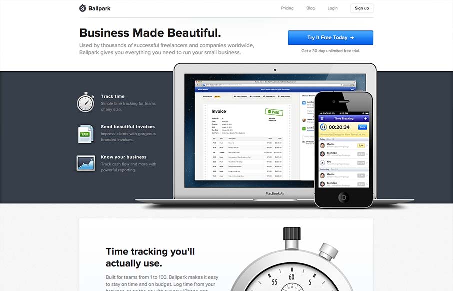
incredibly elegant getballpark.com
— Matthew Smith (@whale) August 15, 2012
Take away the beautiful aesthetic and you’re left with a clearly defined product page. The copy is straightforward enough to be informative, and polished enough to be engaging on its own. They’ve done a great job having testimonials along with payment and server security info reinforcing the credibility and reliability of the app. All of it is finished off by a simple, but bold call-to-action at the end of the page.
Make note that they’re approaching the visitor in a more casual way by asking “Are you ready to get your business on Ballpark?” They alleviate any friction or uncertainty stating that you can sign up and “Try it free today.” To me, that combination works well in humanizing the process a bit. Which takes me to my last and the most obvious point of this whole page. It’s a pretty page. It unexpectedly uses some animations in a non-surprising way. They bring life to the page and again, make it feel…real. I think a lot of the attention is owed to the ‘wow’ factor of that, but even when it wears off I think it’s smartly done and really helps visually sell what the already good content is saying.


0 Comments