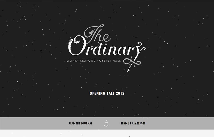
I have to say that I think this is an great site. It has just the right mix of texture, art and typography. My favorite part of the design is the speckled background, which does a great job of softening and activating the negative spaces without making the design busy.
The ‘splash screen’ is a great experience as well. It’s fluid and looks great at almost all screen sizes (except the narrowest) because of the grey band fixed to the bottom of the screen. The scrolling transitions is very cinematic and seems to raise the, for lack of a better phrase, ‘production value’ of the site, without feeling out of place.
Plus, this joint is here in South Carolina!
Awesome.


Giovanni – I met you at last Spring’s Less-Conf. I’m stoked to find you here.
I love the short design commentary – unscripted and natural. awesome. It’s like I’m in the room with you.
Hehe – it’s funny ’cause I did the same thing with a UX problem that gave me a small fit with *getting* to this screencast. Whoa, freaky! Check it out – http://screencast.com/t/SMW1seEkq
These are SO AWESOME. So glad I found these. Watching all of them now, haha.
THANKS!