
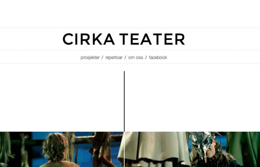
Cool vibe to this scroller website. I really dig how there’s a slight parallax thing going on with the show sections/images, it really helps give it some depth interaction wise. The flip over effect on the lightbox windows for the show details is unexpected yet fun. It’s also kinda responsive too wich is nice to see for an event based site like this, where a large portion of people are likely to look at this stuff on their phones. Woot!


Fitts’s Law: Why the Easy Button Wins
Large, close targets are faster to hit than small, distant ones, that’s Fitts’s Law. A look at the 1954 rule behind buttons, prime and magic pixels, thumb zones, and dark patterns.


0 Comments