stuffandnonsense.co.uk

http://www.stuffandnonsense.co.uk/

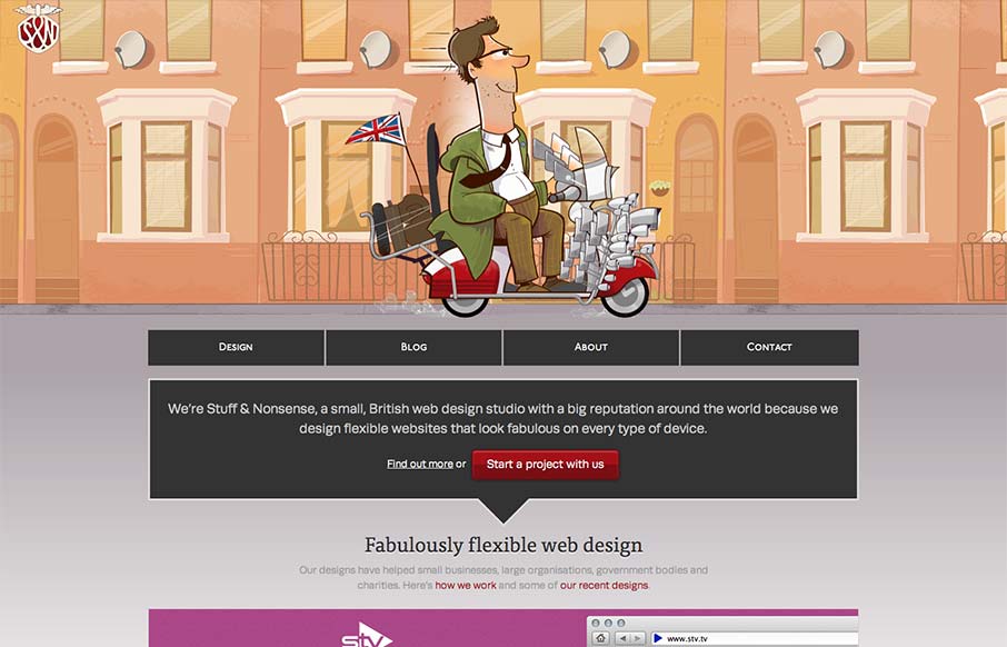
Super fun reboot from Andy Clarke’s stuffandnonsense.co.uk website. Outside of the technical stuff, which yes you should go view source and pour over it. The header is so fun, the illustrations of the dude on the bike with the animated background makes it so enjoyable, then you’re given a nice little surprise when you resize the browser to get different dudes riding different vehicles. Nice touch man.

Andy has a pretty good post about the redesign too:

All CSS background images include retina versions. Making screenshots in HiDPI mode on an iMac involved stitching several high-resolution images together in Fireworks, because there just aren’t enough pixels on a current 27″ iMac.

Interesting indeed…

0 Comments

Submit a Comment

Your email address will not be published. Required fields are marked *

News & Articles

Sign-Up: Enhancing Conversions through good UX

Sign-Up: Enhancing Conversions through good UX

Optimize your website’s sign-up process by focusing on clarity, ease, and user mindset. Clearly explain the purpose, benefits, and steps, and use social proof to build trust and drive conversions.

The Essential Guide to Getting Started on Freelance Writing

The Essential Guide to Getting Started on Freelance Writing

Explore the lucrative and fulfilling world of freelance writing with our essential guide. Learn about specialties like blogging, social media, article, and technical writing. Build a portfolio, find work, set up your business, and discover the potential earnings. Embrace the freedom of working from home and follow tips for success in your dream career.