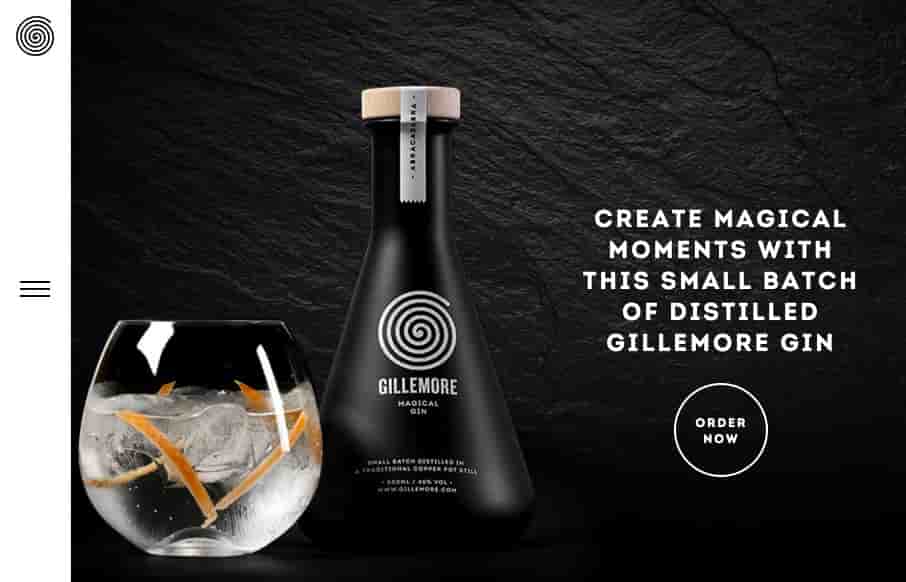
Renato Castelo Branco

Renato Castelo Branco

Great minimal portfolio site for Renato Castelo Branco. I really like the simple grid layout and bold coloring to help you follow along super quick and focus on the imagery. Clean, clear and concise design always wins.

Benny Gold

Benny Gold

After reviewing Camp Woodward's site last week - and having to buy new truck's for my son's skateboard this week - I'm in a skateboarding mood. Benny Gold's site is a good place to start. Great site - little bit of flat(ish) details - little bit of real. Like the...

Northlandscapes

Northlandscapes

A beautiful website design, not just because of the photography though. The layout is really smart and well stacked playing well off the photography. I like the sections and how they break up well as you scroll down the page and the interactions echo the layout and...

Radar #104

Radar #104

In this week's 104th Radar: The rise of the “Full Stack” Designer and the tools they use A 3D Atlas of the Universe, How Designers are Profiting from Ecommerce Contextual Styling: UI Components, Nesting, and Implementation Detail The Complete Social Media Image Size...

Camp Woodward

Camp Woodward

My wife and daughter have spent the week at summer camp - Camp Woodward to be exact. If you're a 7 to 18 year old skateboarder, gymnast, cheerleader, or videographer - this place is nirvana. They've had a great week, and figured this would be my little thank you to...

Republic Wireless

Republic Wireless

The Republic Wireless site is very simple - their tagline is "Beautifully Simple" - so I guess that's appropriate. Think it's interesting how they go on the Home page from a kind of flat design, and transition into real images towards the bottom. And really like that...

TACO Web Design Studio

TACO Web Design Studio

I really like the fixed elements on this website. The left nav and the header & footer area are cleverly done. It really feels like a unique layout, even though it's not really in the long term scheme of things. Great work here. From the Designer: A minimal...

We are moving

We are moving

What a brilliant idea with this website. I't simple yet very fun and the illustration work is spot on. It's such a clever way to generate leads on new jobs too. Brilliant. Submitted by: Sophie Taboni Twitter: @sofialisse Role: Co-designer (with Nicolas Catherin)...

FreshForm

FreshForm

Fresh Form's From the Designer: Change your tablet into a mobile subscription form. One-page website. Submitted by: Chris Adamus Twitter: @FreshMail_APP Role: Client Country: United Kingdom

Grupo TCA

Grupo TCA

Cool site for Groupo TCA, looks to be made by Manya (@wwwManyaPe) out of Peru. If you look past the lorem ipsum in the blog, and the dead social media links... the site is pretty cool - and since this is a design gallery - we'll just look at the design. Great, and...

Typeform

Typeform

I really like Typeform's site - good and appropriate video backgrounds that look great - plus, look at the second one down - the full to split-screen gives the swiping effect of a tablet within the video. BTW - their product looks pretty sweet too.

Punkgraphic

Punkgraphic

When I was a kid, we rented and built out this old department store to turn it into a stage / theater. I found a book from the 1940s-ish that had hundreds of stock drawings / photos that you could use for advertising. There's a lot in the Punkgraphic site that reminds...

Ján Kovács

Ján Kovács

Strong portfolio site from Jan Kovacs - like the coloring and slight texture of the background - provides a good canvas for his work. Submitted by: Jan Kovacs Twitter: @jankovacs Role: Designer & Developer Country: Slovakia  

i heart wines

i heart wines

Love the "hamburger" menu icon for the i heart wines site. The site is fresh and clean, and really like the Wines page. Submitted by: Paul Cripps Twitter: @PaulCripps Role: Designer & Developer Country: United Kingdom

Notes I Kept

Notes I Kept

I hope John Karlsson keeps this site up - Notes I Kept is a quick site, but really love the look of it. Cool backgrounds and love the depth. From the Designer: A collection of notes written by strangers and close ones. The site is a result of nostalgia and a very...

DF Motion

DF Motion

My first thought when I went to this site was "wow, damn nice photography" then I was like, "what's up with that hamburger menu design..." As I considered the design though, I realized that those main 3 links/buttons are really all the company wants you to check out....

Nerdo

Nerdo

Really fun website here. It's fairly straight forward in it's layout and execution but it's chock full of animation work and clever pieces that keep you engaged. Win!

StoryBox

StoryBox

Nice clean product website for StoryBox. I like a lot to this design, especially the color choices. I also like the main blog/story section. From the Designer: Had the pleasure of doing the re-branding, design and development for this awesome social marketing company....

Radar #103

Radar #103

In this week's 103rd Radar: The New Generation of Prototyping Tools (Part 1/2) How to Become a Great JavaScript Developer Discover.Typography, The Roots of Minimalism in Web Design Drop Downs Should be the UI of Last Resort How to Better Manage WordPress Pages with...

Conor Mcgregor Official Site

Conor Mcgregor Official Site

Pretty nice site for Conor Mcgregor the UFC fighter. Typically sport specific athlete websites are horrible, this one is not. It's simple and minimal and has really good photography and typography. I like just about every aspect to it. Good show of restraint on this...

Access ventures

Access ventures

I love the strong typographic approach to this website's design. It's quite nice and feels very unique to me. I especially like how it retains it's asymmetrical layout in the header area. From the Designer: The site was designed by Fuzzco, and Access Ventures is an...

Ryan Johnson

Ryan Johnson

Really nice minimal design for this single page portfolio website for product designer Ryan Johnson. I love the main hero image, how he's done some neat type work and interplaying it with the photo too. Then it's just all business, showing work in context, that's how...

Fixed Group

Fixed Group

There is so much going on with the Fixed Group website that it just makes me smile. It's a fairly simple look and feel but all the interaction and nav design leaves you really blown away. I really dig the main nav interactions a great deal. The colors and dark/muted...

Ctookom

Ctookom

Man, this site blows me away visually. I love that logo/display type and the colors, man. I love the header and how it slides away from being a large hero area and keeps itself there in the fixed header, but still has that slight parallax slide vibe. Strong stuff....

Umahu

Umahu

Pretty neat experience with the Umahu website. It has a very simple straightforward purpose, which is to tell a single story. This is probably the best design project you could get, since most website projects need to do about 12 things at one time to 12 different...

Imbue Labs

Imbue Labs

Very nice minimal approach. I'd say it's "minimal" done right. I love that there's a singular focus on that "projects" button, then you can explore from there, but that's the main thing. It's very clean and clear and I just love it. From the Designer: We wanted to...

Chase

Chase

A fairly clean experience for a big credit card website. The Chase site is responsive and has some nice open space throughout that really helps with the large amount of "stuff" they've put on the screen. I like the navigation design, using the hamburger icon and...

Boss Gloves

Boss Gloves

That is some crazy stuff coming from Boss Gloves - making the site exciting for products that aren't (their words below - not mine). Like the interaction on the slider - and like the points they make below - pretty spot on. From the Designer: After taking boss gloves...

Malte Gruhl

Malte Gruhl

I think Malte Gruhl out of London, has worked on every ad campaign as a design director ever created - at least it feels like that in his portfolio site. It's some sweet work encapsulated in good minimalist design. The images seem lower-res so that you can get some...

Jet

Jet

If you're going to rebuild Amazon - might as well do it cleanly and organized - Jet seems to do that. Like the flat design / icons coupled with real products - interesting combo. Reminds me a little of the iPod ads ala way-back in 2003.