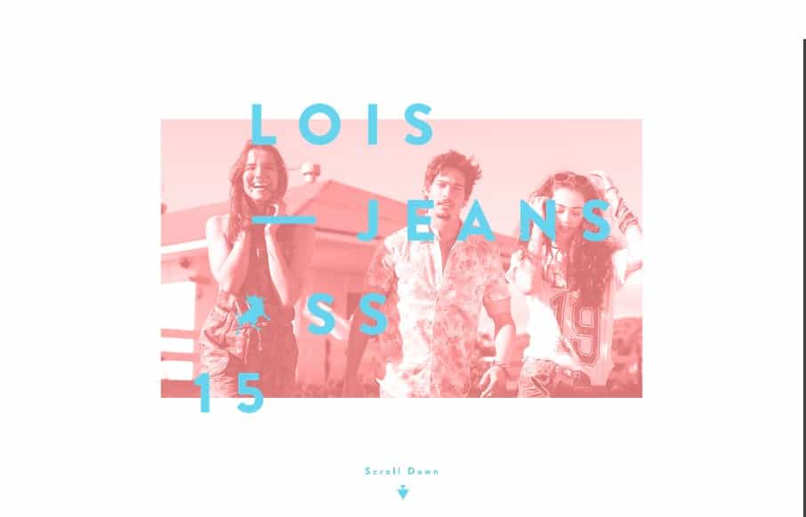
Lois Jeans SS 2015

http://www.loisjeans.com/en/ss2015/campaign

Technically the site is a bit slow to load and chrome choked on it a bit after a while for me personally but I love the visual design of this website. The colors are very stylish and really convey the vibe they want, I also really dig the parallax feel to some of the elements as I scroll down the page. It feels visually unique and really sells “fashion” to me as I stare at it.

From the Designer:

Lois Jeans’s new SS 2015 campaign comes with an interactive parallax scrolling website about the 4 elements: Fire, Air, Water and Earth.

Submitted by: Nectar Estudio
Twitter: @nectarestudio
Role: Designer & Developer
Country: Spain

0 Comments

Submit a Comment

Your email address will not be published. Required fields are marked *

News & Articles

Sign-Up: Enhancing Conversions through good UX

Sign-Up: Enhancing Conversions through good UX

Optimize your website’s sign-up process by focusing on clarity, ease, and user mindset. Clearly explain the purpose, benefits, and steps, and use social proof to build trust and drive conversions.

The Essential Guide to Getting Started on Freelance Writing

The Essential Guide to Getting Started on Freelance Writing

Explore the lucrative and fulfilling world of freelance writing with our essential guide. Learn about specialties like blogging, social media, article, and technical writing. Build a portfolio, find work, set up your business, and discover the potential earnings. Embrace the freedom of working from home and follow tips for success in your dream career.