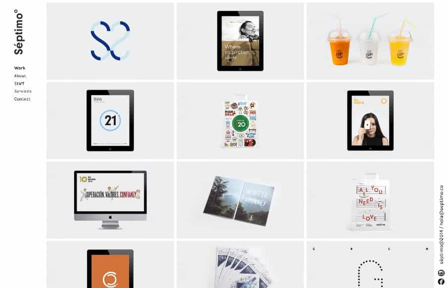
The strict “blocky” grid in this design is pretty cool. It’s been done before and fairly straightforward but when used in this context it feels fresh and unique almost. I dig the fixed left nav too. Check the different screen width design changes out as well.


The Call to Action, Revisited
The Call to Action hasn’t changed in a decade, but the bar has. A fresh look at prominence, copy, mobile tap targets, and accessibility, with lessons from three major design systems.


0 Comments