
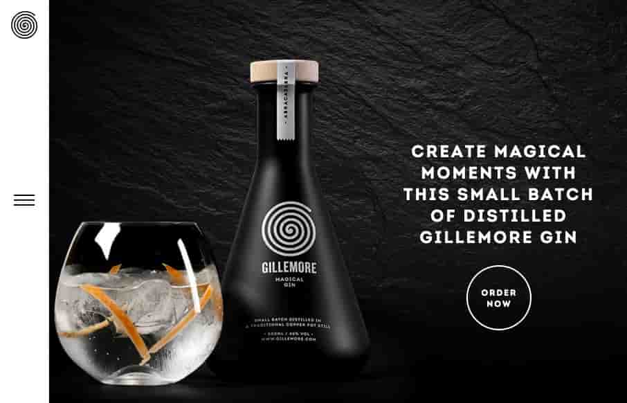
Nice upscale look for the Gillemore Gin’s website. I like the black/dark vibe, it really aides to the uniqueness of what the product looks like. Along side the slightly non-traditional feeling nav in the left hand side tray pattern the approach matches the look & feel very well.


Fitts’s Law: Why the Easy Button Wins
Large, close targets are faster to hit than small, distant ones, that’s Fitts’s Law. A look at the 1954 rule behind buttons, prime and magic pixels, thumb zones, and dark patterns.


0 Comments