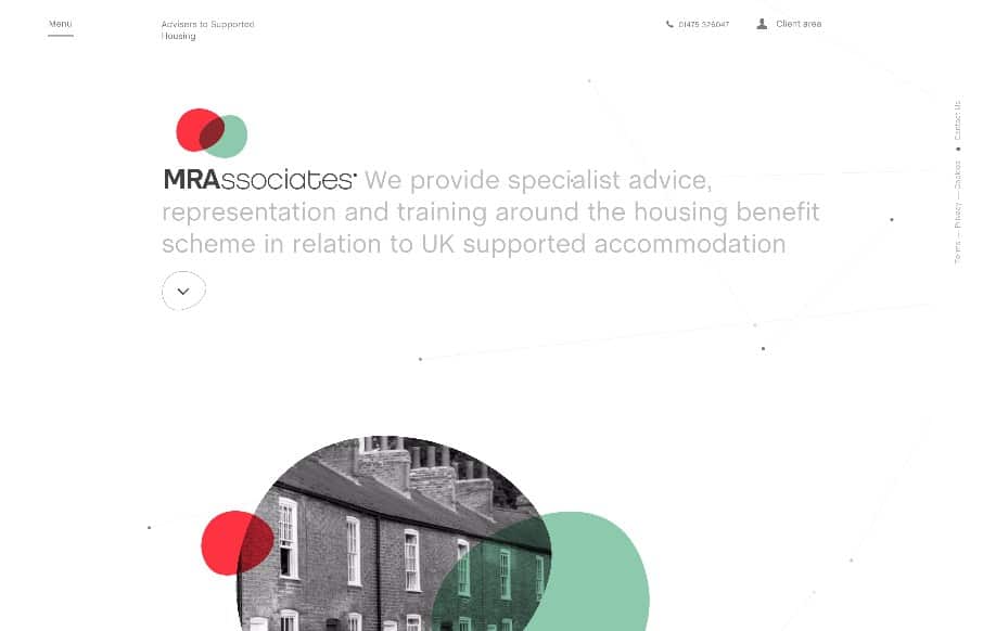
I love the play between the symmetrical and asymmetrical elements to this layout. It’s full of little visual widgets and things to draw your eye around the page. I also really dig the menu design, having it open like it does really felt unique and memorable to me as a web designer.
Glassmorphism: The Transparent Design Trend That Refuses to Fade
Glassmorphism brings transparency, depth, and light back into modern UI. Learn how this “frosted glass” design trend enhances hierarchy, focus, and atmosphere, plus how to implement it in CSS responsibly.


0 Comments