
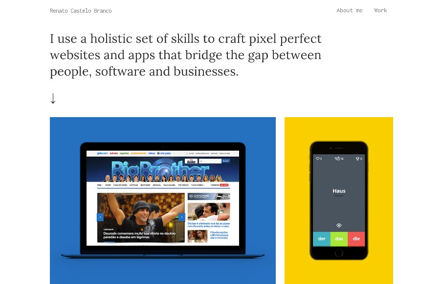
Great minimal portfolio site for Renato Castelo Branco. I really like the simple grid layout and bold coloring to help you follow along super quick and focus on the imagery. Clean, clear and concise design always wins.


Fitts’s Law: Why the Easy Button Wins
Large, close targets are faster to hit than small, distant ones, that’s Fitts’s Law. A look at the 1954 rule behind buttons, prime and magic pixels, thumb zones, and dark patterns.


The intro text makes we want to throw up. “I use a holistic set of skills to craft pixel perfect (like that exists nowadays) websites”. FFS, it manes nothing, and imagine a potential client reading that. Designers really need to climb out of their own arses and stop trying to impress their peers. OK Rant over 😉
Hey MrMulder – you won dude – looks like he changed it.