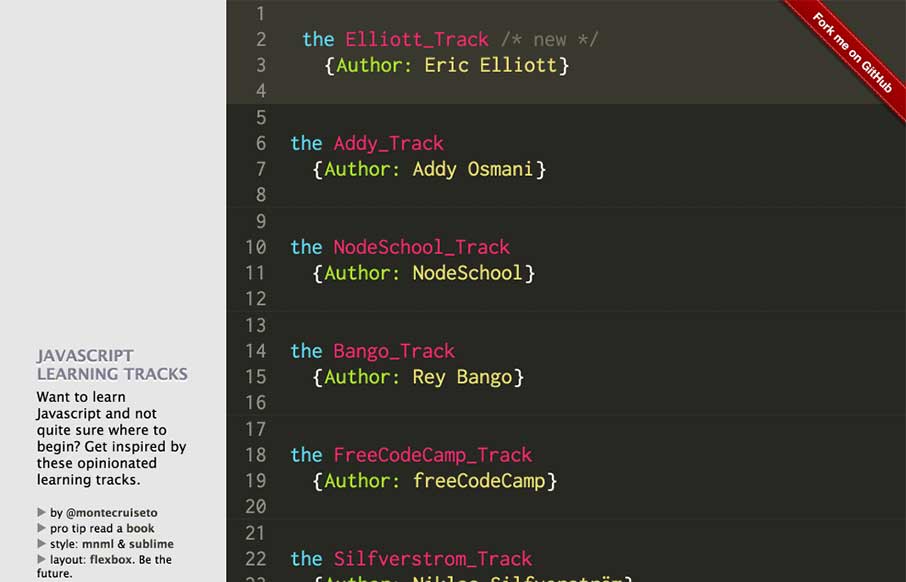
So we're going a little different this morning. The look of the site is probably familiar to you if you stare at Sublime Text for 8 hours a day. Yes - a pretty simple site. But I like that Samir has given reference to what he uses and his inspiration. What I also...
Tasteet – Discover great food
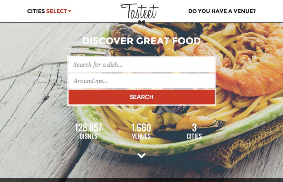
Hope you already had lunch... don't go to this site if you haven't - but if you haven't, and happen to be in Italy, check out Tasteet. Pretty innovative foodie / food finder site. Great design on desktop and mobile. And like the layout of the search result pages...
ArtSocket Posters
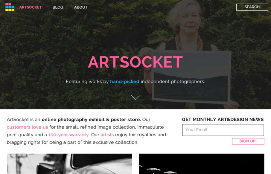
It's kind of nice when the designer reviews the site for you. It helps when they're right in their assessment of their work - Dmitri Tcherbadji did that for me here with talking about ArtSocket. From the Designer: "This is a three-year e-commerce/community project....
LAIC, Columbia University
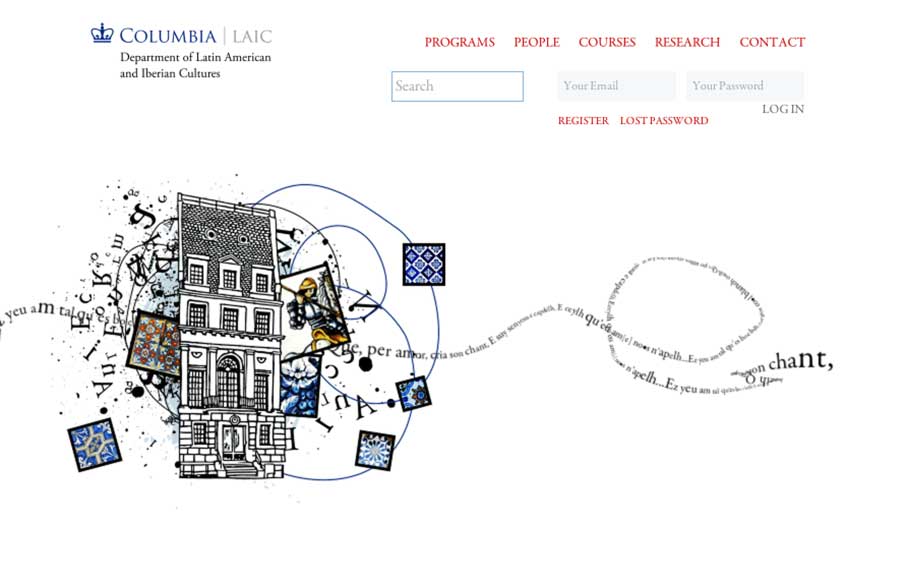
Cool canvas work from Miguel Ripoll for Columbia University's Dept of Latin American and Iberian Cultures. The coloring and tiles conveys a specific cultural element that you don't see in most sites - which is very relevant to the client. And the canvas word play...
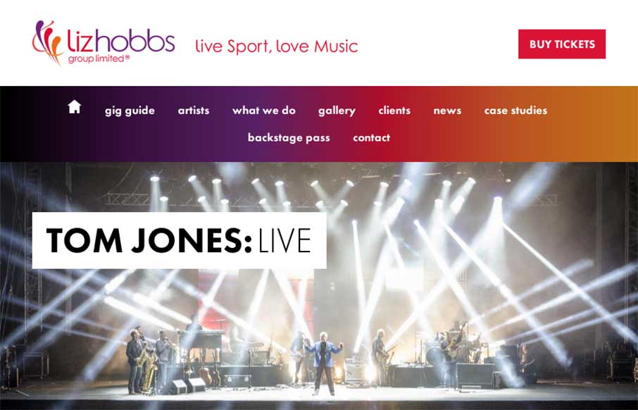
Liz Hobbs Group
Good responsive work by Root Studio on the Liz Hobbs Group site out of the UK. Has a smart integration with Spotify to give you a taste of their artists, as well as hi-res images and color splashes to set a vibrant tone. From the Designer: "Liz Hobbs Group is a...
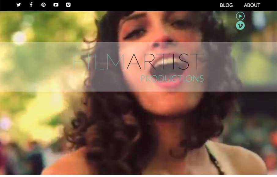
FILMARTIST Productions
Cool video background site from a company that produces videos... and therefore video backgrounds.. The FilmArtist Productions site, out of Toronto, Canada, is a very simple showcase of their work. I like how the video background is persistent throughout the page as...
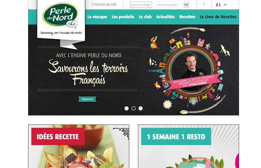
Perle Du Nord
The Perle Du Nord site by the Black Meridian agency out of Paris has good lines, and uses the home page for navigation - which works well for this site. I like the recipe filtered search, but might need more help with the ingredients suggestions. Also, take a moment...
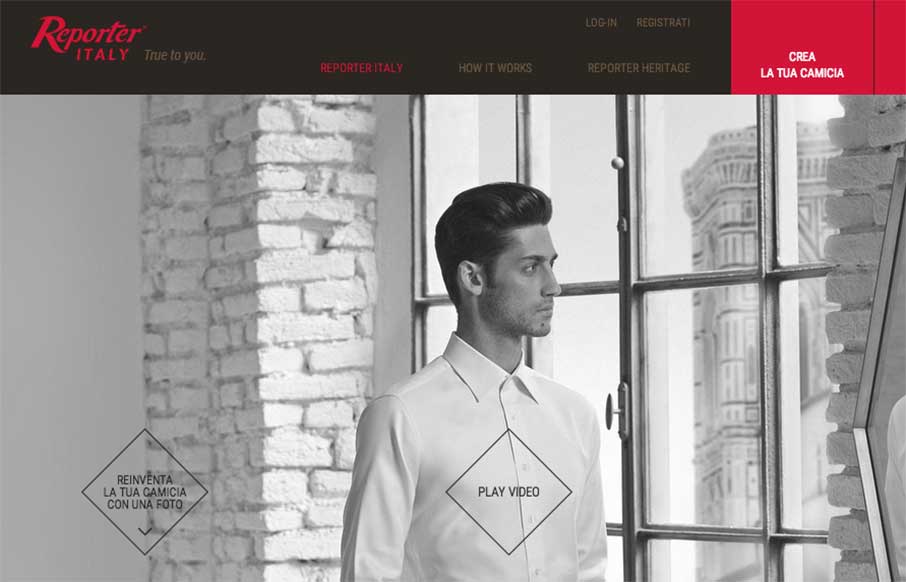
Reporter Italy
I don't wear custom fitted dress shirts - who am I kidding, I'm wearing a Kickball.com tee on top of a Captain America compression shirt while at work... last week when my in-laws spent the night, on Monday morning asked me "And what are you doing today? Working...
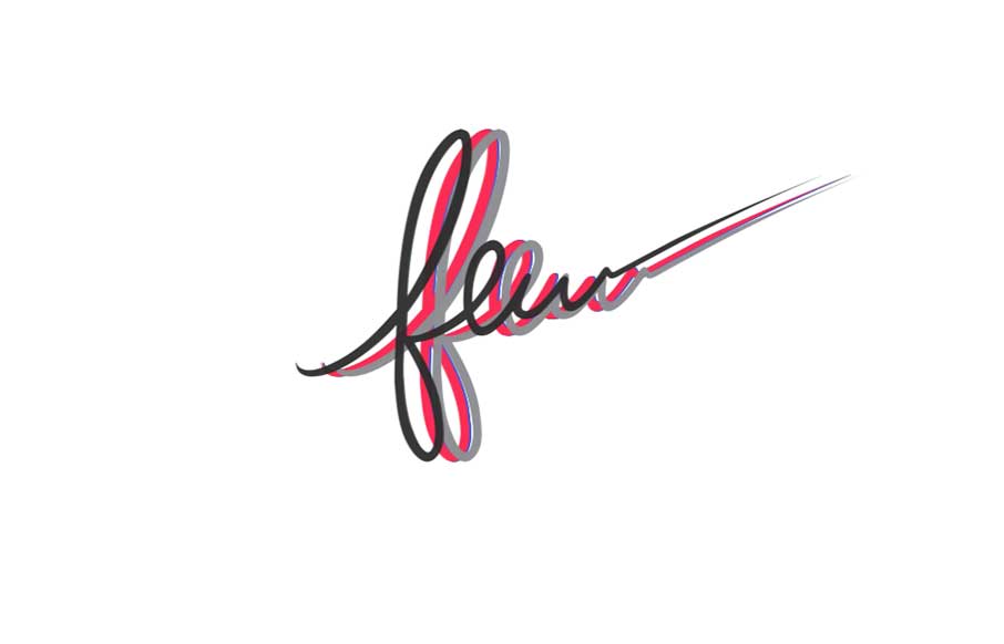
Few
Great colorful on a nice white canvas site from Few, out of Little Rock, Arkansas. Like how you're greeted with the all the colors of the site flying in to make the one black logo for Few. The illustrations of the peeps are cool, and really like how the video...
Five Simple Steps
Love the changes to the Five Simple Steps site from when we reviewed them last March. This feels right - it's clean, simple, beautiful, and practical like the books they sell. It looks to be built on Shopify, but doesn't have the feel of most e-commerce sites (yes,...
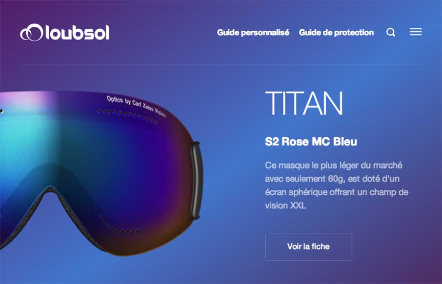
Loubsol
We've started to see a lot of good work coming out of France to Unmatchedstyle lately. The Loubsol (ski googles) site, done by the NOE Interactive agency from Lyon, is shiny, with great coloring for each of the products on the home page. I like the filtered search on...
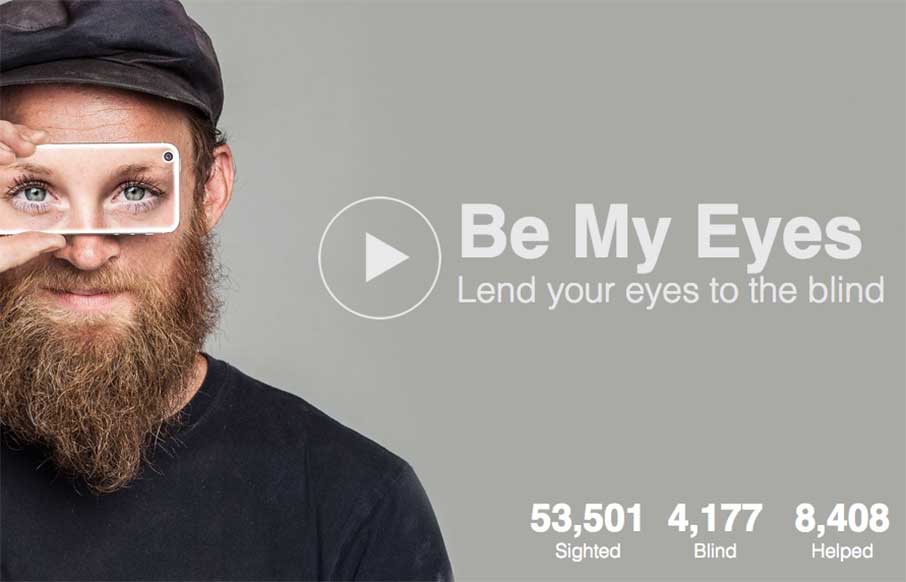
Be My Eyes
Awesome. Robocat out of Copenhagen, Denmark, has an incredible app called Be My Eyes that, "is an app that connects blind people with volunteer helpers from around the world via live video chat. Download now and start helping blind people see." A truly inspired idea:...
Spindletop Design
Really like the vibe coming from the Spindletop Design site, an agency out of Houston, Texas. It looks like they like to use a lot of text treatments in their site, and in their client work - which is cool, considering the graphic design trend of Lettering (or how to...
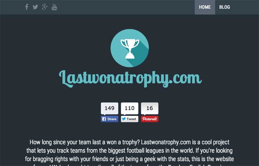
Last Won a Trophy
We admit it - sometimes we don't just review sites for their aesthetic beauty - sometimes we review sites that are submitted because we can see there is love behind it. The LastWonATrophy site by Digital Zoo out of the UK looks like cool and fun side project for these...
Alphabreast
We're seeing more and more animated gifs being used for more than just cats with lasers coming out of their eyes memes... we're seeing them used as the main feature of some sites. Alphabreast has done this in a clean way that really gets their point across in this...
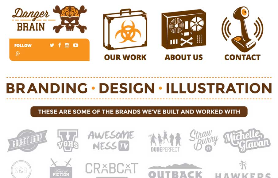
Danger Brain
Fun way to start the day with a site from Danger Brain out of Florida. Feel like I'm back in my BMX / skating days with the artwork and design. And I may have to start watching Video Game High School... just sayin'. From the designer: "Really good site with bold...
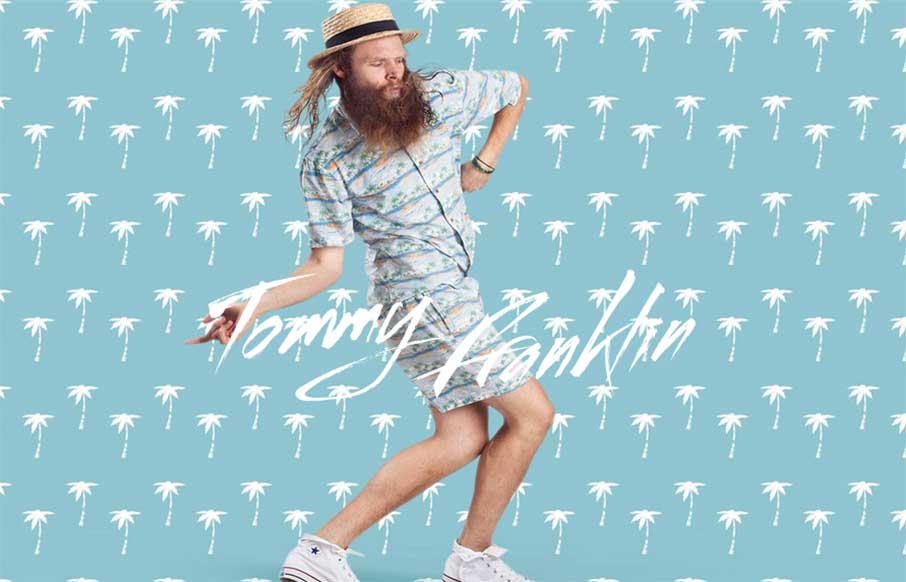
Tommy Franklin Official Website
"Love like you've never been hurt, sing like nobody's listening and dance like you're Tommy Franklin" This site from G'day Byron Bay design company is pretty stellar. I'll let them explain the impetus for the site, but I love it's design, how it moves, and it's...
Portraits of Guilford
I really like what mediaBoom has done with Portraits of Guilford (Connecticut) - a historical / social photo sharing site for the town. I'm a history buff, so love to see the progression of the photos over time. Also like the sticky footer, and how when you change...
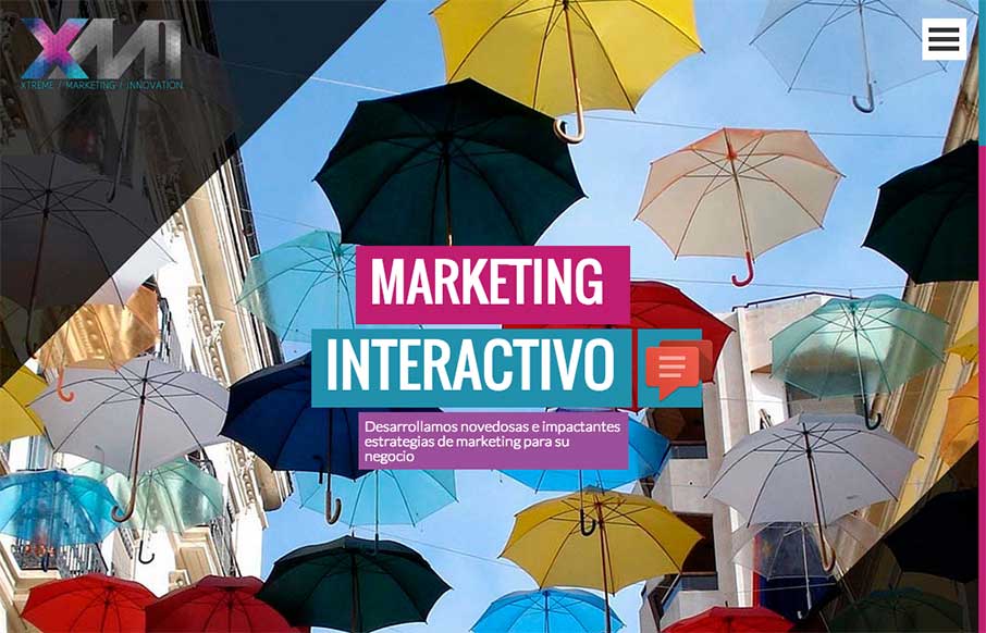
XMI – Marketing Interactivo
Something bright and shiny to wake you up this morning! This full-width site from XMI out of Colombia uses your standard en vogue colors, but makes them big and bold instead of just using them as highlights. It goes all out, and makes the site kind of exciting. Also...
Prishtina International Airport
Very interesting airline website. They use the large hero image slider pattern but then get into some really nifty layout stuff regarding the times and airlines stuff. I like the layout changes as you minimize the window down from desktop to phone screen widths too....
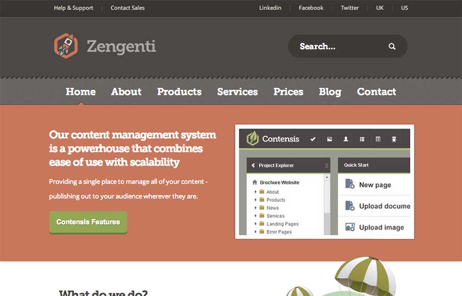
Zengenti
Nice web app site design. I like how it's a little old school but also new school at the same time. Lovely stuff. Our content management system is a powerhouse that combines ease of use with scalability. Submitted by: Alex Dixon @alexdixondesign Role: Designer &...
Elliot Alderton
Some really hot illustration work closes the deal on the look of this website for me. The underlying layout isn't all too different in the design patterns the site utilizes but man, those illustrations. I also really like how the main one is responsive. It's subtle...
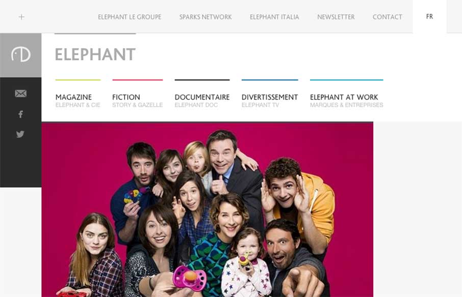
Elephant Group
Cool blocky design for the Elephant site. I dig the adaptive looking approach to the layout across various screen widths. The zoom on hover for the main page's images keeps me engaged somehow as well.
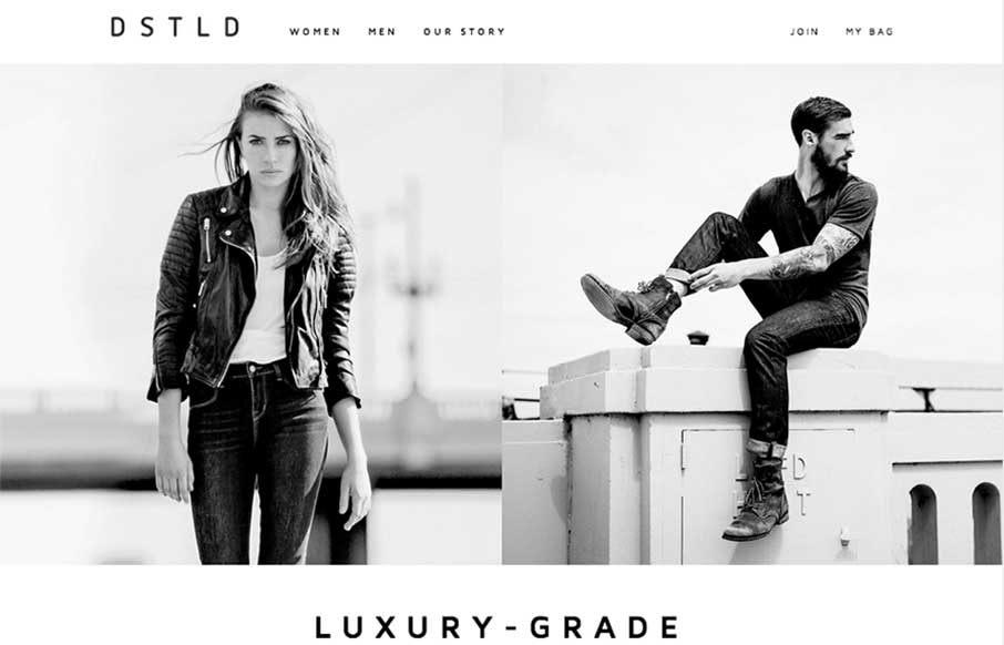
DSTLD Jeans
Beautifully simple layout for DSTLD Jeans. I like the left or right approach to making the women to men selection. It keeps the overall same feel no matter what screen width you view the page at. It's also beautifully black and white which I always love when it's...
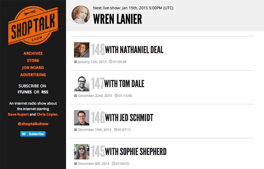
Shop Talk Show
The new Shop Talk Show website is up. Retaining the same branding and colors but very much looks like it just goes straight for mobile users. Likely a very smart move. The content is in the audio and getting people to that fast not in showing off a super slick site...
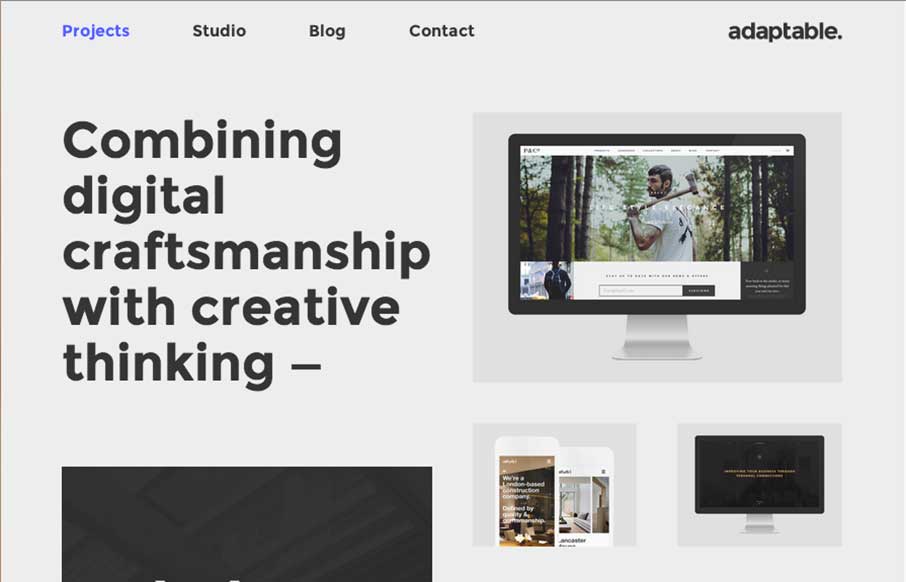
Adaptable
I love this layout. It's simple and to the point as well as a nice example of responsive design. The scaling of the main images is nicely done and in contrast the larger bolder type in the layout works our really well.
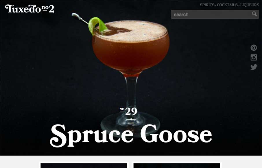
Tuxedo No2
It's 5 o'clock somewhere right? Who needs the Bartender's Pocket Guide anymore - you can head to Tuxedo No.2 for great responsive, Instagram photo, easy to navigate (the drinks are the navigation), drink recipe / instructional guide. As an SEO person - I like all the...
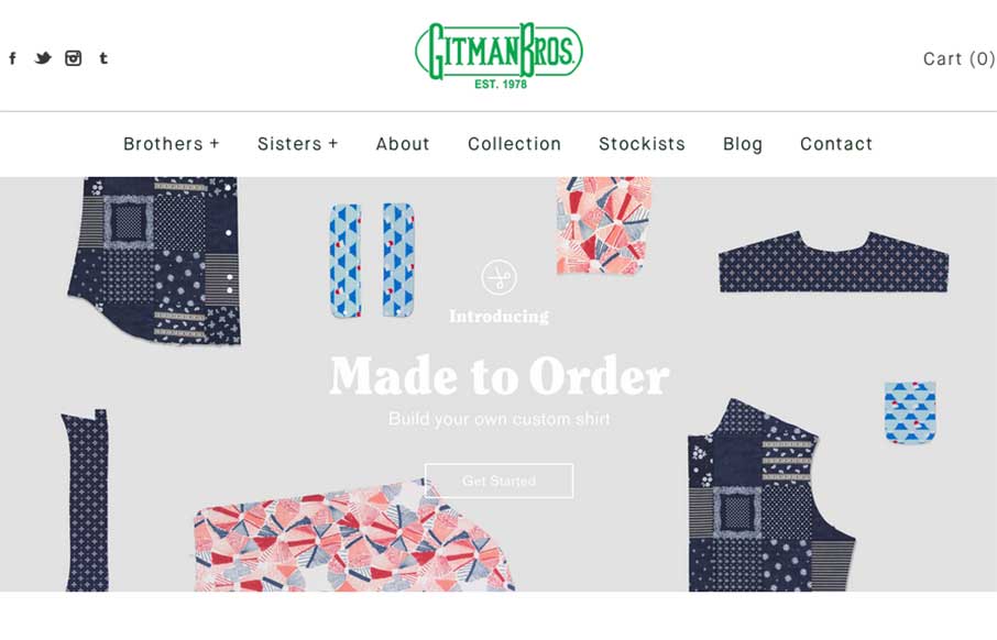
Gitman Bros Vintage Clothing
Good Monday Morning to you! I'm responding to Gitman Bros's Instagram message this morning. Offering cool vintage style shirts through their Shopify site, Gitman's site is clean and easy to navigate (not always the case for shopping sites). Really like their new...
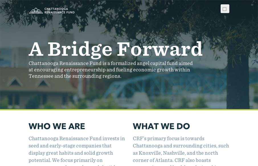
Chattanooga Renaissance Fund
Good way to end the week. The Chattanooga Renaissance Fund's site has great sweeping full-width shots and video backgrounds of Chattanooga that is fun just to look at from a design perspective. Especially like the footer image. Also like the vertical type on the sides...
Electric Pulp
When I was starting to look at Electric Pulp's new site, I realized this is the third time we've reviewed their website (2010, 2013 below). So it's cool to see evolution of websites, and especially from companies that we really like. This new version of the site is...

