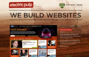
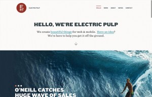
When I was starting to look at Electric Pulp’s new site, I realized this is the third time we’ve reviewed their website (2010, 2013 below). So it’s cool to see evolution of websites, and especially from companies that we really like.
This new version of the site is about what’s under the hood and in the details. First stop is the header – and they are doing something that I really like, and am seeing more of – the sticky header disappears on scroll down to give full attention to that page – but if you change your mind and scroll back up the page, the UX premonition is that you have seen what you want on that page, and want to move on, so the navigation reappears.
EP’s work is phenomenal as always, and their portfolio pages are clean and organized. The About page surprised me a little – only because I saw the classic square black and white employee shots, but accidentally scrolled down over Aaron’s pic.. and what? Dave Chappelle fighting Godzilla animated GIF you say? Shows a good sense of humor for a cool company, that’s been around for a long time, but keeping up with the kids.
2010
2013


0 Comments