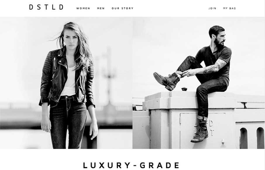
Beautifully simple layout for DSTLD Jeans. I like the left or right approach to making the women to men selection. It keeps the overall same feel no matter what screen width you view the page at. It’s also beautifully black and white which I always love when it’s pulled off well.
Glassmorphism: The Transparent Design Trend That Refuses to Fade
Glassmorphism brings transparency, depth, and light back into modern UI. Learn how this “frosted glass” design trend enhances hierarchy, focus, and atmosphere, plus how to implement it in CSS responsibly.


0 Comments