Perle Du Nord

http://www.perledunord.com/

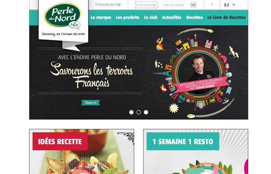
The Perle Du Nord site by the Black Meridian agency out of Paris has good lines, and uses the home page for navigation – which works well for this site. I like the recipe filtered search, but might need more help with the ingredients suggestions. Also, take a moment to resize your browser to a mobile view – I like the coloring and spacing on the navigation. Interesting when sites have a sticky footer too – always interested in that choice. And now I’m hungry.

From the Designer:

“Perle du Nord is the leader of the chicory in Europe since 1983. His website has been developed with Modx.”

0 Comments

Submit a Comment

Your email address will not be published. Required fields are marked *

News & Articles

Sign-Up: Enhancing Conversions through good UX

Sign-Up: Enhancing Conversions through good UX

Optimize your website’s sign-up process by focusing on clarity, ease, and user mindset. Clearly explain the purpose, benefits, and steps, and use social proof to build trust and drive conversions.

The Essential Guide to Getting Started on Freelance Writing

The Essential Guide to Getting Started on Freelance Writing

Explore the lucrative and fulfilling world of freelance writing with our essential guide. Learn about specialties like blogging, social media, article, and technical writing. Build a portfolio, find work, set up your business, and discover the potential earnings. Embrace the freedom of working from home and follow tips for success in your dream career.