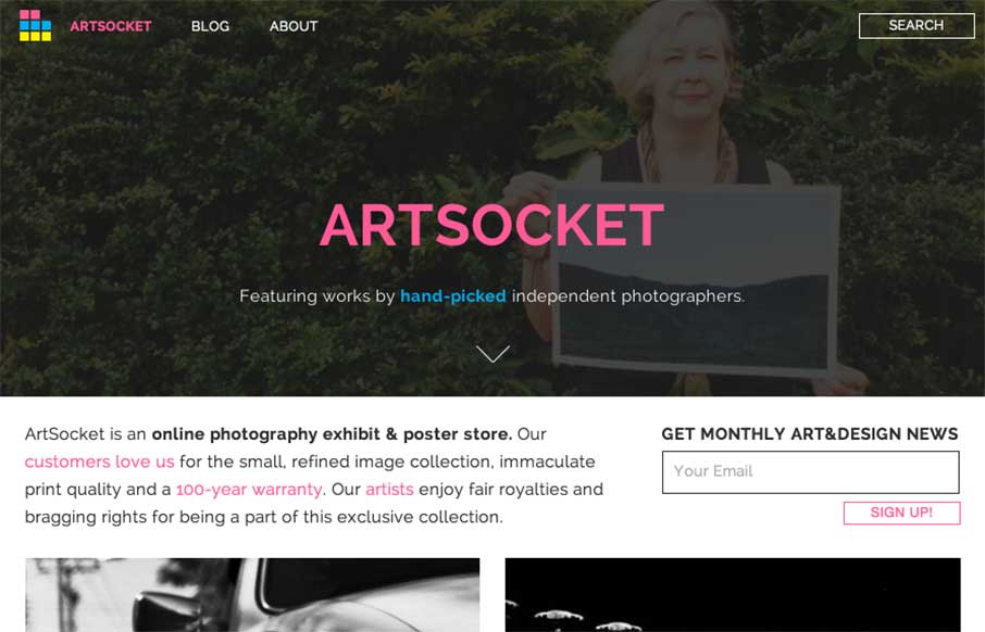
It’s kind of nice when the designer reviews the site for you. It helps when they’re right in their assessment of their work – Dmitri Tcherbadji did that for me here with talking about ArtSocket.
From the Designer: “This is a three-year e-commerce/community project. For me it was a long journey from a crummy little web space to something that now looks and feels great to a lot of people. While building this website I’ve learned a great deal about design, web development, blogging, art and content curation. And, of course, [I’ve learned a great deal about] making best prints possible.
Design. The goal for this particular app was to stand out with the bold color choices, contrast and giant text. At the same time, we devoted an enormous amount of attention to accessibility, speed and usability. This website might not have magic parallax scroll effects, but it works remarkably well and is easy to navigate on all major devices and browsers. It’s been tested on a wide range of audiences and devices. I hope that the work that I and everyone involved with this project did inspires you in some way or another.”
Submitted By: Dmitri Tcherbadji
Twitter: @artsocket
Role: Designer & Developer


0 Comments