Web Design Inspiration Curated
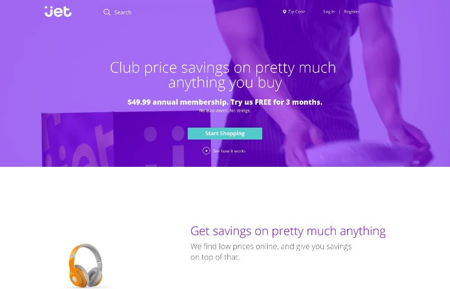
Jet
If you're going to rebuild Amazon - might as well do it cleanly and organized - Jet seems to do that. Like the flat design / icons coupled with real products - interesting combo. Reminds me a little of the iPod ads ala way-back in 2003.
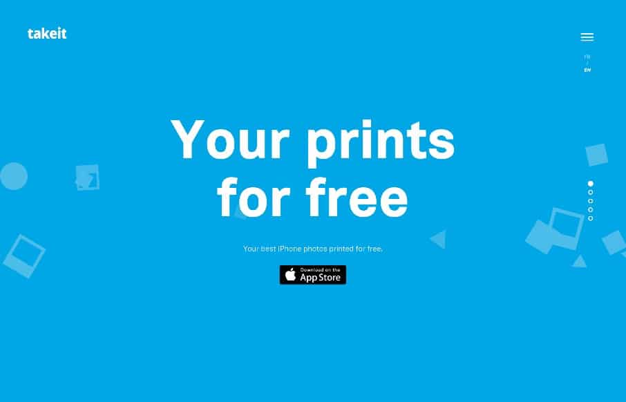
takeit
Love the on-scroll and CSS animation on the TakeIt app site. Just a great "simple" site that get's the product / app's concept nailed down so a potential user get's it. Would be nice if more sites could do that... Happy Friday! @takeitapp
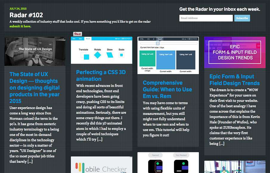
Radar #102
In this week's 102nd Radar: The State of UX Design — thoughts on designing digital products in the year 2015 Perfecting a CSS 3D animation Comprehensive Guide: When to Use Em vs. Rem Epic Form & Input Field Design Trends 9 GIFs That Explain Responsive Design...
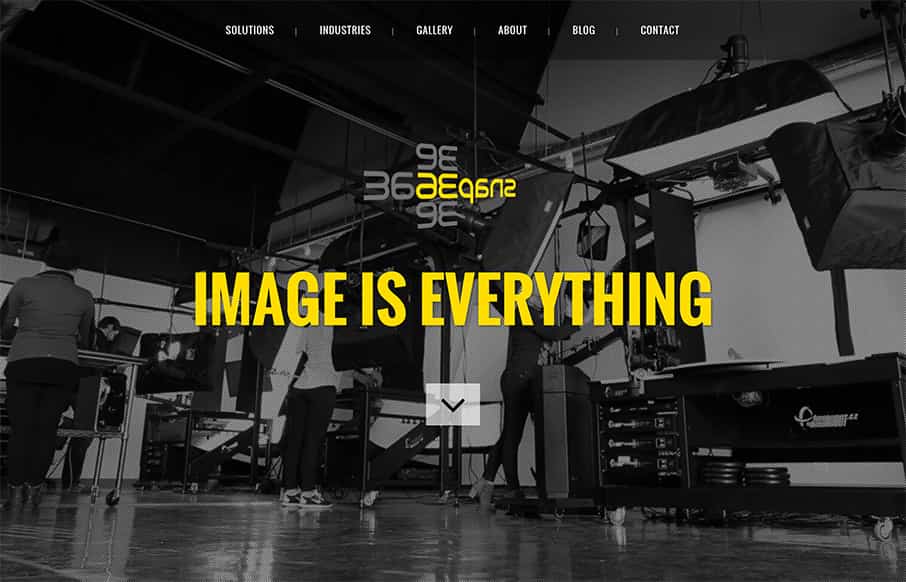
Snap36
From time to time - we let sites on UMS that use themes - as long as they're modified - and not from a web design agency - and this one from Snap36 is pretty tight (and way different than the original theme). They are a custom photography (3D and 36o degree custom) -...
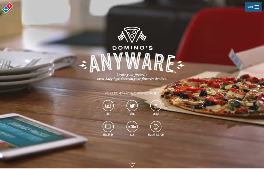
Domino’s Anyware
I wasn't sure whether to post this as a Gallery post, or a resource for Radar - either way - smart site from Domino's with Anyware that gives you instructions on how to use any of your devices and apps to order quickly (get it - not anywhere - anyware?). The site is...
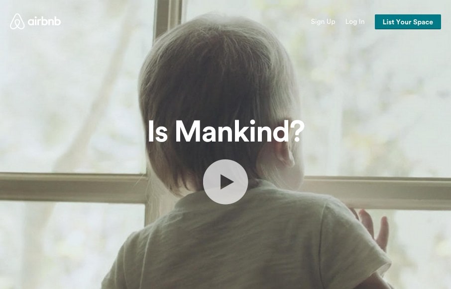
airbnb
I think the airbnb site continues to get better. We reviewed the site right after the redesign in July 2014. It was good then, and one of the first real sites to use use video backgrounds. Well, that continues, but they now have block and card designs that really...
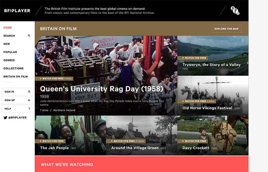
BFI Player
This may be overload for your brain on British films - but the BFI (British Film Institute) Player is loaded with so many different directions to go, hi-res images from the films, themed categories of films, a map feature to show you where they were filmed, and 5...
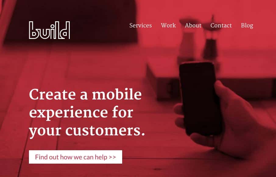
Build Studio
Good agency site by Build Studio out of Calgary - good white space and general design. Like how they changed up the look of the project summaries from the Home page to the Work page. Really like the work they did on the Wisconsin Film Festival site too. ...
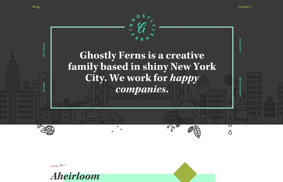
Ghostly Ferns
Like this site from Ghostly Ferns out of Brooklyn - a design studio, made up of freelancers. It's fun and has depth with the shapes / illustrations / patterns. What I really like is the link off to each one of the freelancer's work sites - that are similar, but...
Vito Salvatore
Nice portfolio site from Vito Salvatore out of London. Love the big images and especially love the iconography on the "About Me" section - kind of wish there was more. Submitted and reviewed before in 2012... @vitosalvatore
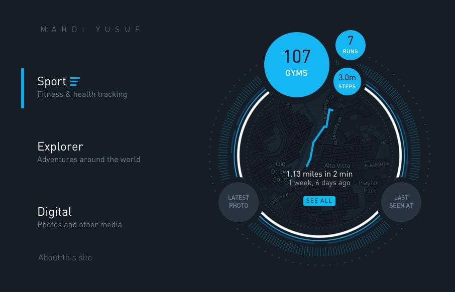
Gyroscope
Gyroscope is an app that I definitely want for my personal life (to track absolutely everything I do) - but their website (out of San Francisco) is pretty good on its own too. Think the 3d breakapart / breakout .js that some developers are using is pretty cool (used...
SuperFriendly
SuperFriendly out of Philadelphia is Dan Mall's (@danielmall) group - good people - great designers (great people too, who am I kidding). First thing I noticed was that the site renders left to right instead of top to bottom. Love how the site is super-simple - big...
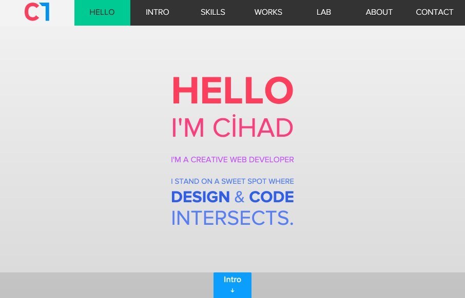
Cihad Turhan
Some unique portfolio / dev work from Cihad Turhan out of Turkey. In his mobile version of the site, he says that the entire site is really one big .js file (that you can download). Love the Works section (and the 3D Works themselves). The whole site is a cool mix...
Kristof Van Espen
Really likeBelgium's Kristof Van Espen's work - one his portfolio site, and especially the client work - and the details he provides on it. Pretty good, clean and simple UIs and what looks to be good UX too. Was listening to a podcast on hiring designers - and the...
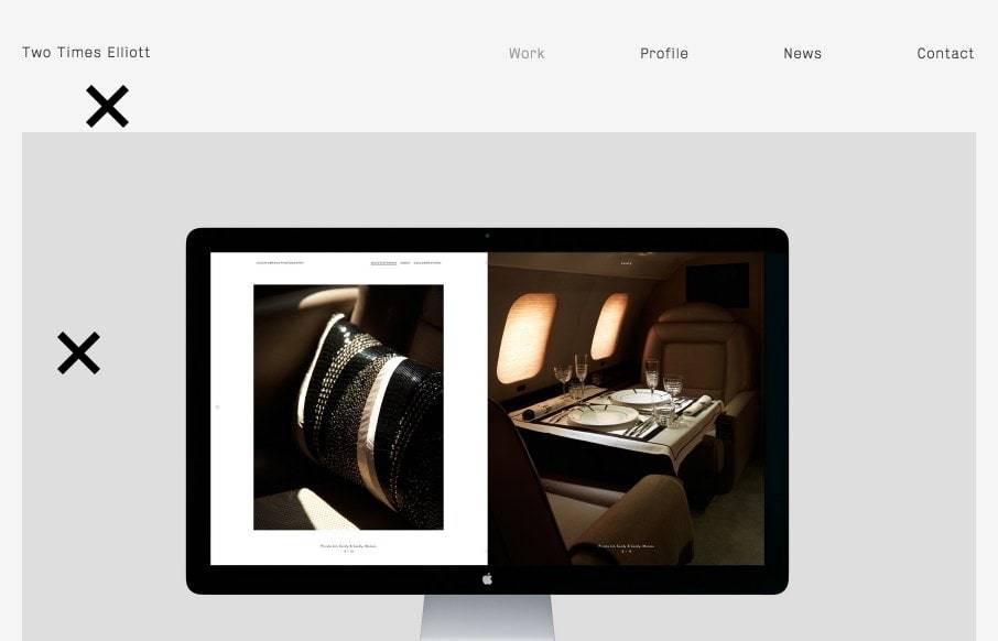
Two Times Elliott
Good start to the week with Two Times Elliott out of London. Like the mixing up of the different client work images as you go down the page. I'm a little hesitant on the 2 x's that are on the page that you just seem to click on to make them disappear - but once I got...
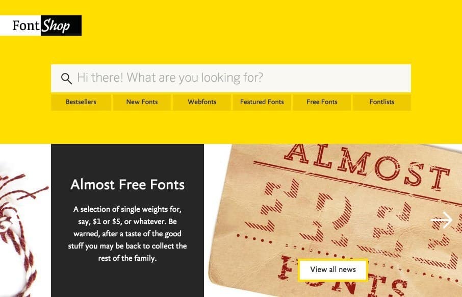
FontShop
We wanted to show you FontShop today - kind of a hybrid Gallery post / Radar-like resource, by Monotype. Like the different feel of the site based on the colors and the general layout - and actually, you can change the theme color (once you get to the detail pages)....
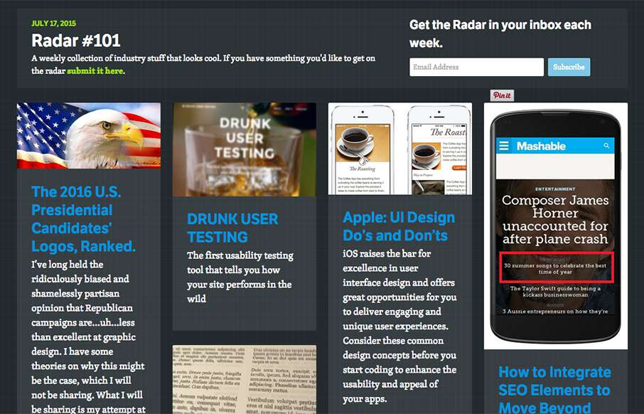
Radar #101
In this week's 101st Radar: The 2016 U.S. Presidential Candidates’ Logos, Ranked DRUNK USER TESTING Apple: UI Design Do’s and Don’ts How to Integrate SEO Elements to Move Beyond Responsive Creating Realistic Text with CSS An Inside Look at Facebook’s Approach to...
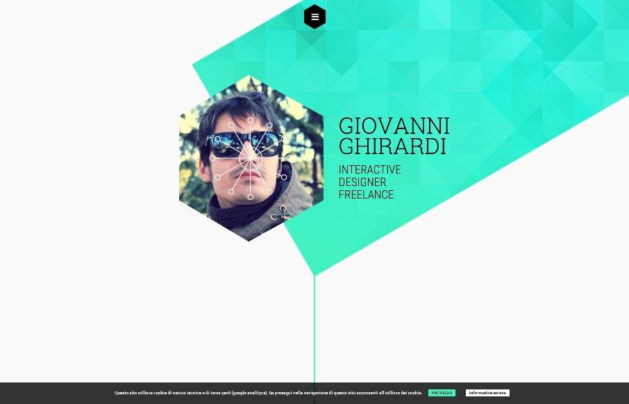
Giovanni Ghirardi
Giovanni Ghirardi portfolio site, out of Veriona, Italy, has some cool, avant garde stylings. Love how the honeycomb selfie is used with the tilted rectangle to give some real texture above the fold. Also like the hamburger drawer that comes down from the top. ...
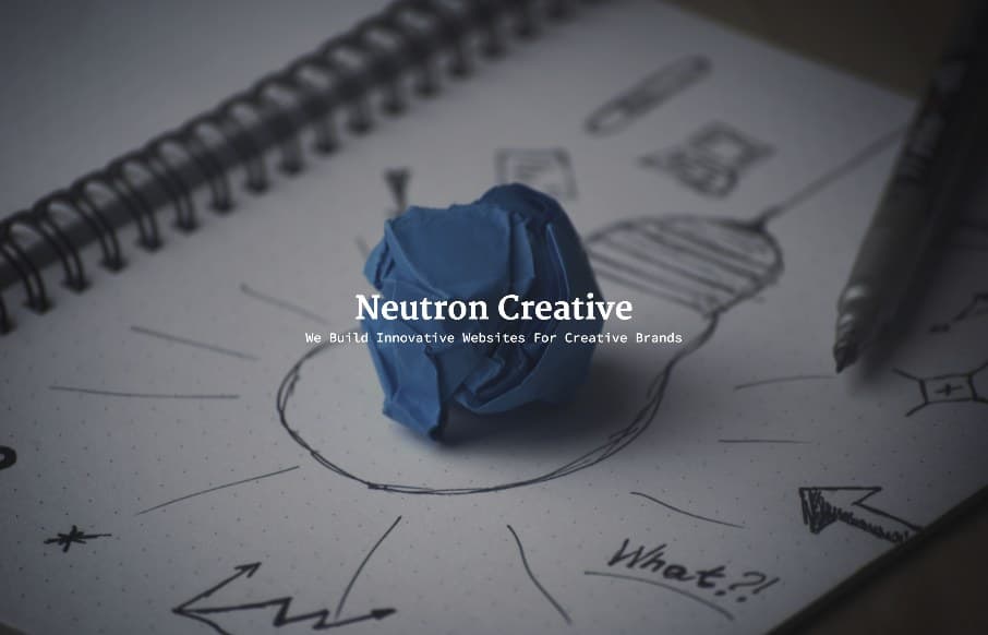
Neutron Creative
Yes - I was the one that approved the Neutron Creative site out of Raleigh, NC. Some of you may ask "why?" - because it's a big picture and some text. The reason: I think with some agency sites, we get too wrapped up in trying to show off every trick and new thingy in...
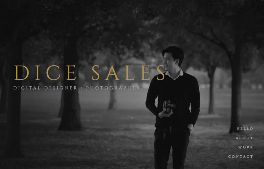
Dice Sales
This is a solid and quick portfolio site from Dice Sales out of Christchurch, NZ. I like the integration of the background photography to the Recent Works section - he's a designer and photographer, so cool to show off both types of work. I think I also like the fact...
EMAIL NEWSLETTER
News & Articles
ConvergeSE 2013 – Thank You!
 We would like to give a sincere and gracious thank you to everyone involved with ConvergeSE 2013.
Draft Episode 21: Industry Roles
 A back to basics episode, reviewing the various roles and jobs you can claim within the web design industry.
BizCraft Episode 20: Contractors, Communication & Maintenance
 In this episode of BizCraft we talk about using contractors, how to communicate with your team, website maintenance and code liability.

HARD WORK. CLEAN FUEL. NO EXCUSES
Use “WARRIOR2023″ for 10% off.