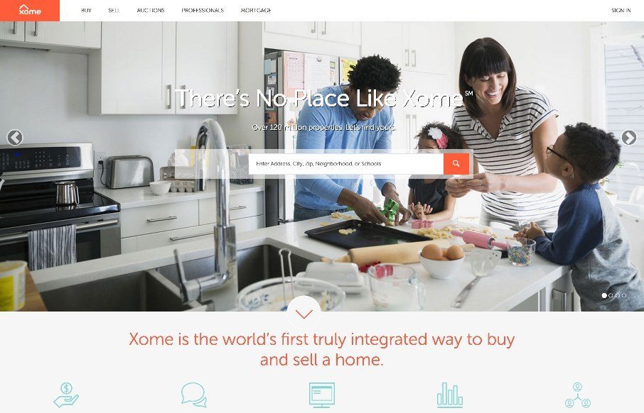
Pretty cool experience for a search based website. I like how the search is focused on top of the main hero image space. Keeps it front and center. There’s very little small screen width experience here but overall for desktop it’s tops. Cool form elements to play around with and clear crisp lines and graphics to help sell you on the stability of the site.
Glassmorphism: The Transparent Design Trend That Refuses to Fade
Glassmorphism brings transparency, depth, and light back into modern UI. Learn how this “frosted glass” design trend enhances hierarchy, focus, and atmosphere, plus how to implement it in CSS responsibly.


0 Comments