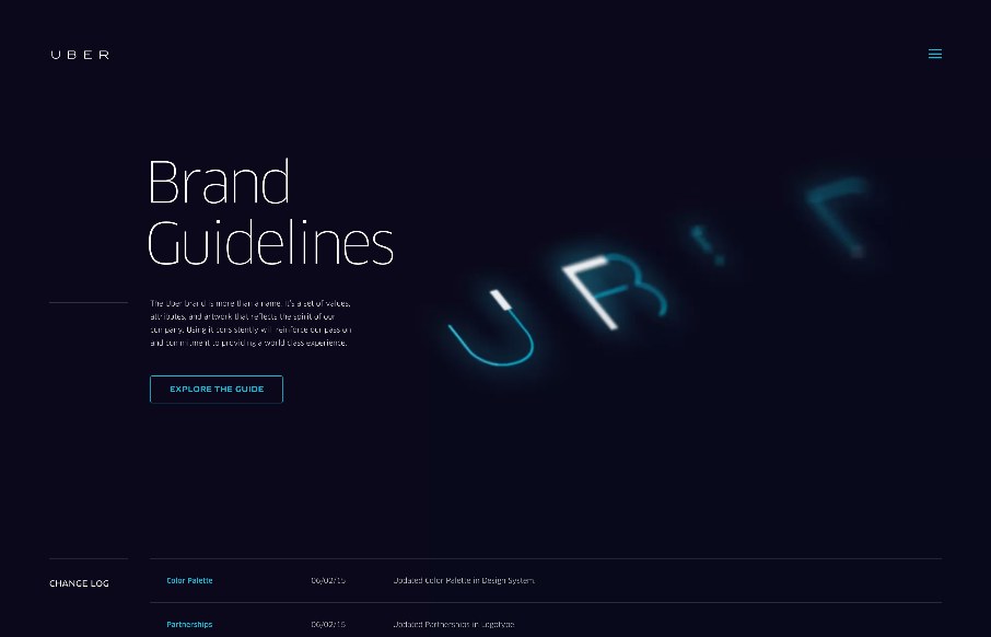
Always interesting to see brand / design / style guidelines from companies and products you use on a daily basis, like this one from Uber. Very clean and minimal, but with a few little interaction pieces – you can see they’ve taken time to make this section of their site have a good user experience (mobile and desktop).


The Call to Action, Revisited
The Call to Action hasn’t changed in a decade, but the bar has. A fresh look at prominence, copy, mobile tap targets, and accessibility, with lessons from three major design systems.


0 Comments