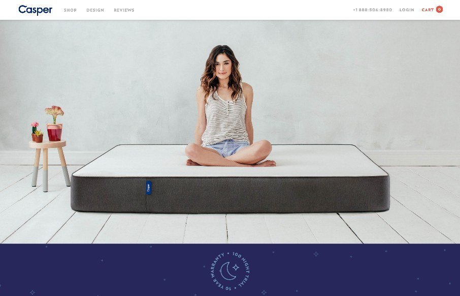
I just love it when a nice brand has a minimal approach to it’s website. Casper is a great example of what a minimal approach can do for you. The messaging is crystal clear and simple and there are still some really great interaction sections on the site to boot. Beautiful site.
Glassmorphism: The Transparent Design Trend That Refuses to Fade
Glassmorphism brings transparency, depth, and light back into modern UI. Learn how this “frosted glass” design trend enhances hierarchy, focus, and atmosphere, plus how to implement it in CSS responsibly.


good choice
Gene Crawford