Web Design Inspiration Curated
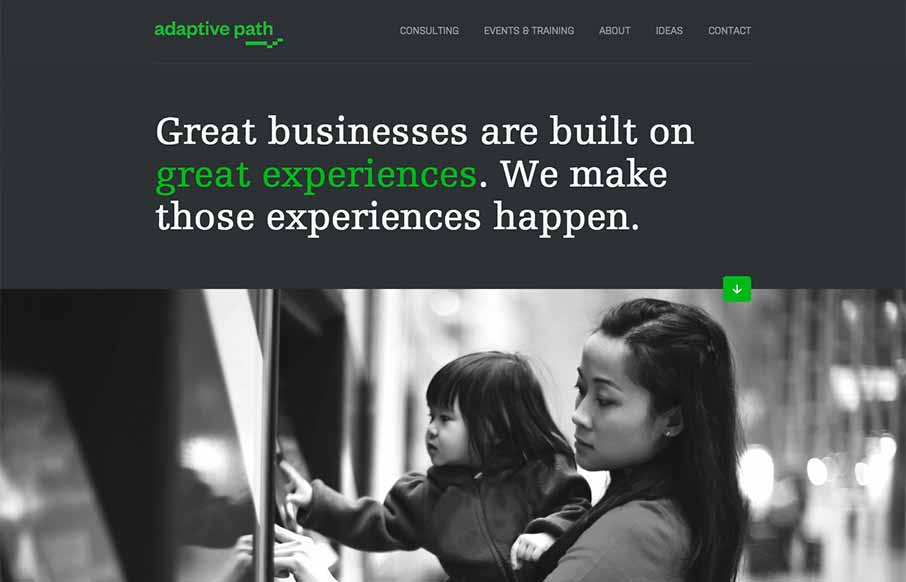
Adaptive Path
The new Adaptive Path website is "as always" a thing of beauty. There really is a lot going on here when on the surface it looks like a simple design. From the slight movement of the top header/navigation, to show you it's there, down to the overall approach of the...
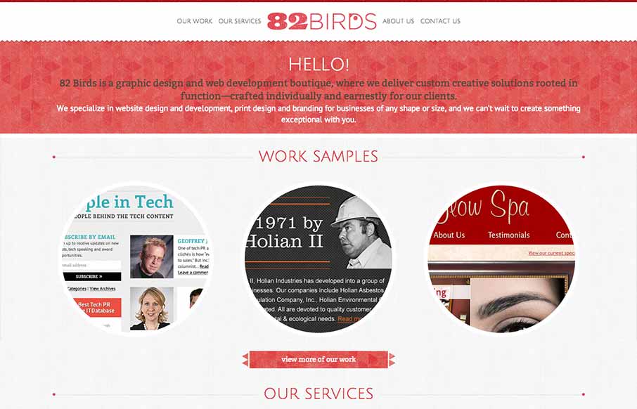
82birds
82birds has a lovely handicraft feel that pairs well with the company's brand. The typography is nicely balanced by the textural elements peppered throughout the site. I especially like the thin line dividers that bookend page titles.
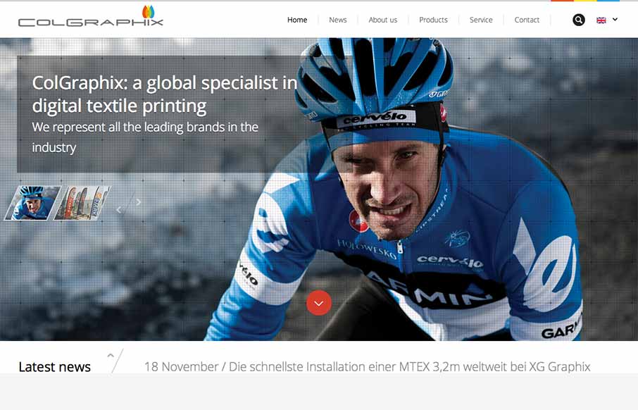
Colgraphix
Colgraphix this is a nice site with a mix of interesting animations, textures, imagery and media. One interesting detail is the loading screen, which manages the function well, but doesn't feel like a loading screen. It's a nice detail that makes the site feel like it...
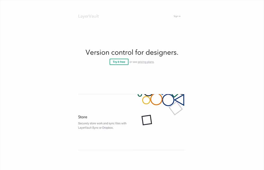
Layervault
Layervault has some crazy awesome animations. I love how each of the animations intuitively relates to the idea that they are trying to convey. It's visually minimal, but conceptually complex. So simple and so effective. Nicely done.

Skookum
I really dig the new Skookum website design. It's very clean and professional feeling but also has a vibe that is counter to an overly technical appeal. There is just enough movement and little surprises tucked away here and there to keep a level of dynamism in the...
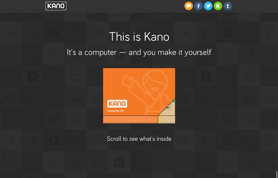
Kano
The Kano page is really just a "splash" or advertising page for the kickstarter campaign. But boy does it work, the way they take you from concept to showing the build out of the computer as you scroll down has you pretty much ready to buy the thing as soon as you hit...
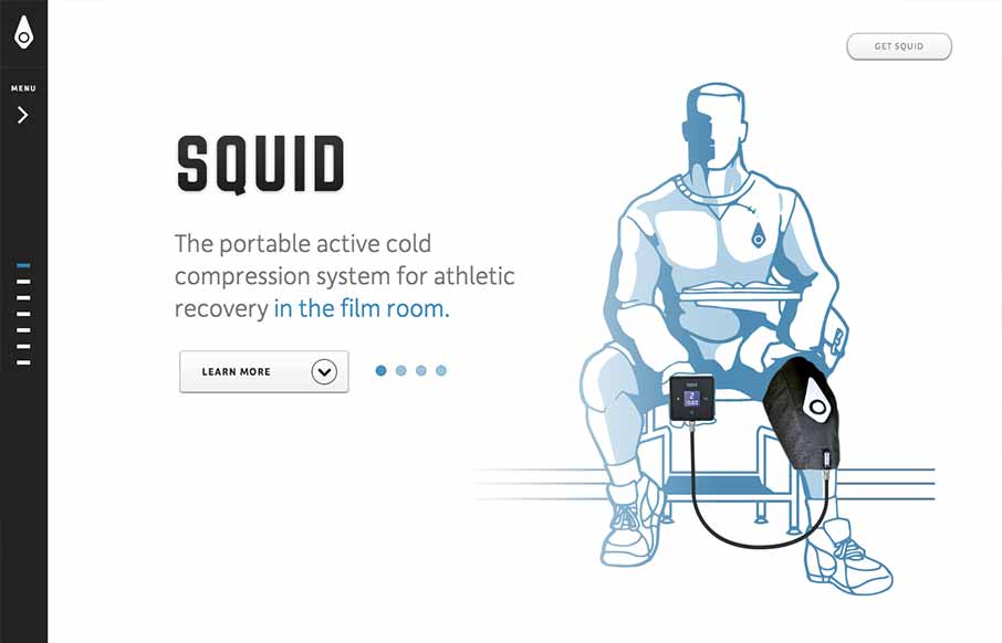
Squid Compression
I like a simple approach, the Squid website does just that. Basically working much like a keynote/powerpoint slideshow - which is really all it needs to do in this instance. The navigation works pretty well, with the down arrow at the bottom and the different...
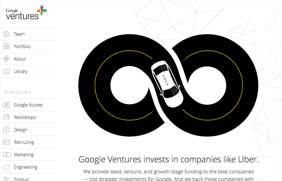
Google Ventures
The new Google Ventures site is an interesting study in creating something rich and minimal. Rich in that there are a number of visual and interactive features that make the site interesting and extremely navigable. I'm not a huge fan of the side-based fly out...
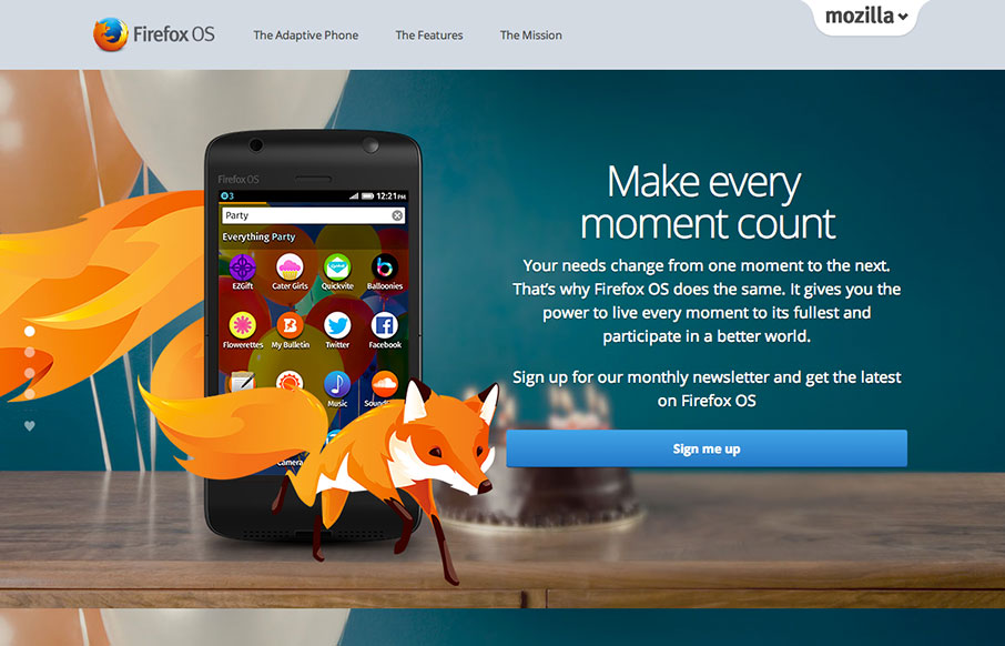
Firefox OS
I sometimes wonder whether the ubiquity of sites that use scrolling for animation and parallax effects will come to define a period in web design in a way that “Flash/DHTML” sites now do. Having said that, for the time being let’s just enjoy this visual feast – of...
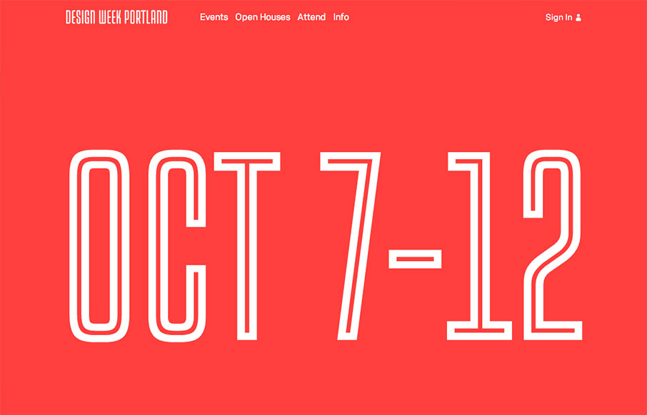
Design Week Portland 2013
I love the Design Week Portland 2013 site design. The way the images flow through in the main image area as you scroll down the page is a very cool interaction. Taking your mouse away from the area makes the image disappear as well. I like the rest of the layout too,...
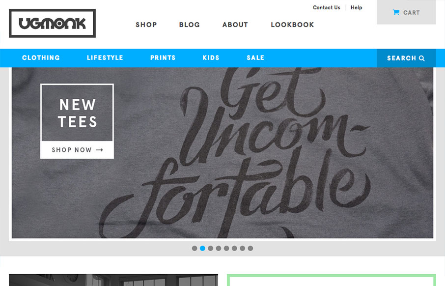
Ugmonk
The newly updated Ugmonk store site is very clean and straightforward, enabling the user to very easily look through their products. I particularly like the header nav design. The way the store nav is "featured" by sticking in place as you scroll down the page is...
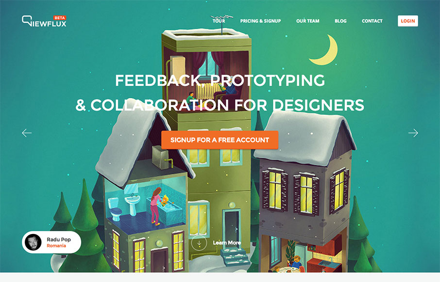
viewflux
I like the implied simplicity of the viewflux site design. It starts off with large photos in a slideshow which seem noisy visually but then it tapers off into some really nicely done grid layout and easy to read copy design. I particularly dig the way the tour page...
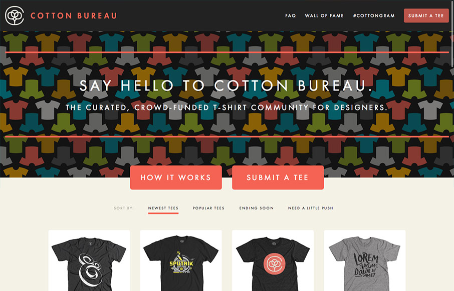
cottonbureau.com
Cotton Bureau is a curated, crowd-funded t-shirt community for designers brought to you by Full Stop; the brains and braun behind United Pixelworkers. It's a great concept with an equally solid site. I think there's a good balance between Cotton Bureau and individual...
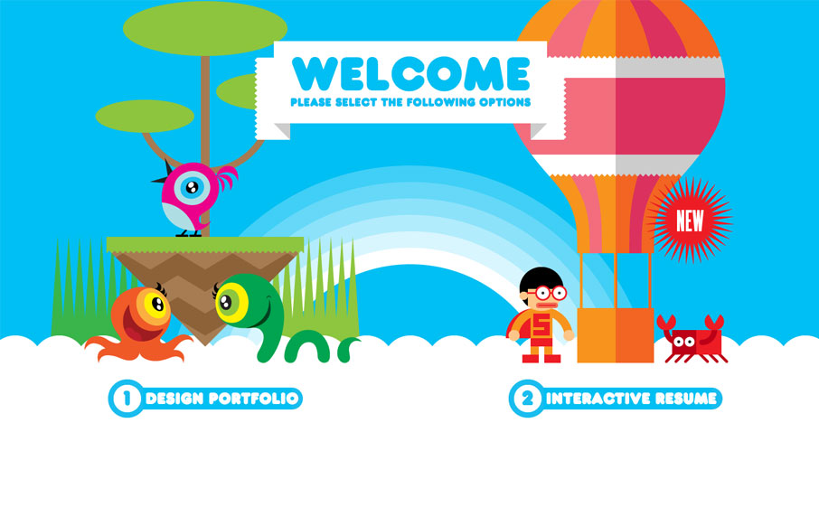
Robby Leonardi
Both his portfolio and resume are cool, but mainly go check out the resume page of this site. Fantastic stuff. This is a really neat take on a single page website design that employs scrolling as primary navigation across the site. Great illustration work and cool...
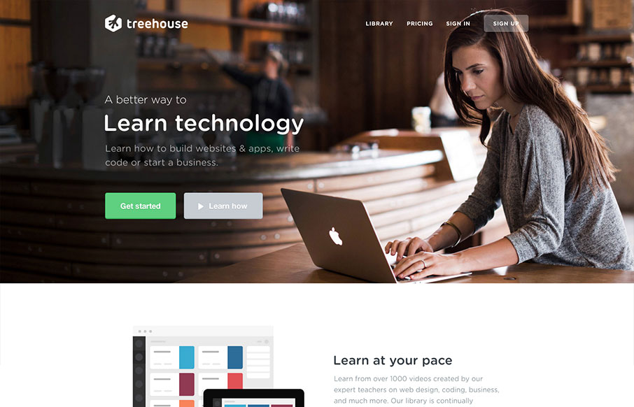
teamtreehouse.com
Newly updated design for Treehouse. The design is incredibly focused and direct yet at the same time the photography and illustrations are open and inviting feeling. The color palette also plays on the essence of making you feel relaxed. Good responsive work here too,...
Thoughtbot
The Thoughtbot site is a really good experience. It's simple and fast to browse and really feels like a "content" or "mobile" first approach. Which is interesting to me, since this is what they do, it's a good idea to really show that off for potential clients and...
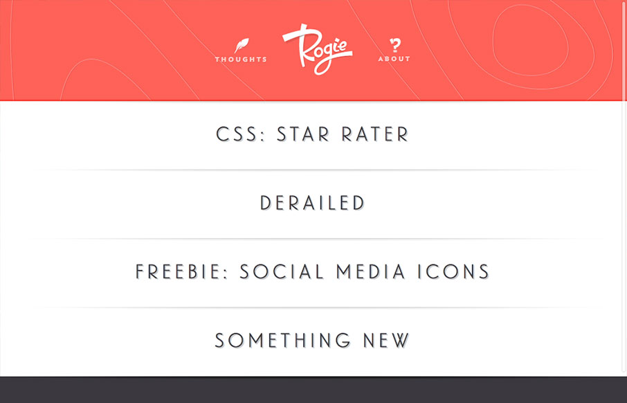
Rog.ie
Rogie's site is a nice example of keeping things simple and straightforward and also fine detail work. This is the stuff he's known for. There are a lot of little interaction details built into the website that add a great deal to the experience. This is a great...
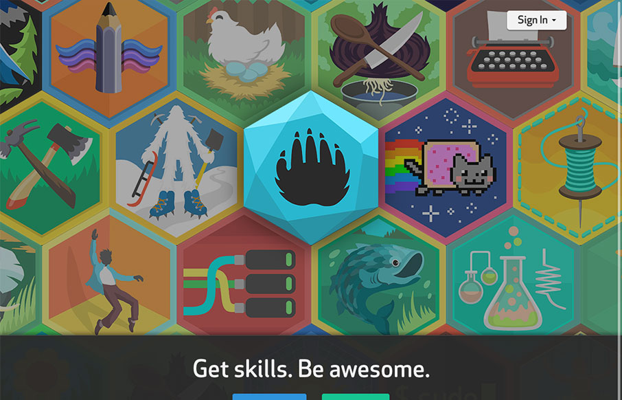
diy.org
This site is all kinds of interesting. It teaches kids new skills and through the power of social media, it connects them to others that share their interests. Honestly, it looks like a heckuva lot of fun for any age. The design is solid - with 3 streamlined paths you...
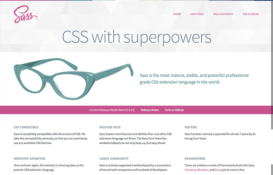
Sass
The new Sass site! It's what you'd expect, good quality simple design. The new logo is quite nice, very succinct and direct, it's a good mark. Nice illustration of the glasses too. This site has to do so much, it has to be easy to read through, fast to get to and...
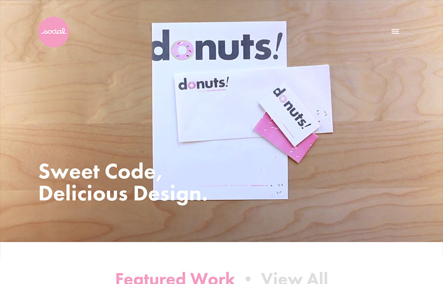
socialdesignhouse.com
I've always like the video on Social's home page, so I'm glad they've found ways to utilize it with each redesign of the site. I especially like the consideration they take when the site's viewed on a smaller device. It's smartly responsive, and not having the video...
EMAIL NEWSLETTER
News & Articles
UMS Sticker Pack Giveaway
 We’re giving away sticker packs to our readers come and claim one, sponsored by the awesome Sticker Mule.
Book Review: 8 Faces
 Review of 8 Faces, the Magazine about typefaces and the people who create them, by Elliot Jay Stocks.
Emily Lewis: Microformats
 Get to know Emily Lewis a little better. Microformats master and author of ‘Microformats Made Simple’ will also be speaking at the In Control Conference in February.

HARD WORK. CLEAN FUEL. NO EXCUSES
Use “WARRIOR2023″ for 10% off.